How to Make a Brochure: A Simple (But Complete) Guide
Discover the key steps and considerations for creating an effective brochure design.

Cassie Viele
Published Apr 28, 2020
 This article was originally published in October 2018, but has since been updated. In a world where just about everything is disposable, generating a brochure with staying power is all about setting yourself apart. If you want to stand tall above the crowd, you need to know and be confident in WHO and WHAT you are and communicate BOTH effectively through your design choices, pictures, and words. Let s start at the very beginning (a very good place to start!)
 Know who you are
Ancient Chinese military general and revered strategist Sun Tzu wrote: Know yourself and you will win all battles. He probably wasn t talking about marketing and brochure design, but we are, and the Chinese DID invent paper, soKnow yourself and you will win all battles. - Sun Tzu
The GOOD
[caption id="attachment_3199" width="700"] Free-Photos / Pixabay[/caption] Take a good hard look at who and what your company is. An intentional self-assessment can provide you with insights and strategies that would otherwise go overlooked. Ultimately, making an honest list of your organization s strengths can and will give you top-notch marketing copy and help you pinpoint your core principles. If you operate a white-water rafting company, it s likely that you would value bravery, a sense of adventure, and a passion for the outdoors as would your customers. Your brochure would then naturally highlight those ideals in your words, images, and design.
 The (this could be) BAD
[caption id="attachment_3203" width="700"] xusenru / Pixabay[/caption] At the same time, determining events and actions that would cause harm to your brand lays out pitfalls to avoid and leaves you with a better sense of corporate-self. Your river guide reputation for being a steward of the outdoors would be severely impacted by news of the failure of one of your employees to maintain your high standards for caring for the environment in any way, so it may be useful to highlight certifications you ve received or commitments you ve made to quality and integrity in your brochure. Including a special section on corporate accountability to get ahead of any potential eruptions could be useful, depending on your industry.
 The (never ugly) WHY
Spend some time thinking about why you got into this business in the first place. What motivated you at the start? Did you start a travel agency because of a treasured memory of a gap year spent backpacking through Europe or hiking the Appalachian trail? Perhaps your love for children prompted you to open your own daycare center or preschool. A passion for food likely fueled your drive to launch your own restaurant. A clearly defined sense of who you are should naturally flow from why you are, and it s the why that your customers connect with.It s the "why" that your customers connect with.If you don t already have your company s mission and purpose boiled down to a catchy one- or two-liner, it s time to hammer that out. A memorable tagline is worth featuring prominently on all your marketing materials, so laying it out and expounding on it in your brochures gives it extra weight in all other locations. Encourage your white-water adventure seekers to "leave behind the grind and experience the thrill of the Grinder" or simply suggest that they try a "[not so] everyday adventure." Their inner athlete would probably also identify with a call to "just [raft] it," but that one's already taken. The right message to the right audience is the key to marketing success. A word about competition Regardless of your industry, there is likely always going to be another company that provides a similar service or a comparable product. Big Joe s River Runs down the road may have new-fangled rafts in brighter colors, but that doesn t mean you can t out-market Joe! Study your competition - since you ve already identified your strengths, highlight them against Big Joe s weaknesses. Stay out of the mud, but emphasizing areas of superiority in your marketing strategy (a stellar safety rating, for instance) can overshadow other places where Joe has you by a nose (those fancy rafts).
Know who your audience is
[caption id="attachment_3214" width="700"] Pexels / Pixabay[/caption] Who are you hoping to reach with your brochure? Customers, investors, or other stakeholders? Walk a (decidedly short and not literal) mile in their shoes. See your brochure through their eyes, and hear your voice through their ears. Ask yourself these key questions:
 Who are my readers?
Take stock of your client base and tailor your design and copy to their likes. The theme and feel of your brochure should make sense to them if you operate a preschool or daycare center, an edgy or cold design would not be well-received. A sunny color scheme and upbeat text, however, would fit the bill to a T.What does my audience want?
Give your reader something of value within the folds of your brochure. Figure out ways to build something worthwhile, whether it be details or discounts, info or images, into the natural flow of the brochure.What tone do your readers expect?
Light-hearted and humorous, casual and friendly, or serious and informative? Ultimately, your tone should effortlessly match their expectations if you re being true to your brand.Is my written voice authentic?
Your copy should match the perception your customers have of your business. If you run a top-notch law firm, casual language in your brochure would be inappropriate. At the same time, $20 words in a brochure for a surf shop would potentially be out of place unless your customers are Stanford dropouts who hope to start Fortune 500 companies.Is my on-paper persona in sync with my company s mission and vision?
Your brochure should be a mirror reflection of your company. Think of it as your ambassador to a foreign land. The style choices you make layout, imagery, font, and color scheme should coincide with the atmosphere and culture of your company, and no one is better equipped than you to ensure that your brochure is on point. Know when to hold back Since we ve already established that Sun Tzu was a print marketing expert, let s lean on another of his pearls of ancient wisdom He will win who knows when to fight and when not to fight. Practically applied, sometimes more is just more. Don t put everything you ve got into one brochure save a little something for the follow-up contact. You ll know when you ve struck the ideal balance. Be true to who you are honesty, integrity, and authenticity will always win the day!Key brochure design considerations:
Get it together!
Before you begin, it is crucial that you employ the foundational French culinary technique of mise en place ( everything in its place ). Gather everything you ll need photos and images, service and product descriptions, marketing goals and expectations, a clear budget, and a sense of what it is you want your readers to do BEFORE you start designing so that surprises and problems down the road can be minimized. Chef Anne Burrell will be so proud! [caption id="attachment_3216" width="700"]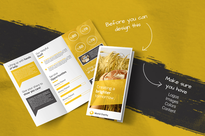 Awesome Charity Tri-Fold Brochure Template / MyCreativeShop[/caption]
 Images
With the advent of digital photography and a million different versions of every image, selecting the ideal photos to include in your brochure can be a challenge. As you navigate these potentially deep and treacherous waters, there are a couple of picture characteristics to keep in mind:- Quality: Select high-quality images with a DPI (Dots per inch) of 300 for the best possible printing experience. Pixelated images just don t exude professionalism and trust, but an appropriately-sized top-notch photo can produce both.For more on image resolution, DPI, and why it matters, check out these resources: A Complete Guide to Understanding DPI DPI or PPI: Does anyone really know the difference? Image Resolution
- Quantity: It can be tempting to want to fill the pages of your brochure with every photo or graphic you have. Resist the urge choose instead to be selective and intentional with the images you include. Too many pictures can create too much visual chaos, but a wise selection of quality imagery gives the eye a soft place to land. Aim to strike a balance in the sweet spot between excessive use of .jpgs and a barren photo landscape.
Service/Product Descriptions (aka copy)
You should already have a clear understanding of what it is you have to offer consumers, so reach into your well of industry knowledge and come out with easy-to-understand and well written blurbs that keep it fresh and simple. Short, to the point descriptions are more readily retained and understood by the reader (there s only so much free space in their mental filing cabinets).Goals and expectations
[caption id="attachment_3218" width="700"] TeroVesalainen / Pixabay[/caption] A consideration of utmost importance is defining your goals in producing a brochure. What are you hoping to get out of it? A hard look at your motivations makes the design process come into sharp focus and gives you a clear path to evaluating your brochure s overall success. Is your client list waning? An influx of new customers is your goal. Are sales plateauing or even dropping? Set an acceptable revenue target and brainstorm strategies to reach it. Do you have a new product or event coming up that needs to be promoted? Getting interested parties to subscribe to your email list should be a priority. In the end, defining the why organically leads you to the what, and it s that what that moves you solidly to the how. The practical application of the what/how relationship is where metrics come into play
 Metrics
Every piece of marketing material you produce should be accompanied by an intentional set of metrics for determining its effectiveness. A few scenarios:- Want to drive traffic to a new or specific brick-and-mortar location? Turn one corner (or an entire fold) into a coupon with a unique code, then track its use to gauge impact.
- Trying to expand your reach to new areas? Send your brochures to specific neighborhoods with a unique call-to-action, then track ZIP codes when they join your email list or visit.
- Evaluate your brochure s ability to increase website traffic by including a landing page URL unique to the campaign and tracking page visits.
Money talks
Setting a budget you can afford puts your entire project into context. Knowing what you can and can t spend enables you to make smart design choices from paper to images to ink and everything in between. Determine an overall budget and divide by how many brochures you ll need to pinpoint your budget per print. With that per brochure max cost in mind, begin planning those areas that warrant a bigger portion of the pie and those that can do more with less. Need help knowing what to expect? Use our print calculator to determine a ballpark budget per print as you evaluate your options.Different types of brochures
If you ve ever done any Google research on napkin-folding, you are painfully aware of the multitude of origami-style ways a flat piece of paper or fabric can be folded and creased into a shell of its former self. Similarly, there are more than 17 different fold patterns available to the humble brochure. What to choose? If you re looking to keep costs down, stay simple and classic with the two most popular options: bi-fold (sometimes referred to as half-fold) or tri-fold. [caption id="attachment_3219" width="700"]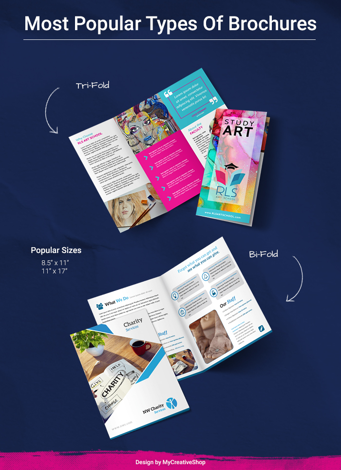 Most Popular Types Of Brochures: Tri-fold & Bi-fold[/caption] Remember, less paper = less ink = lower cost. The tradeoff, of course, is that more print real estate = more space to promote your company, so less real estate requires making the best use of the space given. If you re appealing to customers who expect a higher-end product or service and lots of detail and imagery, you can go all out with a more complicated and involved fold pattern, like the Bird of Paradise or Crown Fold (just kidding consider instead the eight-panel roll fold or tri-fold + z-fold) Tip: Before you commit to any design, be sure to check with your chosen printer to ensure they can print your brochure the way you want. There s nothing worse in the design process than getting all the way to the end and discovering you don t have a way to get your brochure from your screen into the hands of your audience.
 GSM and Finish and Ink, oh my!
Believe it or not, choosing the paper, ink, and finishes for your brochure can be one of the most involved (and potentially expensive!) parts of the design process. There are three main factors to consider:Paper Weight
The paper weight (thickness) you select determines how your brochure will feel in the hands of the reader. Measured most often as GSM (grams per square meter), the metric weight of paper is the weight in grams of a 1x1 meter sheet. When printing a brochure, you should aim for a paper weight of 170gsm or above, but not higher than 300gsm or you ll be in business card territory. For more on paper weight: US to International Paper Weights Paper weight, GSM, and what it all really meansFinishes and Ink
Once you ve selected the appropriate paper for your brochure, you need to decide on a finish (or varnish). There are three main options, and if you ve ever ordered photo prints or painted a wall, you ll know what you re getting into:- Matte: A flat, shine-free finish.
- Semi-gloss: Think of this as a compromise between matte and glossy a happy medium, if you will.
- Glossy: Shine. Lots of shine.
- Get creative: You can go with an all-over varnish or just highlight a few areas with a Spot UV finish that applies an ultraviolet coating to specific areas of your brochure, giving only those areas a matte or glossy finish.
- Embossing: Embossing gives your text a raised finish that gives it a unique feel in the hands of your reader.
- Foil: Just like it sounds this type of ink has a metallic, reflective finish.
How to design brochure content
A little less talk, a lot more action
The focus of your brochure should always land on the CTA (Call To Action) you came up with during the introspective goal setting process at the start. Every part of your brochure should connect back to that CTA what is it you want your readers to DO after reading your brochure? Keep it clear and simple, just like your why statement. When it comes to repetition in your brochure, find that happy Goldilocks-style medium where it s not too little, not too much, but just right. [caption id="attachment_3221" width="600"]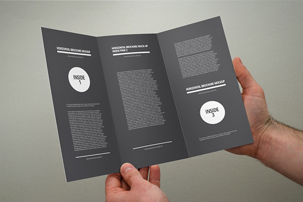 Yogurt86 Design Studio / Behance.net[/caption]