13 Unique Brochure Designs for Creative Inspiration
Discover creative brochure designs that will make your marketing materials stand out.

Published Nov 6, 2018
 Designers are continuing to push the limits of creativity with new ideas for marketing collateral. Whether your preference is bold colors and graphics, a minimalistic looking Apple-esque design or something more whimsical, you re sure to find something inspirational in this collection of unique brochure design ideas from around the web. A well-designed brochure is an effective way to keep your company fresh in the minds of your potential customers. Unlike digital marketing ads that are viewed for seconds and then clicked away and forgotten, brochures are tangible evidence of your company s product or service that your customers can take with them and refer back to for future reference. A brochure is an opportunity for companies to show off their brand s unique personality. Even within similar industries, designs can vary in color, presentation and dynamic, depending on the desired image a business wants to portray. The only steadfast rules for brochure creation are to include quality information and keep your brand consistent across all of your marketing collateral. So be creative and design a unique brochure that flows with your brand and content.
 1. Minimalistically Modern
[caption id="attachment_3433" align="alignnone" width="900"]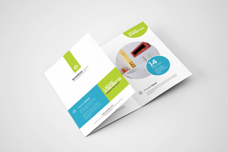 ToaSin Studio | Modern Brochure[/caption] This design is minimalist and modern with a delicate touch and is ideal for any creative. The space surrounding the elements provides focus by separating and grouping the content to draw the eye to the photos and text. This layout is perfect for designers and photographers seeking to showcase their portfolio.
 2. Powerfully Feminine
[caption id="attachment_3435" align="alignnone" width="700"]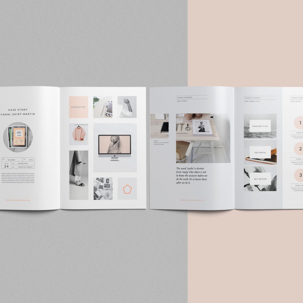 Studio Standard | Powerfully Feminine[/caption] The contrast of soft pastels with black and white photos in this brochure creates a soft, elegant aesthetic along with a sense of empowerment. Perfect for lookbooks, brochures and any type of marketing collateral for your makeup shop, day spa, cosmetic company, or any business that would like to include a feminine touch in their brochure.
 3. Elegantly Understated
[caption id="attachment_3438" align="alignnone" width="700"]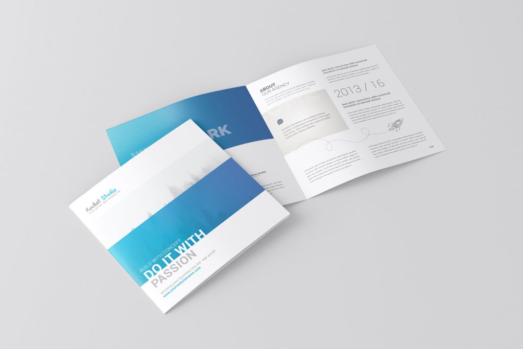 ToaSin Studio Bifold Brochure[/caption] The lines and color of this corporate brochure draw the eye and connect the content, resulting in a design that is professional and understatedly elegant. The combination of blue, white and gray, often used in the medical industry, also creates a calming effect, encouraging the reader to sit back, relax and learn more.
 4. Impressively Fashionable
[caption id="attachment_3439" align="alignnone" width="700"]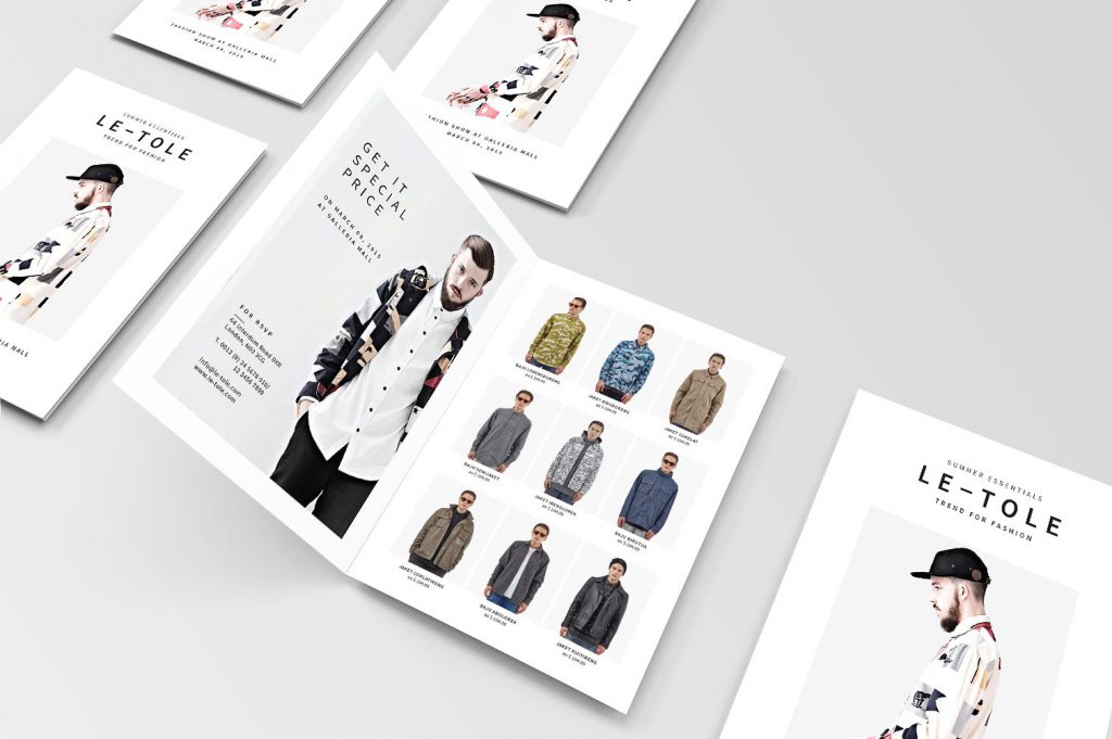 BOXKAYU | Bifold Fashion Brochure[/caption] If fashion is your thing, this brochure is the perfect way to show off your designs. Plenty of white space and an empty backdrop behind the models allow the fashion to be the centerpiece. In this case, the use of color or bold graphics would be distracting, and the product is allowed to speak for itself.
 5. Beautifully Expressive
[caption id="attachment_3441" align="alignnone" width="800"]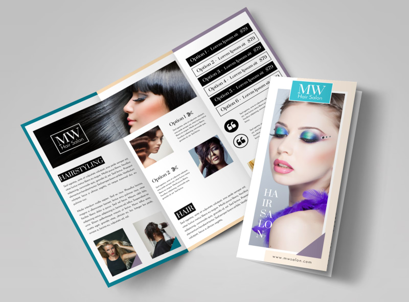 MyCreativeShop | Customizable Tri-fold Brochure[/caption] When you re in the beauty business, you know that style matters, and this should be reflected in your marketing materials, as well. The visual appeal of the photograph on the cover of this brochure with a bold headline draws the reader into the rest of the brochure, which doesn t disappoint. The chic typography, images and graphics in clean, understated text blocks work together to create a luxurious impression without being over the top.
 6. Successfully Impactful
[caption id="attachment_3442" align="alignnone" width="804"]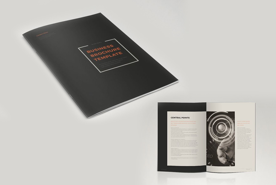 Successfully Impactful | Bifold Brochure[/caption] Sometimes, you want your story and your brand to speak for itself. For this brochure, solid blocks of black with red highlights make the content stand out. If you re stuck on which brochure style to choose, you can t go wrong with a black and white brochure accented by one color. This design has an impactful appearance and is easy to create.
 7. Visually Interesting
[caption id="attachment_3443" align="alignnone" width="700"]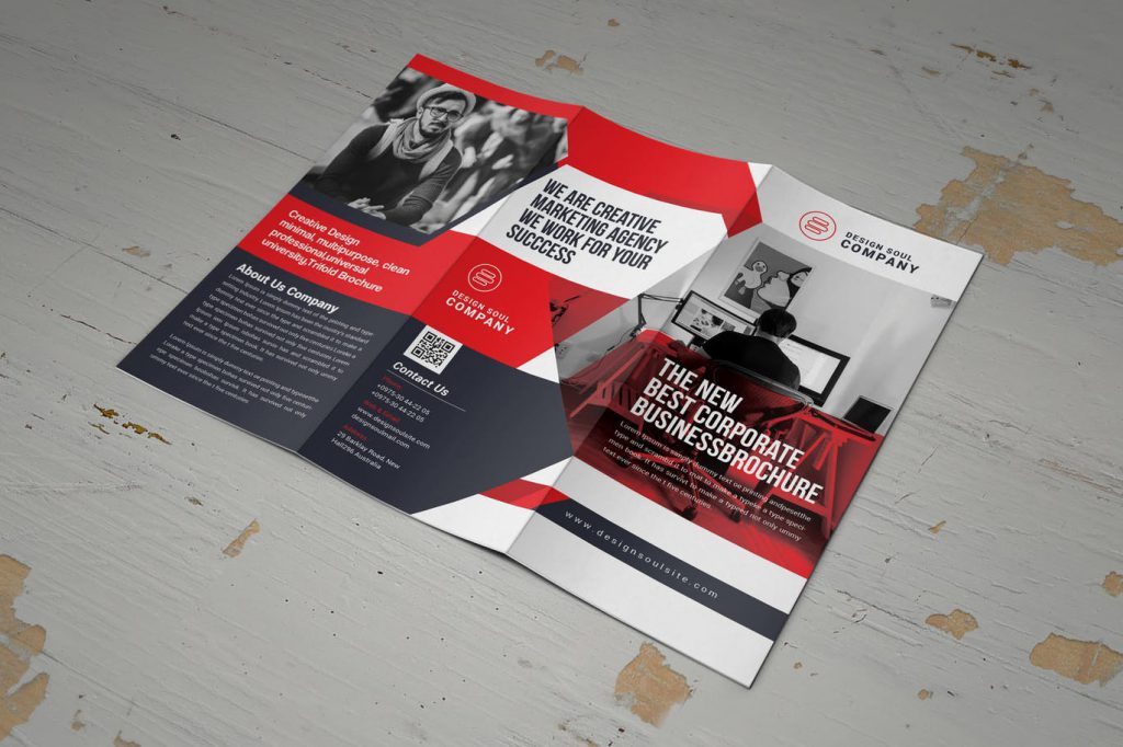 designsoul14 | Trifold Brochure[/caption] Again, the contrast of a bold accent color against monochromatic photographs and black and white makes this design visually appealing. Red and blue are good choices for accent colors, or choose a color from one of the photographs in your brochure and make that the accent color. Background images and overlays add dimension and texture to your pictures. A dark overlay will push your image into the background so that your content will stand out, and a light overlay highlights and brightens your photos.
 8. Noticeably Distinct
[caption id="attachment_3444" align="alignnone" width="706"]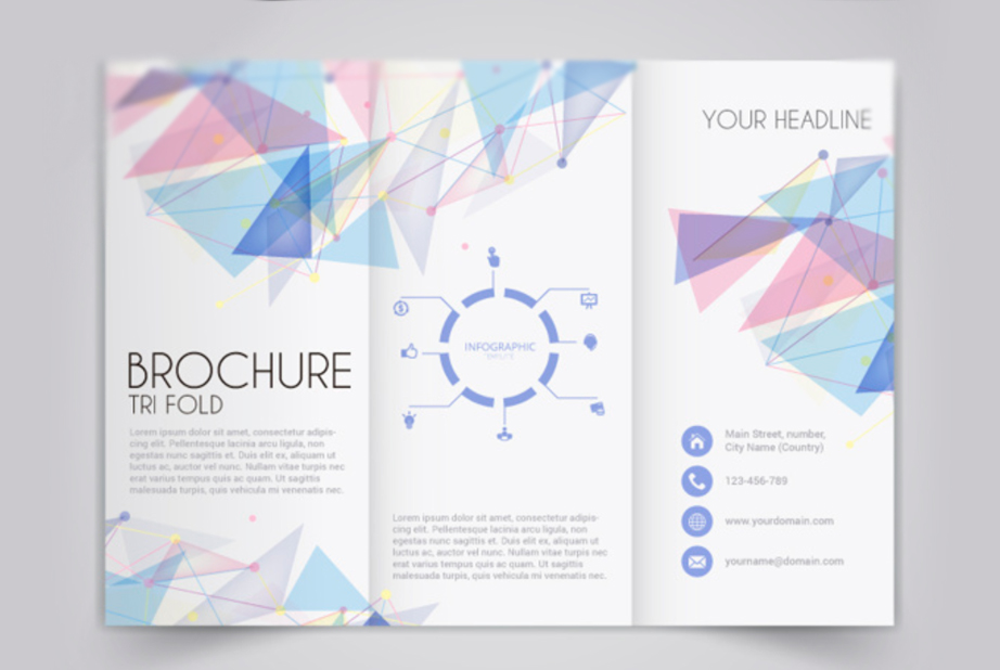 freepik | Trifold Brochure[/caption] Photos placed in geometric shapes on a white background add a visually-interesting element to this brochure. Although it s tempting, avoid trying to stuff your brochure with as much content as possible. Leave plenty of space to let your content breath and allow your photos to shine. Think of your brochure as a canvas. A painting that is crammed full of color and detail can leave the viewer struggling to pick out what is supposed to be the important part of the artwork. Direct your readers attention to the facts and photos you want to stand out in their minds.
 9. Uniquely Colorful
[caption id="attachment_3445" align="alignnone" width="826"]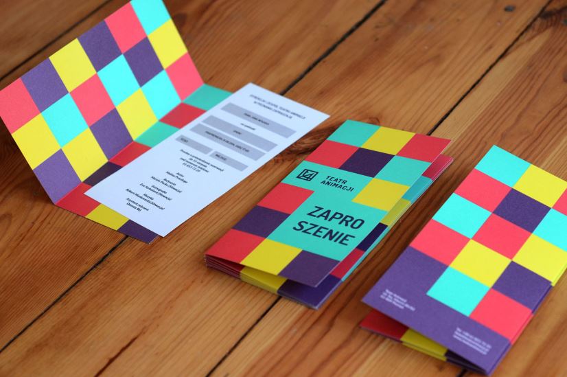 Uniquely Colorful Brochure[/caption] It s important to set yourself apart from the competitors in your market, and so make your design stand out by going with something colorful and unique. If this brochure were on a rack along with other typical business brochures, it would most certainly catch your eye. If you ve decided to go with a colorful brochure, consider taking a cue from your logo and the brand colors used on your website, and carry those colors through into your design.
 10. Artistically Inclined
[caption id="attachment_3446" align="alignnone" width="800"]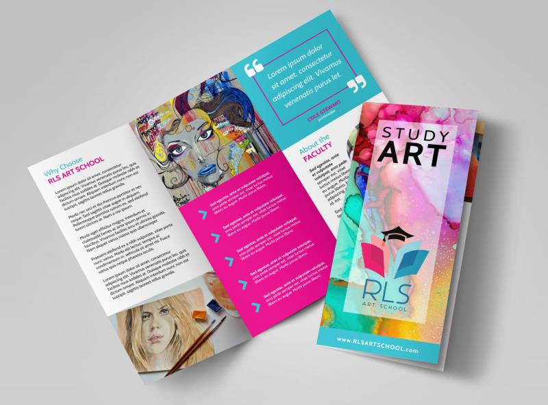 MyCreativeShop | Artistic Tri-fold Brochure[/caption] The avant-garde style of this brochure is perfect for asserting your unique brand. This stunning design uses contemporary graphics and photos to grab your reader s attention while still keeping the content in focus with well-thought-out formatting and coloring. Remember that less is more when it comes to choosing your fonts. Choose a bold font for the header and a complementary font for the rest of your text. The variance in the fonts should be enough that there is a definite contrast, such as using a serif and sans-serif font combination.
 11. Impressively Dynamic
[caption id="attachment_3447" align="alignnone" width="718"]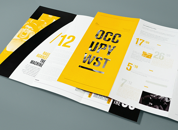 Stephane Pianacci | Brochure[/caption] The front page of a brochure should be designed to grab someone s attention, and this brochure definitely does that! The bright yellow and bold content in this design conveys an energetic feel. The cover color is carried through into the rest of the brochure as an accent color, and the bold type is repeated throughout the advertisement to keep things consistent. It s best when choosing color schemes to stick with two or three primary colors to help keep your content flowing and give your design a more streamlined look.
 12. Motivationally Effective
[caption id="attachment_3448" align="alignnone" width="864"]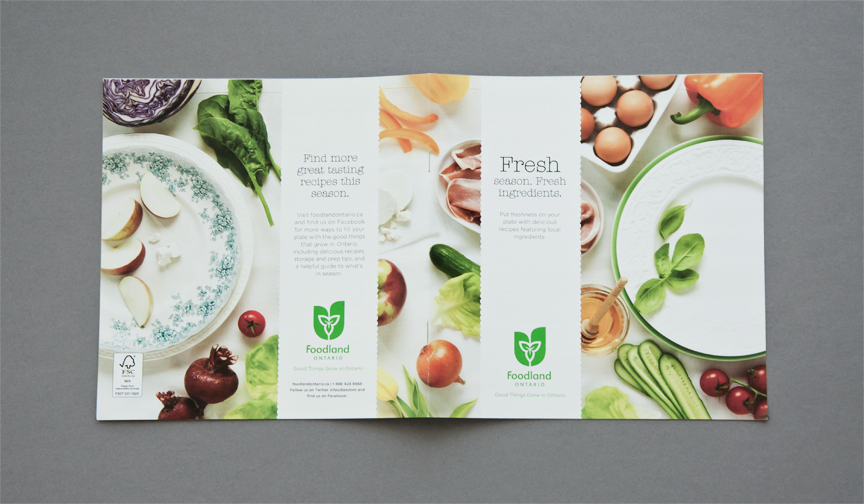 Kimberley Pereira | Fresh Brochure[/caption] The saying A picture is worth a thousand words is on point when it comes to design. The images that you choose can evoke a connection with your audience, and so sometimes it s best to cut down on the text and let your photos tell your story. Food and restaurant-themed brochures have the potential to be held on to for an extended period of time if they include a menu or recipe, and so consider an evergreen design that presents your long-term brand idea.
 13. Strikingly Original
[caption id="attachment_3449" align="alignnone" width="600"]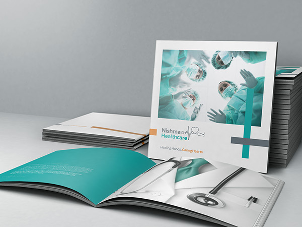 Kiran Qureshi | Medical Brochure[/caption] In today s visually-oriented culture, your choice of photos and graphics is vital to the success of your brochure. The photos used in this medical brochure are unusual and eye-catching, and, overall, the design details harmonize to create a polished, effortless-looking marketing piece. The pictures that you choose will represent your business so choose only quality, high-resolution images that are relevant to your service or product.
 Invest in a great looking brochure!
Go above and beyond the digital advertisement route by advertising the success of your business with a brochure. Brochures are ideal for handing out at trade shows, job fairs, client meetings and exhibitions, and they can also be included with packaged orders, presentation folders and used in direct mail marketing campaigns. Once you have created a design for your initial brochure, you can use it as a foundation for additional marketing materials, carrying over the colors and design for consistency.