Design Essentials for a Winning Company Brochure


With the advent of social media marketing, you may be tempted to neglect your print marketing game. Instead, consider investing an equal or greater amount of your time and effort into crafting a top-quality brochure that works hand-in-hand with a savvy social media strategy and is essential to a well-rounded overall marketing campaign.
In a study entitled "Enhancing the Value of the Mail: The Human Response" the US Postal Service found evidence that physical (printed) ads evoked more of an emotional and memorable response than did their digital counterparts. Specifically, the offline ads stimulated activity in the ventral striatum of the brain, which can indicate a greater likelihood of making a purchase. Their findings are echoed in the below infographic from Celtra.
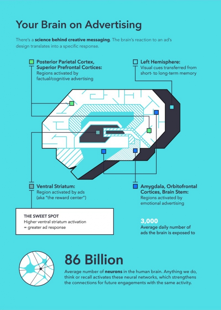
Source: Celtra "Adverscience"
Since your brochure is also a physical ad, it s important to make sure its design and content appeals to your target audience, triggering an emotional response that drives them to take action.
Use the following tips to reinvent your company brochure and then watch it work its magic!
Related article: Don't Be Fooled - Print is Still Where It's At!
1. Be Smart - Get to the Point
"Brevity is the soul of wit." The Bard may not have had modern marketing in mind when he penned Hamlet, but that doesn't mean we can't take his advice to heart. Since you have a limited amount of space to forge a connection the size of a standard tri-fold brochure is 8.5 x 11 you need to present your content in a way that makes the most impact with the fewest words.

When you start to think about boiling down all that your business encompasses into something that can actually communicate a message to a potential client or customer, take these questions to heart:
- WHO are you?
- WHAT do you do?
- WHY should the reader care? (What can you offer the customer?)
- HOW can the reader connect with you?
Make your answers brief, clear, and memorable and your brochure will practically design itself. A little wit can go a long way!
2. Invest in Real Photos
Instead of relying on basic data points and stock images, make the content of your brochure feel human and relatable. This means stepping away from standard run-of-the-mill photos and investing in professional brand imagery.
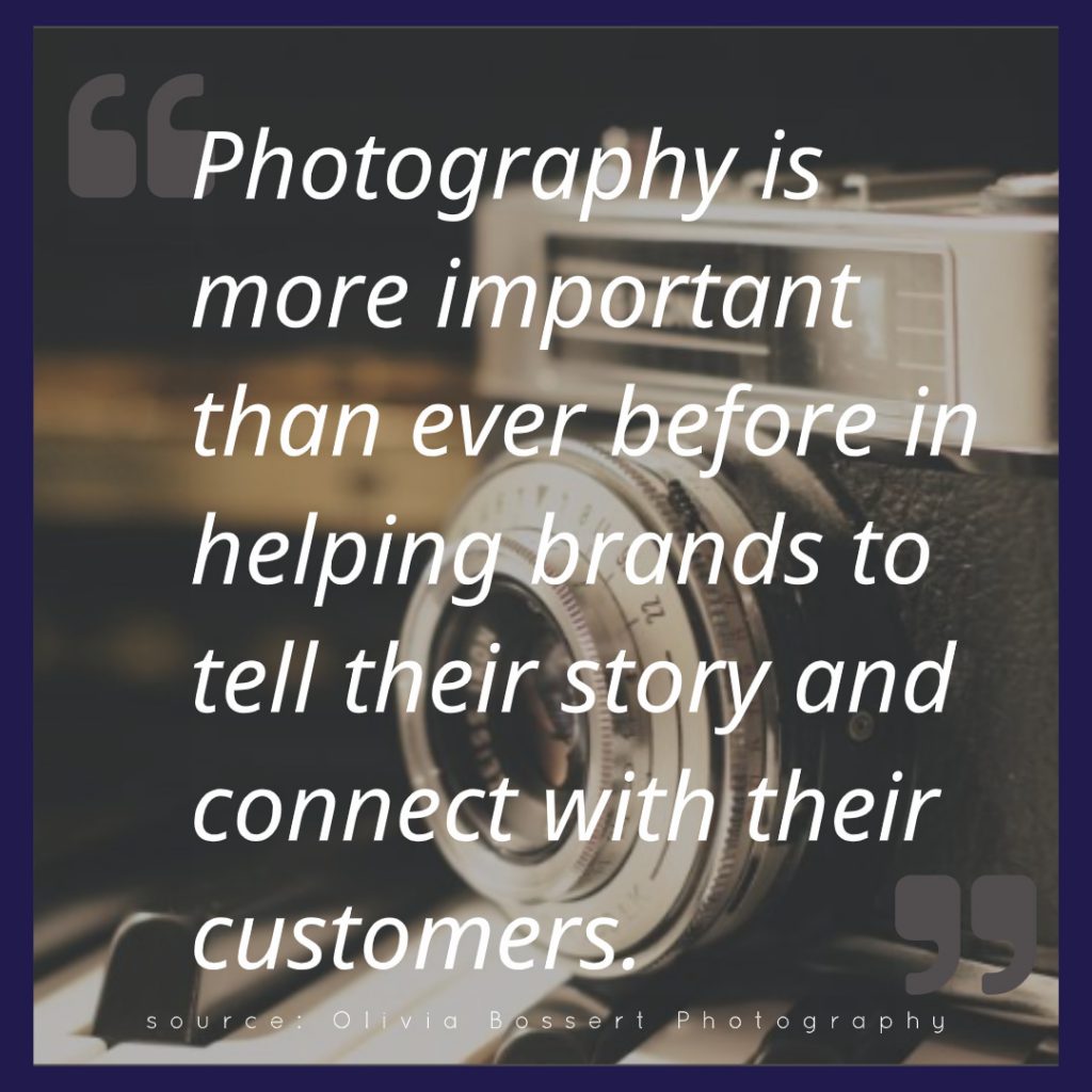
Source: Olivia Bossert Photography
According to professional photographer Olivia Bossert, investing in professional photos is critical for your brand because they convey emotion, are the first impression customers get, add to the perceived value of your brand, and get your message across much faster than any other medium.
Because your photos will tell your story, they then become an incredible marketing asset that can be deployed across all of your spaces. Update the photos on your website, social media, and all other print collateral that you regularly use to maximize your impact.
Related article: How to Master Your Visual Social Media Branding
3. Include Meaningful Testimonials
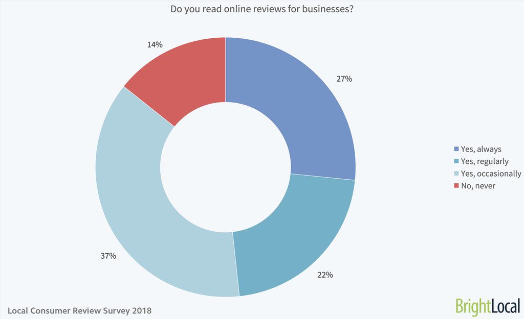
Reviews and testimonials are no longer a nice-to-have. BrightLocal found that 86 percent of consumers read reviews for local businesses and 68 percent say that positive reviews make them more likely to use a business. This makes reviews and testimonials critical for an effective brochure. Don t make potential customers go online to seek them out put them front and center to show that you're proud of them.

Customize it

Customize it
Use the following design ideas to make sure your testimonials stand out:
- Box it in to draw the eye to that part of the page, like in the above lawn care business brochure.
- Use a quote icon to set the testimonial apart, like in the home inspection brochure also featured above.
- Include an image with either format to create an emotional connection.
Remember to ask for and collect reviews and testimonials from your satisfied clients so that you'll have a full repertoire to choose from.
4. Stick With Cohesive Branding Elements
Every design element, from color scheme and graphics to typeface and logo, must be consistent within your brand. This reinforces a strong brand identity that people recognize and associate with your company whether they find you online or in-person.
Does your brand identity need a reboot? Check out these 10 Design Lessons from Starbucks' New Brand Guidelines.
When planning your brochure, start with your brand colors, which will dictate the overall design. For example, if tan is your neutral brand color, that may be the background of the brochure. You can then use pops of your secondary brand colors for icons, frames, and other design elements.
Don t forget to employ your brand font as well. If you don t have one yet, use our guide for choosing a font to pick the one that best represents your business. Once chosen, you can still use a different font for the brochure headline or section titles, remembering to make sure that it's easy to read.
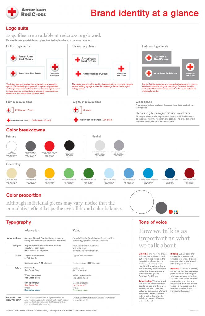
Organize all of your brand guidelines into a single document so that everyone involved in the design process is on the same page when it comes to brand identity, as in the image above from the American Red Cross. When all of your design elements come together to consistently represent your brand, you'll have a winning brochure.
Related articles: How to Create Your Visual Branding Strategy With MyCreativeShop Typography Inspiration for Your Next Print Project
Redesign Your Company Brochure
Your company brochure is more than just a throwaway for conferences. It can be a valuable lead and profit-generating tool when it's designed well with intention and purpose. Use these tips to give your company brochures a well-deserved upgrade so you can reap the benefits.
************************************************************************
Re-launch your company brochure today! Check out our vast array of customizable brochure templates to get started.