10 Best Fonts for Brilliant Brochures

When making a brochure, something as seemingly harmless as font selection can have a huge impact on your project's success. The right font can make your brochure's content stand out from the crowd in all the best ways, while a poor font choice can confuse the reader and cast doubt on your message. Even the most elegant design can be ruined by an overabundance of Comic Sans!
You'll want to consider both font size and readability as you envision how your text will integrate into your finished brochure. For instance, the best font size for an A4 brochure varies depending on the typeface style you choose and the location of the text within the brochure, so a holistic approach is essential.
As you contemplate the best fonts for your brochure, it's important to be thoughtful of your overall design, branding strategy, and space limitations. The best fonts for corporate brochures will vary widely by industry and topic. Whether you're looking for the best font for your tri-fold brochure, an online brochure, or a custom brochure, we ve got a variety of options and use cases that will help you get the most out of your design. Read on to find the one that speaks to you.
1. Verdana
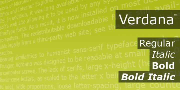
Design via MyFonts.com Verdana by Ascender
Verdana was originally designed primarily for increased legibility on low-resolution computer screens. Since then, this Sans Serif font has gained popularity amongst designers both on- and off-screen. Because there is a bit more inherent spacing (or kerning) between each character, Verdana is an ideal brochure font for areas where there are blocks of text. It is also an excellent option for online brochures.
2. Helvetica
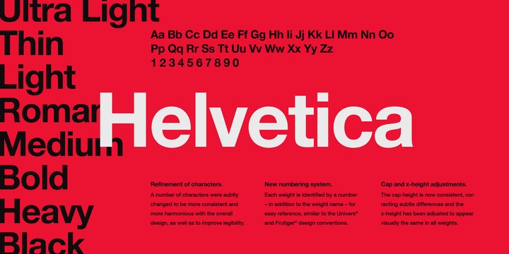
Design via MyFonts.com Helvetica by Linotype
This Sans Serif typeface is one of the most beloved fonts used by designers and creators alike. The key distinguishing impression of Helvetica is, essentially, that it has none. The neutrality of this font allows for designers to creatively draw attention away from the text.
Helvetica is a safe pamphlet font you can use for literally any purpose. Whether it s for the brochure heading, subheading, or the text, you can t go wrong with this versatile font.
3. Didot
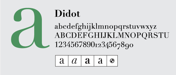
Design via Fonts.com Didot by Linotype
Didot is a Serif font that has a traditional yet modern feel to it. The strokes for this typeface vary in weight, with some strokes being quite thin and others thick.
If you want the best font for brochure design for something more formal, Didot may be the perfect fit. It also works well for design industries such as lifestyle, fashion, or home & garden.
4. Banana Yeti
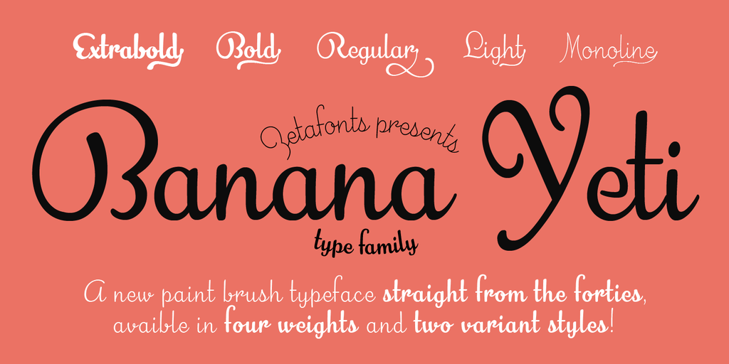
Design via 1001Fonts.com Banana Yeti by Zetafonts
For company brands looking for a vintage flair, the Banana Yeti brush Script font could be suitable for your brochure design. This font has a handwritten feel and possesses a 40s-era vibe. While it certainly won t suit every company brand, it could be a good fit for a fresh-faced spa or a funky boutique.
5. Calibri
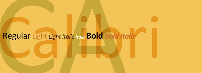
Design via Fonts.com Calibri by Microsoft Corporation
Most widely known as the default font for Microsoft Word, Calibri is another versatile Sans Serif font that can be used anywhere in a brochure. Due to its soft, rounded edges, Calibri exudes a warm and friendly feel. The strokes also present a modern and contemporary impression. Use Calibri in your brochure alongside other complementary round or soft-edged fonts such as Raleway or Chap for a complete look.
6. Raleway
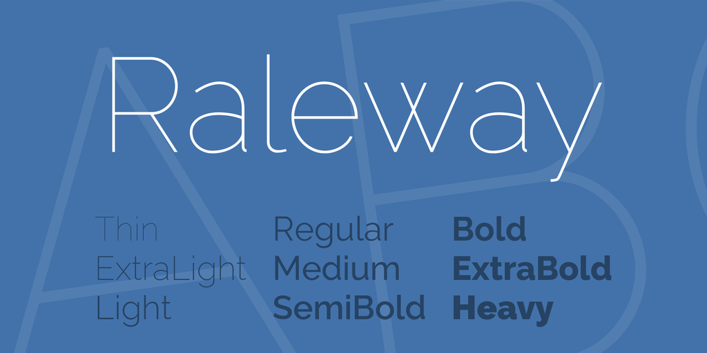
Design via 1001Fonts.com Raleway by The League of Moveable Type
The Raleway font is a Sans Serif typeface that is at once clean, simplistic, and elegant. It pairs well with Serif fonts, as its modern vibe contrasts nicely with the traditional feel offered by many Serif styles. Raleway is the best font for pamphlets with themes like agency branding, personal portfolios, and music promotions.
7. Pacifico

Design via 1001Fonts.com Pacifico by Vernon Adams
If you re looking for something fun and a bit quirky, Pacifico may be it. Pacifico is a handwriting font inspired by the American surf-culture in the 1950s. A burger shack or a fun gift shop-themed pamphlet would be a perfect fit for this font. Use stand-out fonts like Pacifico sparingly and avoid using it for large blocks of text, as the cursive writing can become illegible in big quantities.
8. Proxima Nova
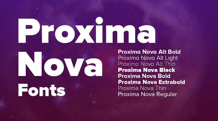
Design via FreeFontsVault.com Proxima Nova by Mark Simonson
While not an overly popular font among the public, the Sans Serif typeface Proxima Nova is a well-known option among designers. This minimalist font works well in brochure headings or subheadings. It is a little weighty, so having it in the body of the text may be a little overbearing. As with so many good things, a little goes a long way!
9. Trajan
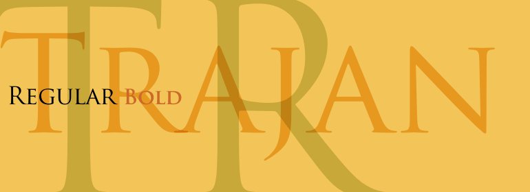
Design via Fonts.com Trajan by Adobe
This all-uppercase Serif font is based on the traditional all-caps ancient Roman style. It has a very pronounced and unique look, giving off a formal or judicial impression. Trajan is best suited for those large brochure text size opportunities, such as headings or main titles. Typical industry use cases for this font are law firms, churches, and wedding vendors.
10. Cooper Black
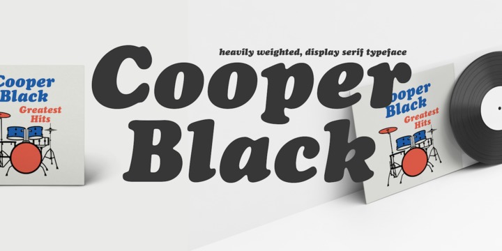
Design via MyFonts.com Cooper Black by Linotype
This ultra-bold Serif font was made popular by the Beach Boys as the signature font for their album Pet Sounds. A popular font in late-60s/early-70s pop culture, it has a nostalgic feel. Despite its golden age having long since passed, Cooper Black still appeals to a wide audience and is a good choice for brochures promoting concerts, camps, and vintage-themed boutiques. #ThrowbackThursday works every day of the week!
*************************************************
MyCreativeShop: Your Source for the Top Brochure Templates
Now that you've seen the best fonts for your next brochure design, it's time to start customizing. MyCreativeShop offers a variety of brochure templates to meet the needs of your business. Our online editor automatically adjusts recommended font sizes based on location and document type, making it easy for even novice designers to get it right the first time.
All you need to do is choose a template, customize it in our editor, and print or download for your use. Designing and having a professional-looking brochure is simple with MyCreativeShop!