Brochure Design: Tips from the Pros
Master the art of brochure design.

Jason Frueh
Published Mar 7, 2018

The modest, but effective brochure
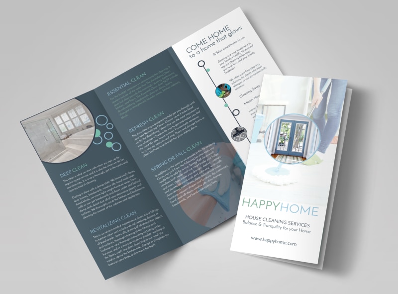
Brochure design can be a captivating marketing tool in an increasingly virtual marketplace. Using brochures to promote your business can set you apart from your competitors and successfully engage your customers. Brochures provide the unique opportunity to communicate with your target audience for longer because many people still have an easier time connecting to something tangible. With a brochure in their hands, your customers will have a chance to engage with your company at their own pace and time.Let s face it: for some situations there still isn t a better alternative to a stunning brochure.Because we know just how important a well-designed brochure can be for your business, we ve included some Dos and Don ts below to help you get the most out of our award-winning templates.

Be Relevant
DO list compelling and relevant information about your company in your brochure.
Think about what you want your readers to know when they look at your brochure and tailor accordingly. Be sure to set yourself apart from your competitors. For example, letting your customers know that you have a "satisfaction guaranteed or your money back" policy can foster trust and increase sales. And remember - the devil s in the details. Don t forget to include important information like your opening hours, contact information, web address, product/service pricing, and the list goes on. Be sure to mention all of the things your customers may need to make an educated decision about your products, services, and, ultimately, your company.DON'T overload your brochure with information that is not crucial.
You may be tempted to put lots of information about your business in your brochure. After all, you are excited to promote your brand! We advise being very selective about your choices. For example, including a history of your business and product development may be informative, but you are also running the risk of losing the readers attention. A brochure can be an inspiring tool, but only if your customers stay interested.Proper Color Selection
DO strive for strategic colors and placement in your design.
When selecting colors, make sure you pick colors from your company logo if you have one. Applying your logo colors to the text is a great way to form a connection with your customers, reminding them of your company whenever they see a certain color scheme. A great example of strategic color use is Target. Doesn t "Target" come to mind when you see red and white in a circular shape? You can create a powerful link between your customers and your brand by properly applying colors in your brochure. Doing so consistently opens up a conversation between your company and its customers.DON'T use all colors of the rainbow.
Just like using the right color scheme can help highlight your products and services, utilizing too many colors can actually be confusing and make your brochure look disorganized and confused. Adding color in your brochure without rhyme or reason can transmit the notion that you are not quite sure about your product or service. Make sure you are conveying a clear idea to your customers. You want them to feel they re in capable hands so they can confidently invest in your company. Targeted and strategic color coordination is key in brochure design.Use Quality Images
DO select high-quality images.
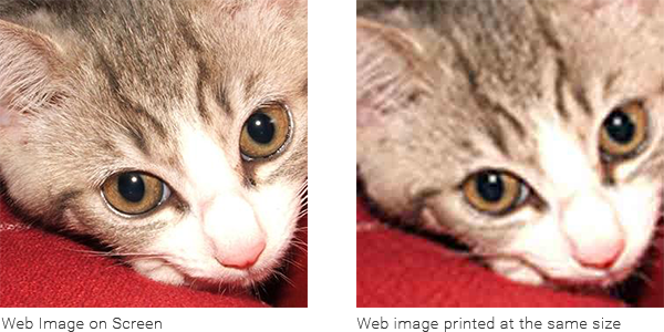
You want to create a consistent and expressive design. Always use high-quality images that accurately reflect your intent. A high-quality picture tells your customers that you have a clear idea of what you re offering. If you are using images from the web, check that they can be printed at the size you require.DON'T use unclear or blurry images.
While high-quality images can add color and vibrancy to a brochure, low-quality images can give a bad first impression. Remember: an image that looks good on the screen will not necessarily translate onto paper. Physical and digital media have two very distinct resolutions images taken from the web may not reproduce well when printed unless they are scaled down. If you know the size of the image in pixels, you can divide each value by 300 to determine at which size in inches the image should be printed.

Choose a Relevant Image
DO use images that clearly express your brochure s objective.
We recommend choosing images that speak to your brochure s purpose. The images you choose don t have to be a visual copy of your company s products and services, but they should help your reader get a clear sense of what you re offering. As always, remember to place great focus on the quality of your selected images.Tip: For budget-conscious projects consider using stock images. However, steer clear of generic pictures and only choose those that best align with your product or service. DON'T use visuals indiscriminately.
We cannot emphasize this aspect of brochure design enough: all elements of your brochure need a clear focus. A targeted selection of imagery can not only underline your brochure s intent it can also foster a personal connection with your customers. Avoid using generic and obvious stock imagery. Using generic images can cause your customers to lose interest in your brochure before they even open it. Try to choose images that represent your company in a unique and compelling way. The images below show how teamwork can be represented using stock images. The image on the left is a poor example of stock imagery. It can come across as generic and emotionless the reader may become discouraged and decide to stop reading the rest of your brochure. The image on the right is a good example of stock imagery. It has contrasting colors, real people, and a familiar environment.
Limit Your Fonts
DO limit your fonts. Use a maximum of two fonts.
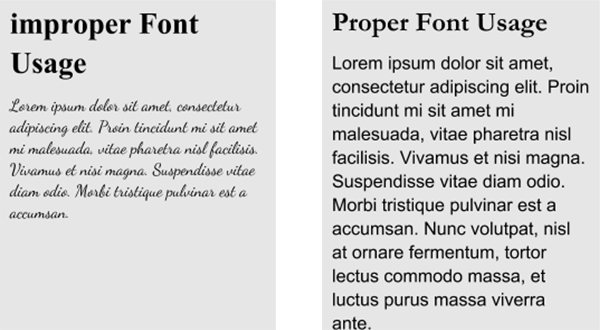
For the text inside of your brochure, we recommend sticking to easy-to-read serif fonts such as Helvetica or Garamond. For headers, you may want to choose something with more flare but remember: the font has to be in line with the products and services you are advertising. In other words, using a script font to present a service like computer-repair can have a confusing effect as customers may associate art with intricate fonts.DON'T use more than two fonts in your design.
Using multiple fonts in your design can make your brochure look unprofessional and disorganized. Plus, some people may have a hard time deciphering your font if it s a particularly elaborate one. A 2011 study showed that when given instructions in an intricate font, people estimated twice the amount of time to complete a given task than people who read the instructions in a plain font. Sticking to clear and legible fonts is a safe and professional way to present your business.