Summer Camp Brochures That Convert: 8 Tips for Effective Design


As summer approaches, parents and children alike start dreaming of adventure and excitement at summer camps. A well-crafted summer camp brochure can be the key to attracting campers, showcasing not just the activities and amenities but also the unique spirit of each program.
In this post, we’ll explore the essential elements that make summer camp brochures stand out and inspire kids to embark on unforgettable summertime experiences!
1. The Art of Visual Storytelling
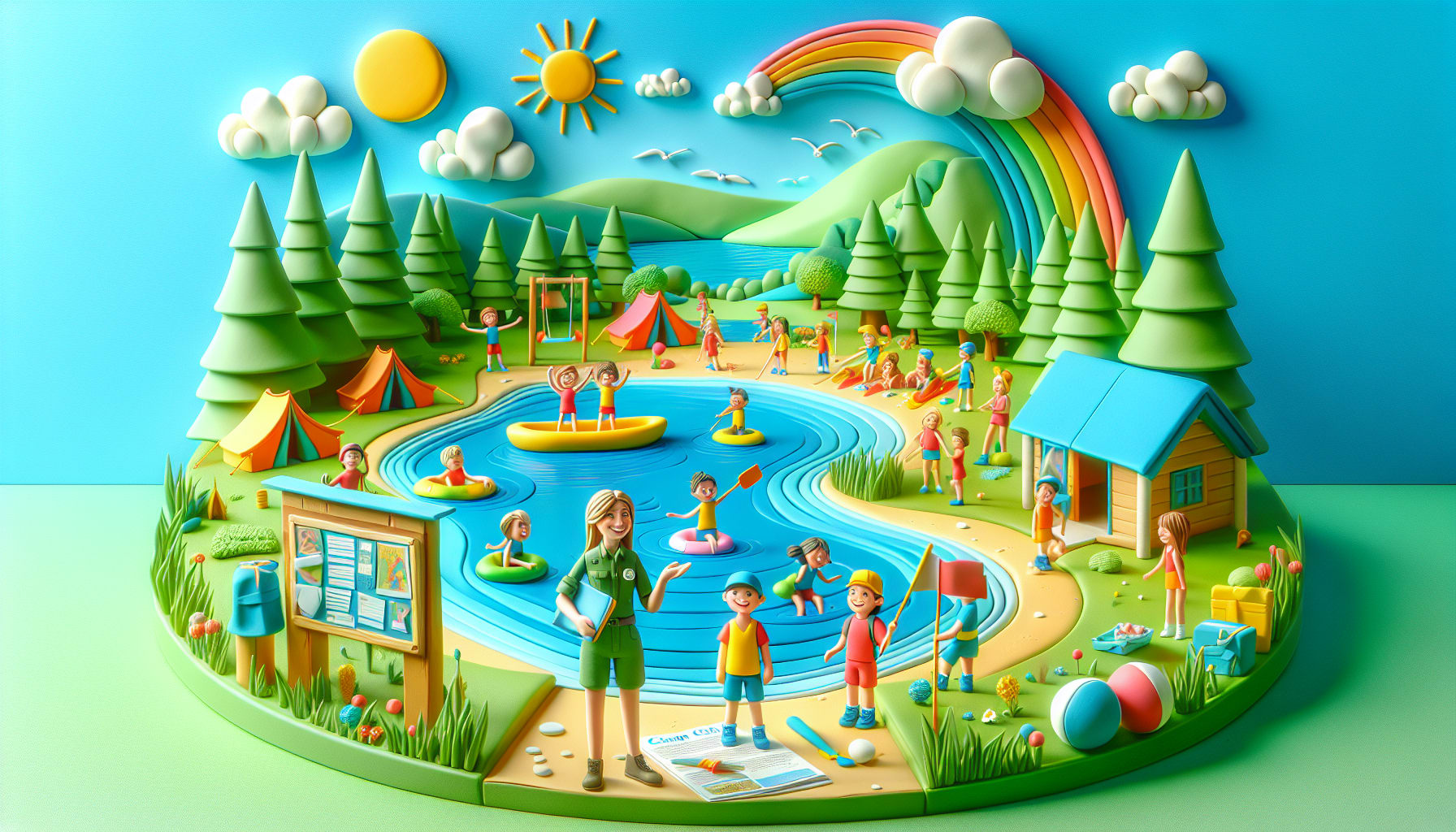
Design is not just about aesthetics; it's a narrative waiting to unfold. Your brochure should be a canvas that paints a vivid picture of the adventures that await. Use captivating imagery that transports the reader into a world of endless possibilities. From picturesque landscapes to joyful faces brimming with excitement, each element should weave a tale of enchantment.
2. Strategic Placement of Information
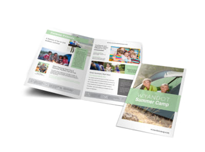
Guide your audience seamlessly through the brochure by strategically placing essential details. Ensure that key information such as camp dates, activities, and contact information are prominently displayed. Create a visual hierarchy that leads the eye from one section to the next, keeping the reader engaged and informed throughout.
3. Color Psychology Matters
Colors evoke emotions and set the tone for the entire experience. Choose a color palette that aligns with the spirit of your summer camp. Vibrant hues signify energy and playfulness, while softer tones evoke a sense of tranquility. Let your color choices resonate with the emotions you wish to evoke in your audience.
4. Font Harmony and Readability
While creativity knows no bounds, readability should never be compromised. Select fonts that are not only aesthetically pleasing but also easy to read. Maintain a harmonious blend of typography throughout the brochure to ensure a seamless reading experience for all ages.
5. Call to Action: Stirring Curiosity
A compelling call to action acts as a beacon, guiding prospective campers towards the next step. Encourage them to embark on this thrilling journey by arousing their curiosity. Whether it's a registration link or a contact number, make sure your call to action is clear, concise, and irresistibly inviting.

6. Embrace White Space
Amidst the colorful tapestry of your design, don't forget the significance of white space. Blank areas allow the content to breathe and guide the reader's focus. Embrace the simplicity of white space to enhance the overall visual appeal and create a sense of balance in your brochure.
7. Testimonials: Voices of Experience
Nothing speaks louder than the words of those who have experienced the magic of your summer camp. Incorporate testimonials from previous campers or their parents to build trust and credibility. Let these voices of experience resonate with your audience and instill confidence in the transformative journey that lies ahead.
8. Mobile Optimization for Digital Discoveries
In this digital age, ensure that your brochure is optimized for mobile devices. Whether it's a responsive design or a dedicated mobile version, make it seamless for users to access information on the go. Embrace the convenience of technology to reach a wider audience and spark their curiosity with the touch of a screen.


Final Thoughts
As you embark on the creative voyage of designing summer camp brochures that convert, remember that every stroke of genius carries the potential to inspire, captivate, and guide young hearts towards a world of imagination. Let your design speak volumes, echoing the joy and wonder that await at your summer camp.
Embrace the art of effective design and watch as your brochure transforms into a gateway to unforgettable adventures!
