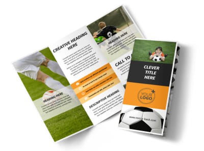
Goal-Oriented Marketing: 10 Tips to Elevate Your Soccer Brochures

Soccer brochures are an essential tool for clubs and organizations looking to engage players, fans, and potential sponsors in the game they all love. These printed materials not only convey important information but also showcase the passion and excitement that soccer brings to communities.
In this post, we will dive into the key components of effective soccer brochures and offer guidance on how to create one that stands out!
1. Define Your Goals
Before diving into design, take a step back. What are you aiming to achieve with your brochure? Are you promoting a youth league, a summer camp, or a tournament? Clearly defining your goals will guide your content and design choices, ensuring every component aligns with your objectives.
2. Know Your Audience
Your audience dictates the tone and style of your brochure. Are you targeting young players, parents, or seasoned fans? Understanding your demographic will inform both the language you use and the visuals you incorporate, making your message resonate more effectively.
3. Craft Compelling Content
The heart of any brochure is its content. Start with an engaging headline that grabs attention and entices the audience to read further. Use clear, concise language, and highlight key information—such as registration deadlines, training details, and exciting features of your league or camp.
4. Showcase Eye-Catching Visuals
Humans are visual creatures. Invest in high-quality images that convey the excitement of soccer, whether it’s a celebratory goal or the camaraderie of a team huddle. Consider adding infographics or icons to illustrate schedules or tournament dates, making the information easily digestible.
5. Use a Consistent Layout
A well-structured layout enhances readability and guides the reader’s eye through your brochure. Use a grid format to maintain alignment and consistency, and ensure the flow of content leads logically from one section to the next. Use white space strategically to avoid overwhelming the reader.

6. Highlight Testimonials
Nothing sells better than social proof. Include testimonials from parents or players that speak to the quality and benefits of your league or camp. Real stories create connections and trust, helping potential participants envision their own positive experience.
7. Include a Clear Call to Action
Every brochure should have a clear call to action. Whether it’s visiting your website for more information, signing up for a camp, or attending a trial, make it explicit. Use action-oriented language such as “Join Us Today!” or “Register Now!” to motivate your audience.
8. Utilize QR Codes and Links
In today’s digital age, integrating technology into your marketing materials is essential. Including QR codes or links can lead to interactive elements like videos, detailed schedules, or registration forms. This additional layer keeps the audience engaged and provides them with easy access to more information.
9. Print on Quality Materials
The tactile experience can greatly influence perceptions. Use quality paper and finishes that reflect the professionalism of your organization. Glossy finishes can enhance colors and images, making your brochure visually striking, while matte finishes can convey a more sophisticated feel.
10. Monitor and Adjust
Finally, keep track of your brochure’s performance. Are registrations increasing? Is there an uptick in inquiries? Collect feedback and be flexible in adjusting your brochure’s content, design, or distribution methods as necessary. This iterative approach can lead to continual improvements.


Final Thoughts
Creating compelling soccer brochures is not just about filling pages with information—it's about storytelling. By understanding your goals, audience, and using effective design techniques, you can craft brochures that inspire action and engagement.
Your brochure is often the first impression potential players and participants have of your organization. Start designing your brochure today and make every detail count!


