The Art Of Great Postcard Design [7 Pro Tips]


Ah, the classic postcard small but mighty! When designed well, postcards can accomplish big goals in a very small space.
What s the secret to a great postcard?
Well, like most other print marketing materials, effective postcards are both an art and a science. The best postcards will balance clarity with creativity and fill every square inch with intentional, high-impact imagery and messaging.
To see exactly what we mean, check out our top postcard design tips below! We're also sharing practical examples from MyCreativeShop's huge library of postcard templates.
1. Start with the End

Before we get into the art of it, let s start with that little bit of science.
Like any good science experiment, there s no point in undertaking a postcard marketing campaign if you aren t sure about two things: what you re intending to accomplish and how you ll measure success.
Prior to writing words or choosing images, map out the end goal for your postcard campaign. For instance, your goal might be to:
- Get more sales from cold leads (AKA people who don t know you).
- Get more sales from people who already know you but haven t yet bought.
- Get more free appointments booked.
- Get more name recognition in a certain area.
- Drive people to your website.
- Get more likes on social media or more views on your YouTube channel.
- Encourage people to sign a petition or donate goods.
- Get more sign-ups for an upcoming real estate open house.*
Each of these goals will drive a very different approach to your postcard s messaging and performance tracking. Starting at the end will make sure you re designing the right postcard for the right goal.
*If you re a real estate agent, we ve got an entire post dedicated to awesome real estate postcard ideas!
2. Write a Clear, Compelling Headline

Another science-y tip comes from the world of psychology and behavioral science.
Have you heard of the invisible gorilla experiment? (If not, I highly recommend watching the short video from the researcher who carried out the experiment.)
The takeaway is this: when we re paying attention to something else, even something as absurd as a man in a gorilla costume can be overlooked. Our brains literally won t see it.
So imagine someone flipping through the mail while they text their spouse, grab dinner ingredients from the fridge, or feed the dogs. Are they paying attention to your postcard? Nope, not at all!
When you design your postcard, remember this:
- The recipient probably won't be paying attention.
- Even if they are paying attention, your message can be easily missed.
A large, clear, easy-to-understand headline is always a good idea for a postcard. The clearer and more eye-catching, the better!
For instance, this real estate referral postcard template has a clear message: refer a friend.

And this yoga studio's message couldn t be any clearer: free stuff!

3. Tell Them What to Do
Either in your headline or in the rest of your postcard text, tell the recipient exactly what to do. Instead of just advertising a sale and leaving it open-ended, provide clear next steps.
For example, you might tell them to:
- Call you
- SMS you
- Email you
- Bring the coupon/postcard in person
- Mention a special code for a discount
- Visit your website
- Join an exclusive Facebook group
- Book an appointment
- Call for a free consultation
To get a little behavioral science-y again, a clear call-to-action can help with so-called decision fatigue. By providing one clear step to take, you ll help your postcard recipient feel empowered to take action without becoming confused or avoidant.
This postcard, for example, tells you exactly what to do: Call Dale!

4. Add in Some Creativity
Okay, now for the art! Once you ve made sure that your message is as clear as possible, it s time to sprinkle in some personality.
Of course, the exact words you use will depend on your brand voice and what you re trying to say. Are you usually funny, friendly, or formal? Are you advertising a special offer, a community event, or a seasonal deal?
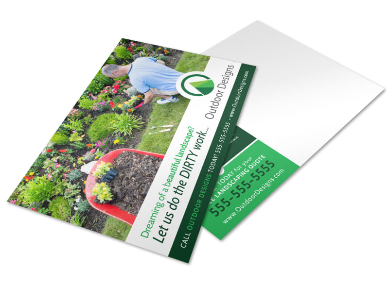
Either way, one great way to add creativity is to use play-on words or clever turns of phrase, like these MyCreativeShop postcard templates do:
Let us do the dirty work!

This is what therapy looks like.

Uninvited guests?

5. Pay Attention to Both Sides
We all like to imagine people picking up our postcards and gazing at the front with a smile on their face. But the reality is this: your postcard will be stuffed in a messy pile, and there s a 50/50 chance as to which side is seen first.
That means that your most important message better be 100% clear on BOTH sides.
Ideally, at the very least, both sides of your postcard will have:
- Clear headlines (that go together and express the same main message)
- Your business s essential contact information and/or logo
- The most compelling information, such as the sale or offer
- Eye-catching imagery
Don t be afraid to repeat yourself from front to back. People scan postcards, so repeated messaging can be more effective.
MyCreativeShop's postcard templates come with both sides ready for customizing. Just flip between the two in our online editor!
This dental clinic postcard has fantastic imagery on both sides.

And this church postcard template includes essential contact and branding on both sides.

6. Give People a Reason to Hold On
One of the most natural advantages of print marketing in today s world is the tactile nature of it. I mean, why send a postcard at all when you could just send an email?
Well, one compelling reason is that you can actually hold a postcard!
A postcard is a physical item that requires your attention so it s smart to use that to your advantage. Once your recipient has picked up your postcard from their pile of mail, give them a reason to continue holding it close.
This reason could be:
- Physical coupons to cut out
- Time-sensitive coupons: one for this month and one for the next, etc.
- Promo codes to save and redeem later
- A call-to-action to hand in this postcard for a free gift
For example, this hotel postcard makes great use of a coupon.

And this tanning salon postcard offers a redemption code.

7. Get an Outsider s Opinion
One last short and sweet tip before sending your postcards is to have someone else look at it. Show them your postcard for no more than 5 seconds and ask them what the postcard is for. If they can t answer, then go back to tips #2 and 3 to refine your headline and offer.
Trust us, it s worth the little time it takes to perfect your postcard's message!
For even more ideas, start with our ultimate guide on how to make a postcard. We ve also got beginner-friendly tips if this is your first postcard marketing campaign!
************************************************************************
We hope you re feeling inspired! If not, no worries a quick look at our many postcard templates will show you plenty more hands-on examples to get those creative juices flowing.
Choose any postcard template, customize it in our online editor, and order professional prints to be shipped ASAP. Being your own postcard artist (and scientist!) couldn t be easier.