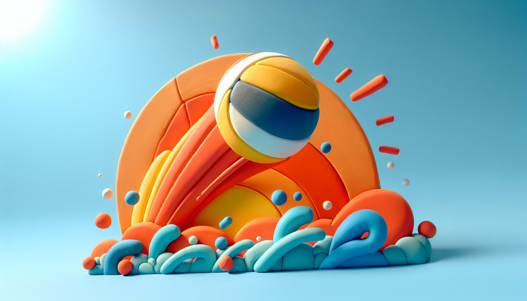
Serve Up Success: 10 Game-Winning Volleyball Flyer Design Ideas


Designing an eye-catching flyer is crucial for attracting attention and generating excitement for your volleyball team, camp, or event. A well-crafted flyer can effectively communicate key information while showcasing the spirit and energy of the sport. With so many creative possibilities, it's essential to find a design that stands out and resonates with your target audience.
In this post, we will explore 10 game-winning volleyball flyer design ideas that will help you score big in your promotional efforts!
1. Embrace Striking Colors
Colors play an essential role in flyer designs, particularly in sports. Bold colors can evoke emotions and energize the viewers. Think about using vibrant shades of blue, yellow, and orange that not only reflect the sport but also draw the eye. Why not experiment with gradients that mirror the sunset hues you’d find on a beachfront volleyball court to evoke feelings of summer fun?
2. Create Dynamic Layouts
A unique layout can set your flyer apart from the crowd. Combine images of players in action with bold headlines to create a balanced composition. Consider using diagonal layouts or asymmetrical designs to give a sense of movement, reflecting the dynamic nature of the game itself.
3. Highlight Key Information
While aesthetics matter, clarity is king. Ensure that important details like event dates, locations, and registration links are easy to find and read. Use larger, bold fonts for these highlights and provided strategic spacing to avoid overwhelming your audience. Have you ever tried scanning a flyer only to get lost in a sea of words? Don't let that happen to your readers!
4. Incorporate Engaging Imagery
Images can tell a story; they evoke the spirit of the game. Utilize high-resolution photos of players spiking, digging, and diving to invoke excitement. However, it’s not just about action shots; consider adding images of the beach or a packed sports venue as well.
5. Use Catchy Taglines
A compelling tagline can make all the difference. Consider phrases that capture the thrill of volleyball such as "Spike Your Courage!" or "Bump, Set, Win!" Taglines should be memorable and reflect the spirit of the event while encouraging participation.


6. Include Team or Sponsor Logos
Showcasing logos can strengthen community ties and provide a sense of legitimacy. Including team logos or sponsor names helps promote collaboration while encouraging support among local businesses. Consider how your flyer can strengthen relationships within your sport community,
7. Offer Clear Calls to Action
What do you want your audience to do after viewing your flyer? Whether it's signing up for a tournament or visiting your website, a clear call to action is essential. Use phrases like "Sign Up Now!" or "Join the Fun!" and strategically place these prompts to maximize visibility.
8. Utilize White Space Wisely
Don’t underestimate the power of white space — it allows your design to breathe and helps readers focus their attention on key elements. This contrast can improve readability and give your flyer a professional finish.
9. Tailor Your Flyer for Your Audience
Understand your target demographic and craft your flyer accordingly. Are you promoting a youth camp, a local tournament, or a competitive league? Use language, imagery, and themes that resonate with your specific audience.
10. Experiment with Digital Formats
In today’s digital age, consider creating both print and digital versions of your flyer. Using animation and video can help capture attention on social media platforms. Share snippets of gameplay or testimonials from past participants to enhance your engagement.


Final Thoughts
The beauty of volleyball isn’t just in the game itself; it lies in the way we inspire others to join in the fun. An engaging, well-designed flyer serves as an invitation to experience that joy. As you explore these ten game-winning flyer design ideas, remember that creativity knows no bounds; let your imagination take the lead.
Whether you’re arranging a tournament or hosting a beach volleyball camp, each design will play a pivotal role in serving up your event’s success. So what are you waiting for? Start creating something extraordinary today!

