15 Flyer Ideas for Small Businesses (Plus Templates)


There are endless flyer ideas for marketing but that doesn t mean they re all good or right for your brand. Flyers are an effective tool for getting the attention of customers, but it can be easy to feel like your print design is getting tired or stale, or that you re using that ideas that don t appeal to your target audience.
Check out these five new ideas to amp up your flyer marketing and use the templates to test each one for yourself.
How to Choose the Best Images for Your Flyer Design
#1: Incorporate Infographic-Style Formatting
Humans are visual beings. Because of this, infographics visual maps that make data easier to understand have become increasingly popular in marketing. According to a recent report, 56 percent of companies use infographics, and of those that do, 84 percent find them effective.
Use the basic principle of infographics making information digestible in your new flyer design.
Create a Simple Sequence

This flyer doesn t use a complex infographic, but the banner at the bottom incorporates simple icons that take the reader through the process of your service. Your infographic-inspired flyer can be as simple as this. The goal: make your reader s life easier.
Direct the Eye Through Each Section

This travel flyer is the perfect example of an infographic-style flyer, with images directing the reader from top to bottom, through each individual section. Notice the use of universally understood graphics where there s less text. Keep this in mind if you re using little to no text so everyone understands your message.
Format Your Flyer Into an Infographic

Don t just use infographic-style elements in your flyer. Instead, format it like an infographic, which seamlessly flows through each section, rather than using square blocks of text. This template is perfect for doing exactly that, from front to back.
#2: Divide and Conquer with Digestible Sections
If there s a lot you need to say on one flyer, break down your information into logical sections. Using this technique will help your viewer compartmentalize different products, services, and offers.
Use Icons for Each Section

With this template, there s no doubt which service each of the four sections describes. There s a header, a corresponding icon, and descriptive text. A versatile design like this can easily be used for any type of flyer.
Separate Concepts with Visual Elements

The offers on the back of this flyer are clear and easy to read when boxed. Further highlighting each one by using a different color background and border makes them stand out even more. Use this format to feature multiple unique promotions on a single marketing flyer.
Use Symmetry to your Advantage

If you want to include several items of equal importance, divide up the space on your flyer equally. This flyer has four similar sections, one for the header and three describing different opportunities. A template like this works well for fundraising or service-based businesses.
#3: Include Unique, Eye-Catching Headline
Eye-catching headlines are key if you want someone to stop what they re doing and pay attention. Use these fresh headline templates to make sure your headline stands out.
Catch the Eye With a Quote

If it makes sense for your business, use this template to highlight a quote that speaks for your business. Include a famous quote to create a connection between the viewer and the template while giving meaning to your brand and mission.
Play With Words

If you know your customers would like a good play on words, have fun with a headline like this one. When done right, humor can make your brand and marketing materials more memorable than if you d used a standard headline.
Keep it Simple

You don t need to use a lot of words to make your headline stand out. This minimalist flyer speaks volumes, both front and back. An impactful image, paired with total lack of imagery on the back, is both striking and clear.
#4: Incorporate Testimonials
Consumers want authenticity. In fact, 86 percent agree that this characteristic is important when they decide which brands to support, based on recent reports. User-generated content (UGC), like reviews and testimonials, can go a long way in legitimizing your business, with 60 percent of consumers also saying that it's the most authentic form of content.
If you re looking for effective flyer ideas for marketing, this is one you can t miss and it s as simple as including social proof on your flyers in the form of a review or testimonial.
Built It Into the Text

Your review doesn t need to take up a lot of space. Instead, build it into the rest of your text so the eye naturally tracks over to it as the person takes in the rest of the content. In this way, the testimonial helps reinforce everything the viewer just read.
Feature Multiple Reviews

If you have more then one great review, highlight a few of your best ones using this template. Choose just a few impactful words from each review to avoid too much text on the page, which can add clutter that distracts the reader.
Include a Link to Find More UGC

If you have a great Yelp rating or shining Facebook review, include a link on your marketing flyer to direct readers to your review sites. Using this template, you can put your Facebook link onto the flyer. Better yet, use the QR code to take viewers right to your best review page.
#5: Don t Forget the Call-to-Action
Your call-to-action (CTA) is the most important design element for converting your viewer. This is the area where you lead them to take action: call us today, book now, join our tribe, etc. No reputable list of flyer ideas for marketing would be complete without some great CTA examples, so dive in!
Keep it Front and Center

Your CTA doesn t always have to be front and center, but if you have a secondary CTA ( Join the 2018 Team ) putting your main and most impactful CTA at the top is a smart strategy. Once you ve caught the attention of your reader, you can further direct them with a more specific action.
Focus on Benefits

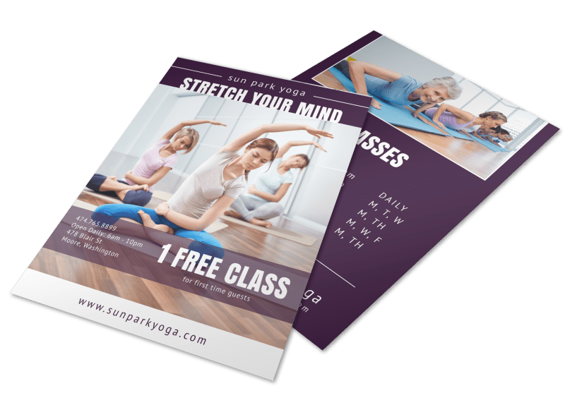
This yoga marketing flyer has a simple CTA that any yogi will notice: one free class. Don t hide this detail in the text. Instead, use the most impactful messaging as your CTA to drive readers to act.
Use Contrasting Colors

Make your CTA stand out with contrasting colors. On a flyer like this one, where you need a significant amount of text, the bright yellow stands out on the turquoise background, drawing the eye right to it.
Flyer Ideas for Marketing Any Business
You don t have to reinvent the wheel to freshen up your designs and get the attention of potential customers. Use these flyer ideas for marketing that s innovative, relevant and effective.