How to Make a Great Flyer: A Complete Beginner's Guide
Master the art of creating effective flyers.

Published Oct 28, 2018
 If you re anything like me, then you ve seen a fair share of flyers during your life. Some big, some small, some colorful and elaborate, and some little more than words and a picture on white paper. But what makes a flyer tick? What makes them so useful that people from all walks of life have been using them since before the middle ages, and will likely continue using them with no end in sight? Simply put, they're incredibly effective at getting to the point. [caption id="attachment_3237" align="alignnone" width="700"]
 OpenClipart-Vectors / Pixabay[/caption] Flyers target a specific audience, attract their attention, and lead them to take a specific action, whether it be going to a local concert, signing up for a yoga class, or giving to their local charity. In addition to those benefits, they're also inexpensive to produce compared to other forms of advertising, and they will likely make a deeper connection with the reader. In that same spirit, this guide hopes to show you everything you need to know about the mystical flyer from what exactly they are and do, to how to plan, design, print and distribute one for the best results. Let s get started.
 The Basics: What is a Flyer and What Are They Used For?
A flyer is simply an ad placed on a single sheet of paper, with the goal of wide circulation. They re commonly distributed by posting or handing them out in public places, sending them by mail, or even spreading and sharing them digitally (think social media). Flyers are used for all sorts of marketing-related purposes, such as:- Promoting an event.
- Showcasing a new product, store location or special sale.
- Creating awareness.
- Enticing people to contact you.
- Drawing in past customers or addressing new ones.
- Creating engagement in a target market.
- Telling your story.
- And much more.
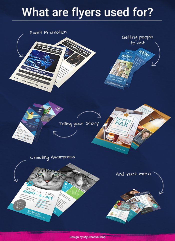 Examples of what flyers are used for[/caption]
 How to Get Started Creating a Flyer
As simple as a flyer might seem in its physical form, creating one is actually a multi-step process that requires careful planning and a fair bit of foresight. I mean, I m sure you ve received plenty of flyers that you ve barely glanced at, tucked away somewhere, and then discarded without giving them a second thought. Those flyers were likely not very well-planned, or if they were, they weren t exactly made for you as a target market. Otherwise, they would ve drawn your attention and gotten a response out of you. That s what we re going to teach you here. Not just the process of making a flyer, but how to make one that gets you the results that you want. We can divide the process of creating a flyer in 4 easy steps: Planning, Designing, Printing and Distributing. Let s take a look at the first (and arguably most important) step: Planning.Step #1: Planning an Effective Flyer
[caption id="attachment_3244" align="alignnone" width="700"] Monfocus / Pixabay[/caption] As with any kind of marketing material, before you even think about a design, you need to have a solid plan backing your decisions. You can t get anywhere if you don t know where you re going, and this is especially true when it comes to marketing. You need to know what role your flyer will play in your overall marketing strategy before you move into the design phase.
 - What kind of people are going to read the flyer?
- What reaction should the flyer achieve in them?
- Where is it going to be distributed? A school? Mall? Library?
- In which way? By hand? Posted on walls? Mail?
What s Your Marketing Strategy? How Does the Flyer Fit in It?
Flyers are just another tool in your overall marketing strategy. For a flyer to work, it needs to be designed with the overall plan in mind, and not as a standalone piece of marketing. Is the flyer meant to bring new leads to your store? To incite prospective customers to call you and ask for more information? Or maybe to create curiosity and interest in your brand, and help spread awareness? Some companies even distribute flyers to help bring back old customers that haven t been very active lately. In every case though, a flyer needs to have a clearly defined purpose in order to work, and that purpose should be easily identifiable in either the design or the copy (preferably both). You want to make sure that readers can easily figure out the purpose of the flyer, and then make it as easy as possible for them to know what to do next. Should they call you? Sign up for a class? Visit your store? Make sure they can see that the clearer, the better.Who s the Flyer For?
[caption id="attachment_3241" align="alignnone" width="700"] Free-Photos / Pixabay[/caption] Next, you need to know who the flyer s for. Who s going to be reading it? What age are they? What do they like? How do they talk? What needs and wants they share? These questions will help you design a flyer that speaks to your target audience, and will improve its chances of getting the desired action from its readers. It will also help in the design of the flyer. I mean, think about it. You wouldn t use the same colors, shapes and font on a flyer designed for a school play, as you would for one promoting the opening of a fine-dining restaurant.
 How Will It Be Distributed?
[caption id="attachment_3252" align="alignnone" width="700"] Pexels / Pixabay[/caption] Last but not least, you need to keep in mind how the flyer is going to be distributed. A flyer that is meant to be directly handed out to people can afford to have more written text in it and smaller shapes, but one that goes on a wall needs brighter colors and less text in order to attract the eyes and be noticed. You should also consider if your flyer is going to be distributed digitally, or sent through the mail which opens up a new set of design possibilities as well. Once you have a solid plan in place, and given your flyer a clear goal that matches your overall marketing strategy, then we can move onto the part everyone loves the design.
 Step #2: Designing an Attractive & Effective Flyer
When designing a flyer, the possibilities are limitless. Because of this, it s important that we know who the flyer s for and what it s meant to achieve before we start designing. Once we ve got that, we need to narrow down our design options using some critical criteria which we ll use as an outline for what our flyer should look like, based on several key factors, which we ll learn about in a moment. Even if you plan to hire a graphic designer to create the flyer for you, it s important that you understand what you want and need, so that you can communicate a clear idea to your designer and save on time and frustration. Let s start with the basics.Anatomy of the Flyer
While flyers can be as different as night and day, they all share several key elements that are necessary for a flyer to work. There are always exceptions to the rule, of course after all, the best flyer is the one that best accomplishes your specific goal but it s always a good idea to know the essential parts of the flyer first, especially if this is your first time designing or commissioning one.- A Title or Headline: this tells the reader immediately what the flyer is all about, and helps them make the split-second decision of whether the flyer is relevant for them, or not.
- Body Copy: Some flyers don t have any body copy and still accomplish their goal, but these are the exception to the rule. Most flyers will need some sort of body text in order to explain their offer and to entice readers to take a desired action. This can be as short as a sentence or two, or as long as a couple of paragraphs, depending on the needs of the flyer and the overall design.
- Call to Action: Time, Contact Info, and Address A very crucial element (that people often forget!) is to add the time, contact info or address. Whatever your flyer s all about; it should be crystal clear to your reader what the next step is. It doesn t matter how well-designed your flyer is if you don t tell your reader how to contact you, where the event is, or where they need to go the flyer won t do anything!
- Picture/Design: Finally, you tie your flyer together with a great design. Some people think that the design is the first thing they need to come up with, but unless your design conveys most of the information in the flyer, it should ideally come last and act as a complement to the message you wish to share, tying it all together in a way that s pleasing to the eye, and attractive to your target audience.
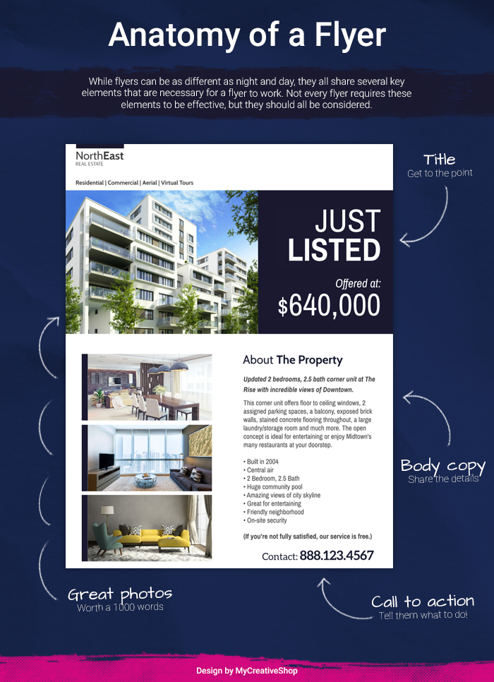 Anatomy of a flyer[/caption]
 Which Colors Are You Going To Use?
Choosing the right color for your flyer is very important, as they will not only make your flyer stand out to the right people, but will also help create brand awareness and recognition. For example, a flyer meant for children would benefit from bright colors, while a flyer meant to promote a restaurant might have more oranges and yellows to it, which are colors that stimulate the appetite. If your flyer is promoting a sophisticated art exhibition, then blacks and whites with crisp, interesting pattern designs will work better than using bright colors with whacky shapes. And don t forget colors can also make key information stand out in your font, or guide the eye towards vital information.What Visual Elements Need To Be in the Flyer?
The first thing that comes to mind when talking about visual elements in a flyer, are of course, the pictures that you ll use. Where are you planning to get your pictures from? Will you be taking them yourself? Purchasing them from stock sites, or maybe getting them from a royalty-free collective? No matter where you get them, the pictures you use in a flyer should always be high resolution. Another visual element to consider if you own a company or business is your logo.Design tip: Most business owners struggle to know what logo to use in print. Typically in print, the right logo file is a vector file that ends in .ai ,.pdf or .eps. Make sure you request these file formats from whomever designed your logo.Where will you put it in relation to the other elements of the flyer? Will you use the other elements and colors to complement it, or make it stand out more by having everything else look different? Lastly, don t forget that the visual elements you decide to use for your flyer should also reflect your industry, specific brand or target market here. Keeping these things in mind will help you create a much more focused and professional flyer.
Text Placement and Quantity
Knowing where to position the copy is also very important, as this will play a big role in how your message is perceived by your audience. You already planned out the key message of your flyer, and you know just how much copy you ll need in order to convey all the necessary information. Now it s time to figure out how to place it in your flyer in a way that works with all of the other design elements. Do you write the key message of the flyer in bold, colorful letters? Will you add several lines of copy below the main design of the picture? Whatever you choose, remember that readability is key. Use contrast, background shapes and clever positioning to help your text stand out and act as another appealing element in the flyer preferably one that attracts their eyes.What Fonts Will You Use?
[caption id="attachment_3249" align="alignnone" width="700"]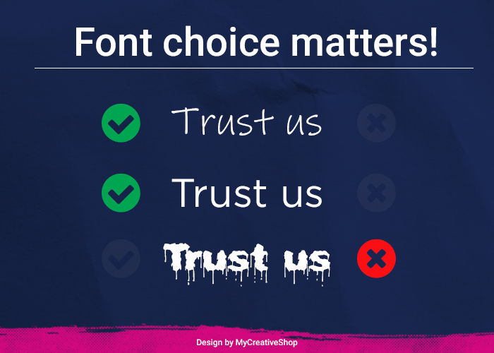 Font choice matters[/caption] Font choice will also play a big role in your flyer. Does your company or business have a specific font that they use? Does your school require you to use a specific font? Which kind of font will resonate better with your target audience, depending on your flyer s needs? Big, colorful fonts might be good for a school event, but if you re designing a flyer for a travel agency, you may want to use smaller, more sophisticated fonts. Your font is a key part of the design, and should be chosen in a way that complements the overall message, while still feeling attractive and relevant for your target audience.
 Comparing Designs and Choosing the Right One
Whether you choose to go with a graphic designer or create your flyer yourself, it pays to have more than one option to choose from. The more designs you have, the more options you can move around and test.Design tip: Whether you're simply looking for inspiration or you're possibly considering designing your own flyer, consider checkout out our huge collection of flyers. Everyone can be customized in our online editor, but they can also be used as inspiration to share with a graphic designer to communicate the things you want and don't want in your flyer.If you can t afford to print more than one design, having more than one option to compare is still an effective strategy, as this will give you a better understanding of what works and what doesn t. You could hire a designer to produce several options for your design, hire several designers to come up with different mock-ups or concepts, or just sketch them out loosely yourself to see which feels better. Once you have a design that works for you, it s time to head to the printer.
Step #3: The Process of Printing a Flyer
We ve made it past the planning and design phases, and now it s time to print these bad boys. But before we do that, there are some very important choices to make and factors to consider. Printing any kind of material comes with its own set of choices and decisions to make. You want to make sure that you get the best print quality possible, at the best price, depending on the size of your order. Let s take a closer look. [caption id="attachment_3256" align="alignnone" width="700"] Pixies / Pixabay[/caption]
 Offset or Digital?
First, there are two main ways to go about printing your materials: Offset or Digital. They both have their pros and cons, and which method suits you best will depend on your specific needs for the order. Let s take a quick look at the pros and cons that each method offers: Offset Pros- Superior color quality and accuracy.
- Ability to closely match colors.
- The price per copy gets cheaper the bigger the order gets.
- It s a cheaper option if your order is large enough, and more so if it doesn t require color.
- Slowest of the two methods.
- Can be considerably more expensive if your order isn t large enough (200 or more).
- Very hard and costly to make changes to the design or fix mistakes once printing has started.
- Only recommended for high-volume orders.
- Fastest of the two methods.
- Can make changes or fix mistakes throughout the process.
- It s much more affordable if doing a smaller order (200 or less).
- Makes it much cheaper and easier to get a test sample before printing a full batch.
- Color quality is not as accurate as offset printing.
- Price per copy doesn t change with quantity, so larger orders can get very expensive much more so than in an offset service.
- Cannot reliably match colors.
- Not able to print well on as many different materials as offset printing can (plastic, metal, etc.).
 kschneider2991 / Pixabay[/caption] Now that you know about the pros and cons of these two methods, the next key factor will be to determine your budget for the project. How many flyers do you need? Does exceptional color quality matter to you for this project? Do you strictly need to use Pantone color mixes in your prints? These questions will help you make a better decision when it comes to choosing the best printing method for your work. For high-volume orders, or orders that require specific color mixes and/or high color accuracy and quality, offset is really the best way to go. Also, flyers that have very small text would benefit greatly from the added print quality of offset printing, as the colors might otherwise mix and hamper the quality of the individual letters, making them look fuzzy and difficult to read. However, smaller quantity projects or jobs where printing time is of the essence would benefit more from digital printing than offset. None of the two methods is perfect, and in most cases, a compromise will have to be made whether it be on price, color quality or printing time. But now that you know how they work, you ll be able to compare them to your specific project needs, and hopefully settle on a balance between quality and price that works for you.
 Other Important Factors to Consider While Printing
There are just a couple more important factors to keep in mind before printing your flyer:- Bleed: If your design fills the entire flyer, you may want to add a bleed to the file, which is an extra bit of space in the design that allows for a (literal) margin of error, in case mistakes happen during the printing and cutting of the individual leaflets during an offset print.
- Paper Quality: You ll also want to make sure you ve selected the right paper for the job. Does your project needs demand glossy paper? Regular paper? Should it be thick or thin? This is important, as the quality of the material will directly impact how your flyer, and hence your brand, is perceived. Different audiences also react differently to different materials.
- File Format: When designing a flyer, the file will usually be created in an RGB (Red, Green, Blue) format, which is the standard color format for digital files. Printers, however, use CMYK (Cyan, Magenta, Yellow, Black). To make sure that your printed work looks just as good physically as it does in the computer; make sure to change the color format in your design editor or software before delivering the files to the printer.
- Resolution: As we previously said, high-resolution pictures are a must for flyers. But you ll also want to set the image quality to at least 300 dpi (dots per inch) on your editor or software, so that the image comes out as crisp as possible once it s printed.