How to Make a Menu: The Ultimate Guide
Master the art of menu content and design to captivate customers and increase profits.

Andrea Schlottman
Published Nov 9, 2018
 How many times have you walked into a new restaurant, taken a cursory glance at the menu, and immediately known which dish you want? Sometimes the act of picking your meal is akin to a gut feeling, like some kind of instinctual cry for sweet and sour chicken, BBQ pulled pork, or the classic American burger. In reality, though, there may be more to your dinner-time craving than that. In fact, your suddenly insatiable desire for that juicy, mouthwatering appetizer a course that you didn t even think you wanted may have been sparked by a well-designed menu. That s right, the menu! [caption id="attachment_3541" align="alignnone" width="649"]
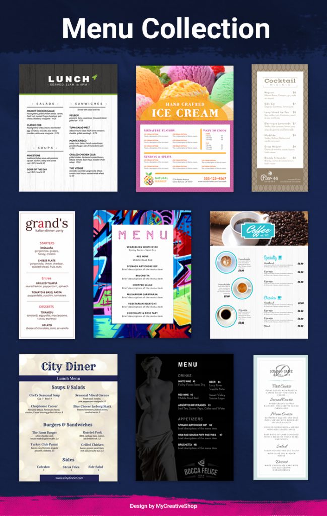 Menu Designs[/caption] It may sound strange, but the content and design of a menu can have a significant impact on a customer's dining choice and overall experience. As a restaurant or bar owner, then, your menu represents a wonderful opportunity to improve your business in almost every way: your branding, your memorability, your customer satisfaction, and ultimately your profits. Whether you re opening a hip new eatery or would like to optimize the same stale menu you ve been using for years, this guide will show you how to make the most of this valuable piece of marketing material. (Yes, your menu is definitely an important marketing tool!) Throughout this guide, we ll provide professional advice, including both large-scale recommendations and small-scale tweaks, on how to make your menu more appealing to customers and more effective within the context of your greater marketing strategy. We ll cover: The big picture Some thoughts on content & design The finishing touches
 Restaurant 101: Does the Menu Even Matter?
The short answer to this big-league question is, of course, yes! Otherwise we d have nothing to say about your menu, and every restaurant in town would just throw something together in Microsoft Word and call it a day. So, of course, the menu does matter but why? Successful bar and restaurant owners know that the menu is critical for one simple reason:Your menu will be seen by 100% of the people who come to your restaurant, all of whom are there with the specific intent of purchasing something from you.Unlike virtually any other type of marketing collateral, your menu has guaranteed visibility. You don t have to seek out your target audience or spend tons of money getting your menu out there; you literally have people lining up to view it. That level of consumer attention is almost unparalleled among any other marketing or branding effort! [caption id="attachment_3500" align="alignnone" width="700"]
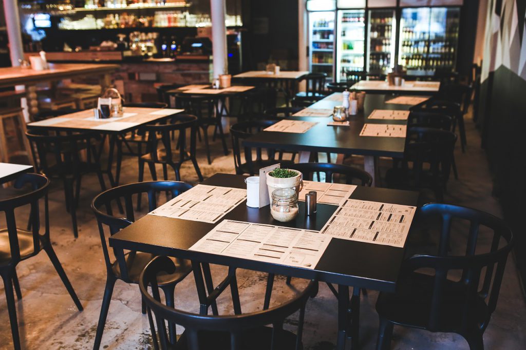 kaboompics / Pixabay[/caption] Because your menu will be placed in front of a self-selected, purchase-ready audience, the majority of the work is done for you. All that s left for you to do, then, is tailor your menu so that it connects with, informs, and satisfies your customers. And that s what we ll be diving into next: specific tips and guidance for more effective menu content and design.
 Writing Menu Content That Connects With Customers
At first glance, the content of your menu might appear painfully obvious. After all, what we d call menu content is just your dishes, right? All those appetizers, main courses, add-ons, and beverages? And to some extent, that is true. The most critical content on your menu will absolutely be what you re serving to your customers. Even the most well-written, beautifully designed menu won t help if your dishes are fundamentally unappealing to your target audience.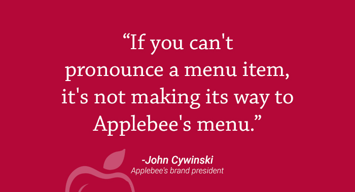
If you re interested in the fit between menu offerings and target audience, check out the 2018 menu reorganization at Applebee s. We won t spoil the whole story... but it s an interesting case study in how serving the right dishes can lead to a huge uptick in profits.So when we say "menu content," we're focusing not so much on what you re serving, but how you re presenting it. Having phenomenal content won t make up for lackluster dishes but it can take solid, well-prepared dishes and turn them into something your diners are dying to try. Here are four tips for writing more attractive, informative, and profit-driven menu content.
1. Name your dishes well.
What s the difference between naming your dish Chicken-Fried Steak and Grandma Greta s Famous Gravy-Smothered Chicken Fried Steak? One sounds boring like something on a months-old grocery list and the other is evocative of a juicy, handcrafted, delicious meal. One is instantly forgotten, and the other leaves an impression on both the mind and the tastebuds.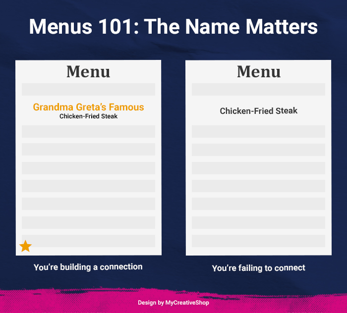 Choosing the right name can take an otherwise standard dish and turn it into a unique meal that people can only find at your restaurant. So instead of relying on barebones descriptions like ham and cheese sandwich or ribeye steak, follow these rules for more enticing dish names:
 - Use nostalgia. The best marketing techniques always tell a story, and your restaurant dishes are no exception. Your diners will form an emotional connection to dishes that tell your story and evoke shared ideas of family, childhood, and comfort food.
- Write in your brand voice. Throw in some branding-specific language to make it clear that this dish is truly yours. For instance, if you re a beachfront eatery with a focus on easy living, add some casual beachy jargon to some of your dish names.
- Be clear. Above all, every dish name should adequately describe what the dish is. It doesn t have to list every single ingredient, but the reader should be able to see the name and immediately discern whether it s a casserole, a salad, or an ice cream sundae.
2. Describe your dishes specifically.
Beyond the title, the second component to any individual dish on your menu is its description. Because the description is longer than the title, you have more opportunity to describe the contents of the dish and drive your customers desire for it. While there s no hard-and-fast rule for what to include in a dish description (you re certainly welcome to be creative), there are a few highlights we recommend: [caption id="attachment_3538" align="alignnone" width="695"]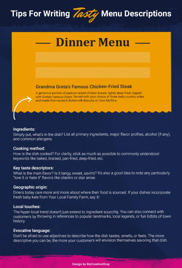 Our Tips For Writing Menu Descriptions[/caption]
 - Ingredients. Simply put, what s in the dish? List all primary ingredients, major flavor profiles, alcohol (if any), and common allergens.
- Cooking method. How is the dish cooked? For clarity, stick as much as possible to commonly understood keywords like baked, braised, pan-fried, deep-fried, etc.
- Key taste descriptors. What is the main flavor? Is it tangy, sweet, savory? It s also a good idea to note any particularly love it or hate it flavors like cilantro or star anise.
- Geographic origin. Diners today care more and more about where their food is sourced. If your dishes incorporate fresh baby kale from Your Local Family Farm, say it!
- Local touches. The hyper-local trend doesn t just extend to ingredient sourcing. You can also connect with customers by throwing in references to popular landmarks, local legends, or fun tidbits of town history.
- Evocative language. Don t be afraid to use adjectives to describe how the dish tastes, smells, or feels. The more descriptive you can be, the more your customers will envision themselves savoring that dish.
3. Leave out the dollar signs.
This tip could really fall under content or design, but let s go ahead and look at it here. According to a 2009 research study, the use of monetary cues on menus (which refers to the dollar sign $ and the word dollar ) resulted in lower total spending by diners. These results suggest that you might be better off labeling your prices as 15 or fifteen rather than $15.00 or fifteen dollars. [caption id="attachment_3515" align="alignnone" width="700"] rawpixel / Pixabay[/caption] However, you should keep in mind that these conclusions were drawn from a single study, and there s not nearly enough evidence to say that you must leave out the dollar signs. If you re looking for a new strategy to try, or if a lack of dollar signs happens to suit your restaurant s modern minimalist aesthetic, it might be worth a shot.
 4. Tell your restaurant s story.
As you write your menu content, you should remember what it is you re actually doing. You re not just listing the dishes that your chefs have imagined or the cocktails that your master bartender has crafted; you re forging a connection and, hopefully, a lasting relationship with your customers through food. To do this effectively, you need to engage with your customers on an emotional level. In addition to your unique dish names and descriptions, consider having a short block of text (maybe on the front or back of your menu) that simply tells who you are. [caption id="attachment_3518" align="alignnone" width="700"] 742680 / Pixabay[/caption] Use this space to share your origin story, your philosophy, your cooking methods, your sourcing practices anything that sets you apart and gives your customers something to come back to. Your food is certainly important, but so is your story!
 Designing Your Menu for Increased Satisfaction and Profit
Once you ve written out your dish names, descriptions, and business story, it s time to put those pieces of text together into a cohesive, clear, and visually pleasing menu design. Check out the following five tips to get started:1. Choose a menu style.
Based on the level of formality and service style of your restaurant or bar, you can choose from several different types of menus: [caption id="attachment_3522" align="alignnone" width="700"]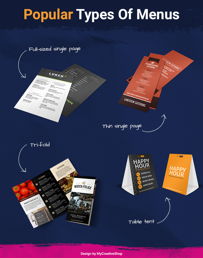 Popular Types Of Menus[/caption]
 - Full-sized single page menus: A versatile option for restaurants with a small or large selection. Both sides of the page can be used, and multiple pages can be arranged in a booklet if you have a particularly large menu.
- Thin single page menus: Perfect for wine/craft beer lists, take-out menus, food trucks, or fast-casual eateries with a limited number of dishes.
- Tri-fold menus: Another versatile option that provides enough space for a wide selection but also provides natural divisions of space for different categories of dishes.
- Table tent menus: Good for advertising daily specials or limited-time dishes, but may look too cheap for fine-dining restaurants.
2. Order your dishes carefully.
Based on the type of menu you ve chosen, you ll next need to decide where to place the dishes. It may seem unimportant, but the visual layout and ordering of your dishes can actually have a strong influence on what your customers choose to eat or drink. [caption id="attachment_3524" align="alignnone" width="700"]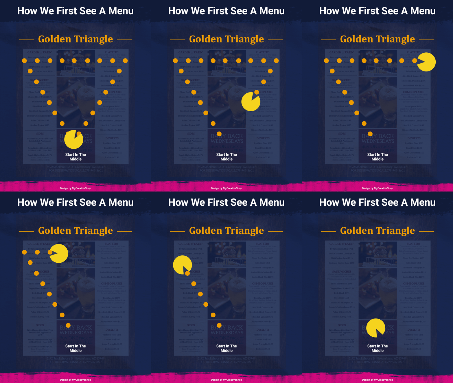 How We First See A Menu[/caption] Restaurant consultants and menu engineers (yes, those exist!) frequently recommend these tips:
 - Use the Golden Triangle. The Golden Triangle refers to the three areas of the menu on which diners eyes settle on first: the middle, the top right, and the top left (in that order). You should place your highest-margin dishes in these areas.
- Place high-profit dishes first. If you follow the Golden Triangle Rule, you ll likely be doing this already... but be sure to place your highest-margin dishes in the first two spots of any category (such as Appetizers, Main Courses, Seafood, etc.). These are most commonly ordered by patrons.
- Center-align your dishes. Some restaurant consultants recommend aligning dishes to the center of the page with the prices listed below. This prevents customers from easily scanning the prices and then making decisions based more on price comparison than actual desire.
- Have one low-cost dish in each category. Price anchoring is an important strategy based on the fact that people tend to gravitate toward the middle ground: not the cheapest, but not the most expensive. When you offer a low-cost alternative, your patrons are more likely to choose a mid-priced dish. (Plus, diners on a serious budget will be pleased with a more affordable choice!)
4. Use color theory and design elements.
What distinguishes a boring, low-effort menu from one that looks professional and attractive? Typically, it s the careful use of design tenants. After all, every menu is essentially a list it s just that some look better and are easier to read! You'll boost the appeal and practicality of your menu by taking advantage of these tenants in color theory and visual design. [caption id="attachment_3527" align="alignnone" width="700"] garageband / Pixabay[/caption] Color Theory Choosing the right colors is especially important in a restaurant or bar setting, and many menu engineers use color theory to choose the best primary and accent colors. Here are just a few common menu colors and their emotional connotations:
 - Green implies freshness and health, and it s often used to denote vegan or vegetarian dishes.
- Red stimulates the appetite and connotes energy and passion.
- Orange is also related to high energy and signifies good value.
- Blue is known to suppress appetite, so it s usually not the best menu choice.
- Font size and style
- Call-out boxes
- Frames and borders
- Photos and other imagery
- White space
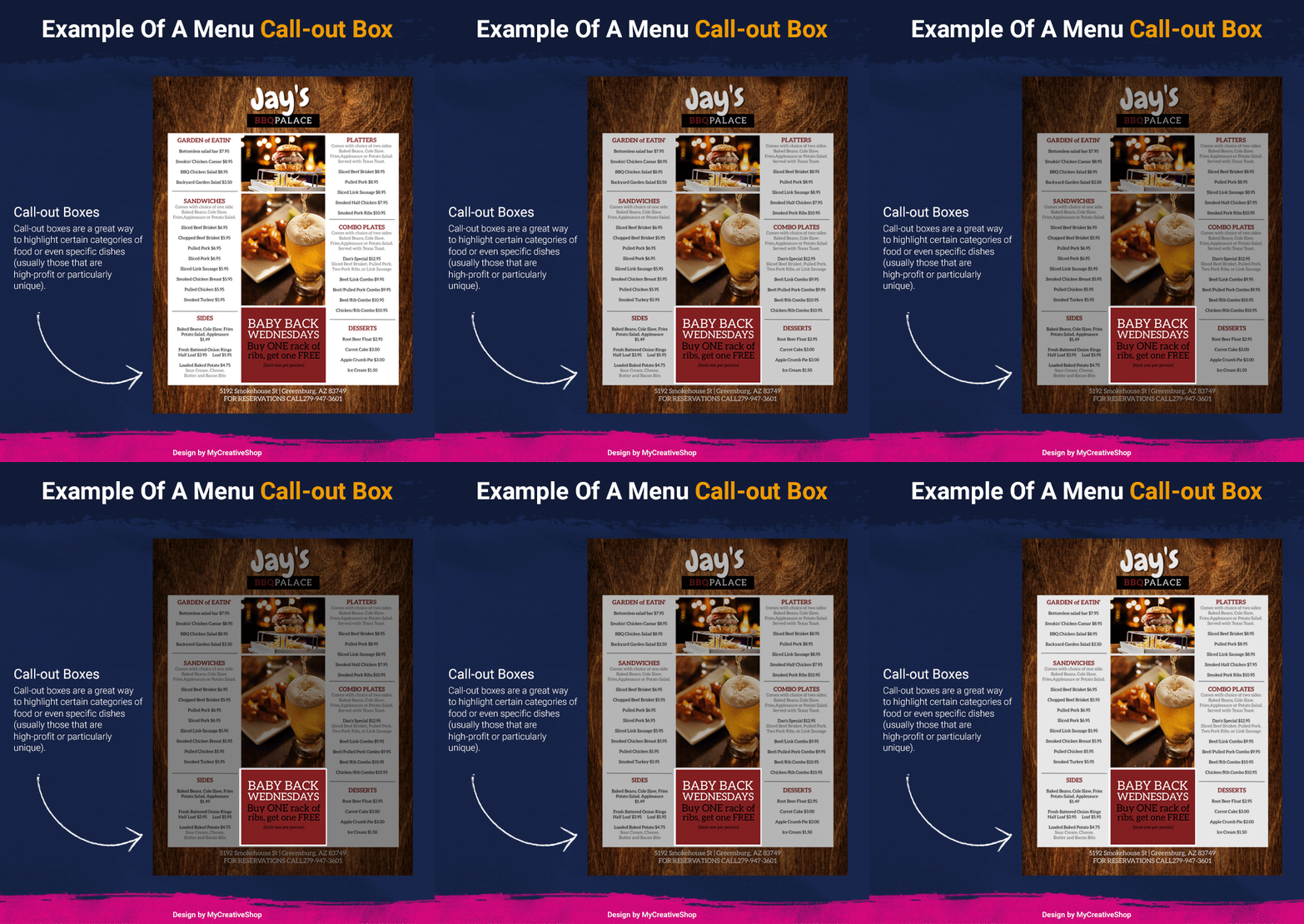 Example of a menu call-out-box[/caption] A good rule of thumb is to have at least one or two items per page that are graphically set apart in some way. This will give your customers a nudge as to which dishes are popular or provide especially great value for their money.
 4. Don t be too clever.
Although you re definitely free to make use of creative design elements, it s important not to stray too far from the primary purpose of a menu. We recommend avoiding overly clever or unexpected designs in favor of clear, easy-to-read menus with a familiar layout. Your customers shouldn t have to work hard to find the appetizers, main courses, or drinks. Here are some additional top tips to get the design of a menu just right!5. Express your restaurant s personality!
[caption id="attachment_3531" align="alignnone" width="700"] bridgesward / Pixabay[/caption] Are you a fast-casual chain with an emphasis on heart-healthy, meatless dishes? A homestyle Italian joint that still makes meatballs the way Nonna did? A traditional ice cream parlor with surprising twists on classic flavors? Whatever your food or beverage niche might be, your menu should fit seamlessly into that bigger picture. Always evaluate your choice of fonts, photos, and colors with an eye toward your overall brand identity, target audience, and level of formality.
 The Finishing Touches: Material and Marketing
After your content has been refined and your design selected, it s time to combine those elements into the final product: an eye-catching menu for your restaurant or bar. As you finish up your menu design, check out these final three tips for an effective menu!1. Choose right menu material for print.
Similar to your languaging and overall design, the material you choose for your menu should reflect your restaurant s brand and identity. Whether you go with plain matte card stock or laminated paper inside a leather-bound booklet, make sure that the material fits in with your restaurant s theme and reflects your brand story. [caption id="attachment_3534" align="alignnone" width="535"]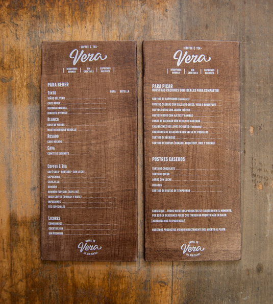 Printing Craft Workshop El Calotipo[/caption]
 2. Test out your menu.
If at all possible, it ll be worth the effort to test your menu in person, in real life before committing to the final design. By doing so, you ll be able to see how well your menu reads, looks, and performs under the actual conditions of your restaurant. Not sure why a "menu trial run" could be helpful? Here are a few examples:- Say you re a fast-casual restaurant where people view menus as they wait in line. Are the menus easy to hold (especially with a purse, child, or other important item in hand) and view from a distance?
- Say you re a downtown bar with a hip, speakeasy feel. Are your cocktail menus legible in low light? Is the font large enough and the color contrast high enough to be read under dim bar lighting?
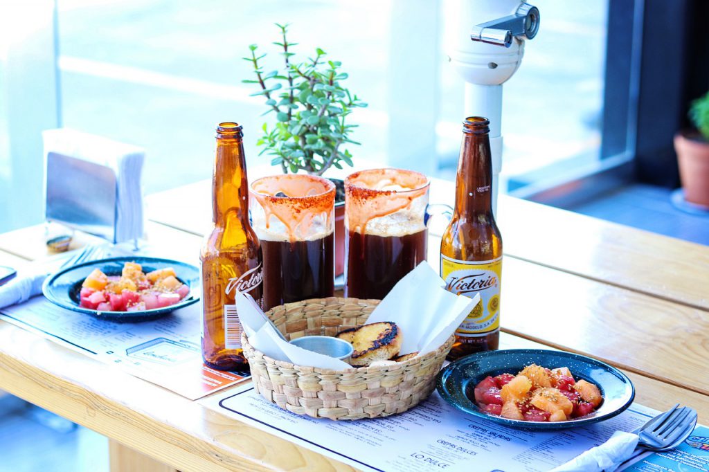
- Say you re a local Tex Mex restaurant that serves freshly fried tortilla chips as your customers make their dinner selections. Is your menu easy to sanitize between uses?
- Say you re a fine-dining establishment with cozy, intimate tables. Is your menu small enough to be viewed without crowding the table setting or knocking off the wine glasses?
 DomAlberts / Pixabay[/caption]
 3. Integrate your menu with the rest of your marketing strategy.
One of the biggest mistakes that restaurant and bar owners make is assuming that the menu is finished as soon as it leaves the printing press. If you all you do is design and print a new menu, you re missing out on some huge marketing opportunities! Instead of creating your menu and calling it done, work to integrate it into your overall marketing strategy! Here s how you could do that:- Put your menu online. Add your new menu to your restaurant s official website, Facebook page, Google My Business profile, and all review sites on which you re featured. If possible, don t just upload a PDF; make sure it s an actual web page so at that you can reach the 50% of users who browse from mobile devices.
- Make your menu visible. Visitors to your restaurant will definitely see your menu, but what about people around town? As much as possible, try to bring your menu into the community. You can put up a menu sandwich board outside, give takeout menus to nearby offices, or post on local ad boards.
- Train your employees on the menu. Nothing is more frustrating for a diner than asking your waitstaff a menu question that they can t answer. Take time to train your employees on the menu, along with some tips and tricks to encourage diners to try new items.
- Inspire customer engagement. Try to view your menu as an active tool for customer engagement rather than a static list of cocktails and main courses. Your menu can be a great jumping-off point for both in-person and social media conversations, so include your customers through fun activities like dish naming contests or secret menu challenges.
Menu Content and Design: A Worthwhile Investment
As you can see, a lot of thought goes into an effective menu. Although it certainly serves the practical purpose of telling customers what you serve, a well-written, well-designed menu does so much more than that:- It tells your brand story.
- It builds an emotional, memorable connection with your customers.
- It drives customer desire for your food and drink.
- It encourages diners to make the most satisfactory choices for you and for them.
- Above all it makes you stand out.
