9 Menu Secrets Every Restaurant Owner Should Know
Discover the secrets to creating a profitable and enticing menu.

Published Nov 26, 2018
 A well-designed menu is the shining star of a restaurant. Its purpose is to not only guide customers effortlessly through their dining choices and enrich their overall experience but also to be a brand advertisement that displays the business s style and attitude while driving profit. [caption id="attachment_3599" align="alignnone" width="700"]
 Free-Photos / Pixabay[/caption] Menu creation is an essential part of marketing for the food industry. Caterers, fast food establishments, grocery/meal delivery services, cafes, and high-end restaurants can all benefit from designing a well-planned, attractive menu for their customers. There are many elements involved in good menu design. All of these elements combine to create an overall picture of the restaurant in the mind of the patron. The layout of food choices needs to be in a well-organized pattern that guides patrons through their choices and assists them in making satisfying decisions. The colors and design should reflect the overall look and feel of the establishment.
 1. Avoid Providing Too Many Choices
It s great to have choices on a menu; however, too many choices can have an adverse effect. When a restaurant offers tons of options on their menu, guests may feel overwhelmed and a bit stressed as they try to choose from the many items before the waiter arrives to take their order. Then, at the last minute, patrons could end up ordering something they ve already tried because they don t want to risk choosing something that they don t like. There have been many studies (like this one) on identifying the perfect number of menu items to offer your customer. We don't believe there is a specific number that fits every restaurant, but we do believe every restaurant should work to limit the number of choices you offer your patrons. A well-designed menu with just the right amount of items might tempt customers to try something new or decide on an entree a little more expensive than they normally would choose.2. Include Limited, High-Quality Photos
It s best to let your customers imagine the food quality when they browse your menu, however, some strategically placed photographs can also be a great way to advertise menu items. Many times, when a customer cannot decide what they want to order, they will check out the pictures to help them make a decision. The rule of having too much of a good thing applies to photos as well as menu items, as too many photos can be confusing. Overdoing the images might also detract from the overall look, causing a fine dining establishment menu to appear less high-end and more like a pancake house menu. Be careful not to cheapen your overall look with too many photographs. Here are some other menu photo pitfalls to avoid:- Go big or go home - Be wary of using photos to advertise your food in a menu or elsewhere if they have not been taken professionally. Poor quality food photos look unappealing and outdated. The more realistic and vivid the images are, the more likely they will stimulate the appetite of your customers.
- What you see is really what you get - Be truthful in your advertising. The food photo that you advertise in your menu is what your customers will be expecting to receive when they place their order. Anything subpar will be a disappointment.
- Practice what you preach (or sell what you advertise) - Related to the point above, try to use photos of the actual food for sale at your restaurant instead of stock photos, unless it s a picture of a Caesar salad or something that won t differentiate much from your restaurant s actual version.
3. Strategically Price Menu Items
Price psychology is a common way for restaurant owners to convince their patrons to spend their money. Dollars signs are left off of the menu because, as marketing writer Martin Lindstrom says, The dollar sign is a symbol of cost, not gain. [caption id="attachment_3604" align="alignnone" width="700"] rawpixel / Pixabay[/caption] A study by Cornell University s Center for Hospitality Service found that taking away the dollar sign from menus encourages restaurant guests to spend more money. Those in the study who were given menus without dollar signs spent considerably more than those given menus with dollar signs. Subconsciously, the act of spending money somehow hurts a little less when we re not reminded of the monetary amount that we re paying, which is what the dollar sign does. Some additional tricks of the trade when it comes to menu pricing (and retail pricing) is setting a price with a decimal instead of rounding up. Somehow, $9.95 looks a lot better to us than $10.00. Some restaurant also spell the price out (twelve instead of 12). Before the advent of awesome menu templates that make designing menus a snap, a trick of typesetters was to add a line of decimal points to connect the menu item to the price. Stay away from doing this on your menus, because the eye naturally will follow the prices down on the right-hand side of the menu and then the least expensive item can be easily chosen. Instead, try giving each menu item its own paragraph and then listing the price of the item at the end of the description (nested pricing). Another trick of the trade is to list the most expensive items at the top of the menu so that everything else seems to be priced more reasonably. Budget-conscious patrons might balk at ordering the prominently advertised $55 lobster. However, the filet mignon priced at only $30 a bit further down the menu now seems an acceptable choice.
 4. Use Layout to Your Advantage
When looking at a sheet of paper or a magazine, your eye automatically goes from the top left to right and then the center, and so this is the prime area of the menu and where the money-making items should be presented. The eye then continues to scan down the menu taking in all of the rest of the details. The list should follow courses in a natural progression, starting with salads and appetizers and then entrees and desserts. Another idea is to make high-profit items stand out by placing them in their own box or highlighting them on the menu with a different color. Leaving space around the items will draw the eye, as well. [caption id="attachment_3530" align="alignnone" width="700"]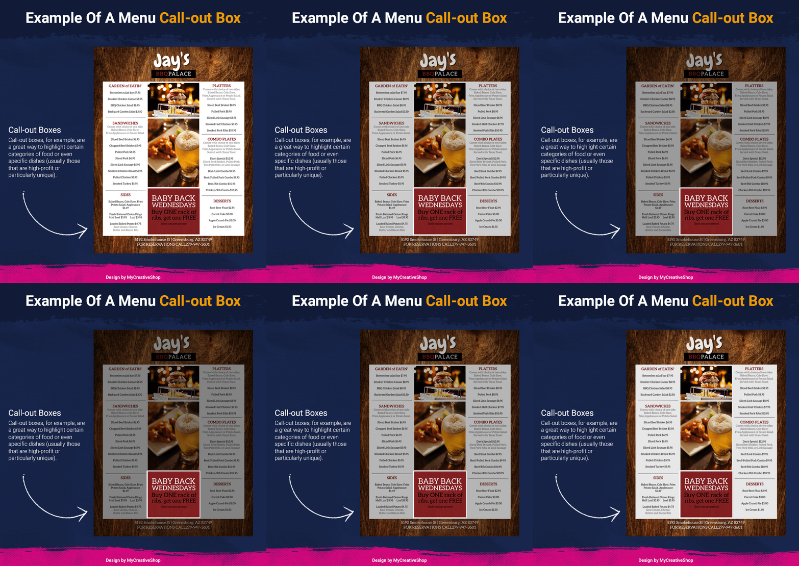 Example Of A Menu Call-out Box[/caption] Brian Wansink, author of Slim by Design, Mindless Eating Solutions to Every-Day Life says, "What ends up initially catching the eye has an unfair advantage over anything a person sees later on."
 5. Make Your Descriptions Colorful
Think colorful adjectives when trying to sell your food on a menu. The more descriptive you are in describing the mouth-watering, scrumptious taste of the food, the better the results will be. According to another Cornell study, when many words and adjectives are used to describe a menu item, customers don t mind paying more, because it seems that they are getting more for their money. Some top adjectives for describing fish and meat items are line-caught seafood, farm-raised poultry, and locally sourced beef. Some other descriptive words to describe taste are as follows: Acidic - Sharp or tart tasting food Briny - Salty Earthy - Brings garden soil to mind, used for root vegetables and mushrooms Cooling - Minty Fresh - Light and crisp Honeyed - Sweet Nutty - Used frequently to describe cheese Zesty - Lively and fresh6. Use Nostalgia as a Selling Strategy
Food Newsfeed explains that, Housemade items that remind consumers of childhood can make profitable additions to restaurant menus. Especially for smaller-scale restaurants and diners, family names for food can evoke memories, which makes food more desirable, because, after all, They sure don t make it like they used to. Aunt Emma s Homemade Chicken Noodle Soup or Grandma s freshly-baked chocolate chip cookies evoke nostalgia, making those items more desirable in the mind of your customer. Our favorite foods as kids often remain our favorite foods as adults, and, with today s consumers busy lifestyle, there s less time to make a home-cooked meal. So restaurants are stepping up to the plate with traditional foods that remind us of down-home cooking. Home cooking can also be emphasized by promoting your hand-crafted flavors and advertising the use of ingredients that have an established reputation, like Hershey s chocolate.7. Use Cultural Words to Improve Experience
Everyone likes to treat themselves sometimes, and when customers walk into a restaurant that s playing lovely music and presents a menu of rich sounding food choice, they might be persuaded to pamper themselves with a higher-priced meal. Culturally descriptive words, such as old-Style Italian Spaghetti verses spaghetti, can result in customers enjoying their meal even more. Charles Spence, an Oxford psychologist, has this view about naming cultural-sounding food on a menu, "Give it an ethnic label, such as an Italian name, and people will rate the food as more authentic. A label directs a person's attention towards a feature in a dish, and hence helps bring out certain flavors and textures."8. Be Intentional with Color Choices
Color can be used to make an emotional connection on a marketing piece and can have a significant effect on the subconscious reaction of the consumer. Hues that match the overall tone of your branding and style work best for your menu. Use color to attract attention to specific areas of the list and strategically-placed items. The use of color also works to pull the reader s eye in the desired direction. Some colors also carry specific intonations.- Red is an ideal color for meat-centric establishments, such as barbecue and steak restaurants. It s an intense color that encourages urgency, and studies have shown that using red tablecloths results in people eating more food.
- Blue is a popular color for businesses because it brings to mind security and trust. It s also a calming color that is reminiscent of water and the ocean, making it also a great color choice for seafood restaurants. Be wary of using too much blue, however. Because blue rarely appears as a natural food color, it s subconsciously not an appetizing hue. Have you noticed blue food labels for healthy foods in stores? Possibly, the manufacturers are using color psychology to give consumers the impression of a reduced appetite resulting in possible weight loss.
- Green is a good color choice for a deli or any restaurant that advertises fresh ingredients, and it also encourages a relaxed environment. Starbucks uses green as a brand color in the hopes that customers will sit back, relax and eat scones and drink endless cups of coffee.
- Yellow is a happy color that promotes cheerfulness and youthfulness. It can also engage the analytical side of our brain. This might result in being a food deterrent, as food would most likely be considered creative. Beige or earthy tones, which brings to mind foods that are natural, might be a better choice than yellow.
- Orange is a comforting, but also an impulsive color. Orange stimulates the senses, and so this color is used at restaurants to encourage appetite and socialization. This color in the decor of a restaurant might inspire you to hang out and chat with your friends longer and spend more money in the meantime.
9. Use Font to Express Your Style
It s interesting that, in 2008, Time magazine reported that high-end restaurants were using difficult to read fonts on their menus, because, if something is difficult to understand, the mind interprets this as being at a higher level of sophistication. These restaurants believed that the difficult fonts conveyed that the food was complicated to prepare and resulted in increased sales. Your font choice is a significant part of the menu design. The font reflects the overall style and design of the establishment, which means you need to be as spot-on as possible with your choice. Choose two or three fonts to create the desired impression with your menu. Some examples of nice menu fonts are - The Rigatoni font [caption id="attachment_3466" align="alignnone" width="770"]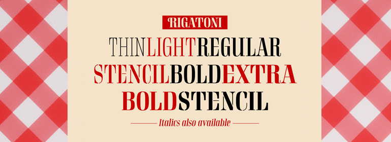 Source: Fonts.com | Rigatoni Font[/caption] Fettuccine or spaghetti, anyone? This font was designed specifically for restaurants and has an old-world style that is perfect for Italian restaurants or any restaurant that wants to establish a culturally-rich atmosphere. Timberline font [caption id="attachment_3467" align="alignnone" width="700"]
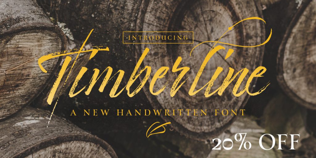 Source: myfonts.com | Timberline Font[/caption] Perfect for high-end and artisan restaurant, the Timberline font conveys style and sophistication. Use it for your menu title and section headers as an attention-getting design element. Thirsty Soft font [caption id="attachment_3468" align="alignnone" width="700"]
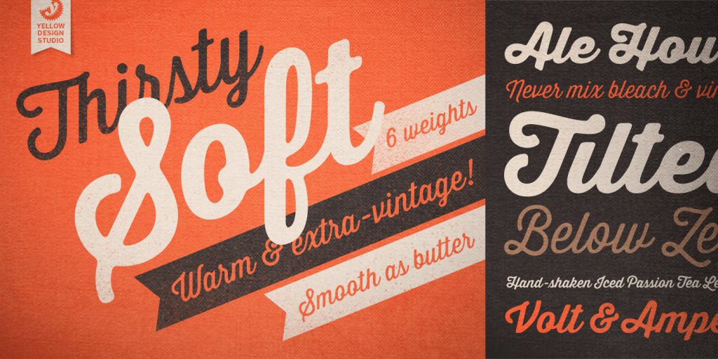 Source: myfonts.com | Thirsty Soft Font[/caption] The Thirsty Soft font has a friendly and vintage look that would be great on a sandwich shop or deli menu. A bold font choice can reflect bold flavors, and high-end foods look sophisticated when spelled out with an understated, lowercase font. Remember to use bold and italic font strategically to draw the eye towards items like specials and featured entrees.
 Bon App tit
The effective use of all of these elements can combine to create an impressive menu that s a beautiful representation of the style of your food business. Every restaurant should offer a polished, naturally-flowing presentation of their food choices, incorporated into a menu design that catches the eye without being distracting. Interested in designing your own menu? Our online editor gives food industry business owners the ability to create their own beautiful menus that will impress and encourage repeat business.