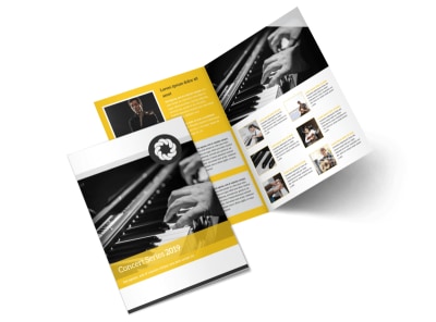
Dynamic Concert Brochures: 10 Design Tips to Rock Your Audience

Are you ready to take your concert brochures from dull to dynamic? In the world of music and arts, grabbing the audience's attention is half the battle won. Your concert brochure is the first glimpse into the magic that awaits at your event. With the right design, you can create a buzz, build excitement, and ensure your concert stands out in a sea of events.
In this post, we will explore 10 helpful tips for designing engaging and visually appealing concert brochures that will captivate audiences and effectively promote your event!
1. Know Your Audience Inside Out
Before you start designing your concert brochure, immerse yourself in the world of your audience. Understand their preferences, demographics, and what appeals to them visually. Tailoring your brochure to resonate with your target audience ensures a higher chance of engagement.
2. Catchy Headlines and Visuals
Grab attention right from the start with catchy headlines and captivating visuals. Your headline should be concise, impactful, and relevant to the concert theme. Pair it with eye-catching visuals that convey the essence of the concert at a glance.
3. Unleash Creativity with Colors and Fonts
Colors evoke emotions and set the tone for your concert. Choose a color palette that complements the theme and genre of the event. Experiment with fonts to add personality and readability to your brochure. Strike a balance between creativity and legibility for a winning design.
4. Showcase the Lineup
Your concert brochure is a platform to showcase the star-studded lineup. Highlight the performers, artists, and special guests with enticing visuals and brief descriptions. Make sure the lineup takes center stage in your design.
5. Incorporate Interactive Elements
Add a touch of interactivity to your brochure to engage the audience further. QR codes for ticket purchases, interactive links to artist profiles, or access to exclusive content can elevate the user experience and drive actions.
6. Create a Visual Hierarchy
Guide the reader through the brochure with a clear visual hierarchy. Use varying sizes, colors, and placement to direct attention to key elements such as dates, venue, and ticket information. Ensure the most critical details are easily noticeable.
7. Tell a Story
Weave a compelling narrative through your brochure. Take the audience on a journey from anticipation to experience. Use storytelling elements to create intrigue, build excitement, and leave a lasting impression on the readers.
8. Balance Information and White Space
Avoid cluttering your brochure with excessive information. Balance text with ample white space to give your design room to breathe. White space enhances readability and visual appeal, ensuring key information stands out.
9. Test for Print and Digital Readiness
Before finalizing your design, ensure it is optimized for both print and digital formats. Test the readability, colors, and dimensions to guarantee a seamless experience across all platforms. Make adjustments as needed to deliver a polished final product.
10. Consistent Branding and Call to Action
Streamline your design with consistent branding elements such as logos, color schemes, and fonts. End your brochure with a strong call to action that prompts the audience to take the next step, whether it's purchasing tickets, visiting your website, or following your social media channels.


Final Thoughts
Dynamic concert brochures have the power to captivate, inspire, and drive audience engagement. By implementing these 10 design tips, you can elevate your brochure from a mere promotional material to a captivating visual experience. Remember, every element of your brochure should align with the concert's theme and appeal to your target audience.
As you embark on the design journey, infuse creativity, strategic thinking, and a touch of magic to craft brochures that rock your audience to the core!

