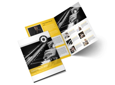
10 Creative Ideas for Concert Brochure Designs

Concert brochures are more than just pieces of paper. They are gateways to immersive musical experiences that can captivate, excite, and inspire. As a designer, your task is to create a brochure that not only provides essential information about the concert but also becomes a piece of art in itself.
In this blog post, we will explore 10 creative ideas for concert brochure designs that will help you leave a lasting impression on your audience.
1. School of Visuals
When designing a brochure for a concert organized by a school, consider incorporating elements that reflect the educational institution's visual identity. Use colors, fonts, and imagery that are synonymous with the school. This will create a sense of familiarity and pride among students, parents, and faculty members.
2. Rhythm of Typography
Typography plays a crucial role in any design, and concert brochures are no exception. Explore typography options that capture the essence of the music genre or the artist performing. Whether it's bold and edgy for a rock concert or elegant and flowing for a classical performance, the right typography can set the tone for the entire brochure.
3. Live Music, Vibrant Colors
Concerts are synonymous with energy and excitement. Capture this essence by using vibrant colors in your brochure design. Opt for bold, eye-catching combinations that immediately grab attention and evoke the feeling of being at a live concert.
4. Schedule in Harmony
The schedule is an important element in a concert brochure, but it doesn't have to be mundane. Design the schedule section in a way that complements the overall visual theme of the brochure. Integrate elements like musical notes, instruments, or concert venue illustrations to add an artistic touch.
5. Harmonious Contrasts
Contrast is a powerful design tool that can make elements stand out and create visual interest. Experiment with contrasting colors, textures, or typography styles to create a visually engaging concert brochure. Balance is key, so ensure that the contrasts are harmonious and enhance the overall aesthetic.
6. Symphonic Illustrations
Illustrations have the ability to bring a concert brochure to life. Include hand-drawn or digital illustrations that capture the spirit of the music or the personality of the artist. Whether it's a whimsical sketch or a detailed rendering, illustrations can add a unique and memorable touch to your design.
7. Festive Flair
Designing a brochure for a Christmas concert requires a touch of festive flair. Incorporate elements like snowflakes, ornaments, or holiday lights to evoke the spirit of the season. Use a color palette that reflects the warmth and joy of Christmas to create a visually delightful experience.
8. Nature's Melody
Take inspiration from nature when designing a concert brochure for an outdoor event. Use imagery of trees, birds, or flowers to create a sense of serenity and connection with the surroundings. Incorporate earthy and organic colors that reflect the beauty of the outdoor venue.
9. Concert in Motion
Concerts are dynamic and full of movement. Capture this energy in your brochure design by incorporating elements like blurred lines, motion trails, or abstract shapes that suggest movement. This will make the brochure visually engaging and convey the excitement of the live performance.
10. Stage Lights, Drama Unfolds
Stage lights play a crucial role in setting the atmosphere during a concert. Incorporate elements that mimic the effect of stage lights, such as gradients, light leaks, or lens flares. This will create a sense of drama and anticipation, making the concert brochure truly captivating to the audience.


Conclusion
Designing a concert brochure is an opportunity to showcase your creativity and leave a lasting impression on the audience. By incorporating these 10 creative ideas, you can create a brochure that not only provides essential information but also becomes a piece of art that resonates with concert-goers.
Remember to tailor your design to the specific concert and audience to truly make a connection and enhance the overall concert experience!

