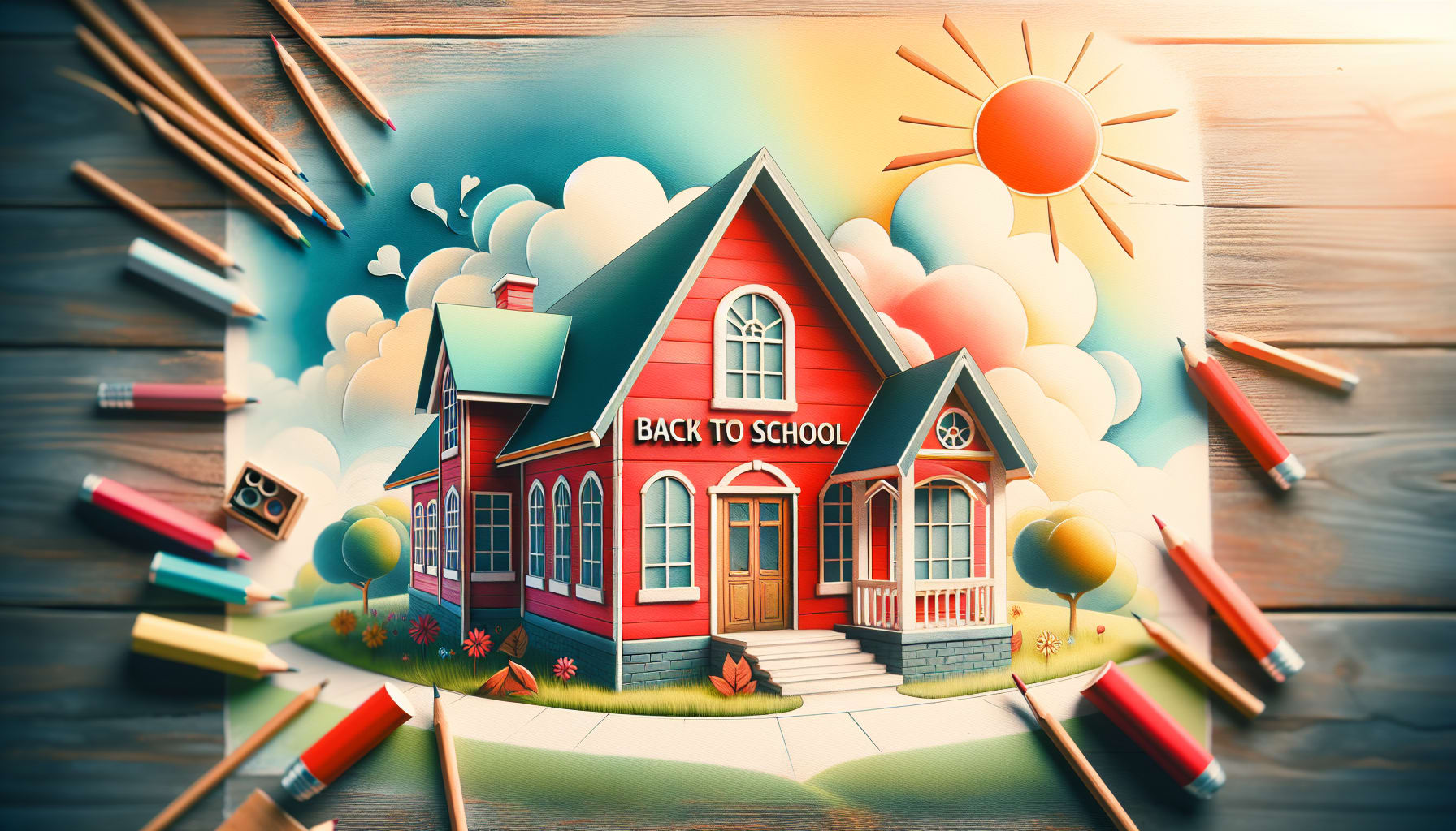
7 Creative Ways to Make Your Back to School Brochures Stand Out


Back to school season is upon us, and with it comes the excitement of new beginnings, fresh supplies, and eager students ready to embark on learning adventures. As a school administrator or marketer, one of your key tasks during this time is creating brochures that not only inform but also captivate and engage your audience. In a sea of standard back-to-school materials, how can you make sure your brochures truly stand out?
Let's explore 7 creative ways to add that extra sparkle to your back-to-school brochures and make a lasting impression on parents, students, and faculty alike.
1. Inject Personality with Engaging Graphics
Who says brochures have to be dull and lackluster? Sprinkle some fun and excitement into your design with vibrant colors, playful fonts, and eye-catching graphics that reflect the youthful spirit of the upcoming school year. Whether it's cartoon characters, school mascots, or whimsical illustrations, let your creativity shine through!
2. Tell a Compelling Story
Don't just list facts and figures - weave a narrative that draws readers in and makes them feel connected to your school's mission and values. Share success stories, testimonials from happy students and parents, and anecdotes that showcase the unique culture and community of your institution.
3. Interactive Elements for Engagement
Break away from the traditional static brochure format by incorporating interactive elements like QR codes, puzzles, or tear-off sections that invite readers to participate. Encourage them to scan, fold, or engage with your brochure in a way that makes the information more memorable and interactive.
4. Play with Shapes and Sizes
Step out of the box - or in this case, the rectangle - by experimenting with unique shapes and sizes for your brochures. A circular brochure or a die-cut design can instantly grab attention and make your materials stand out in a stack of standard rectangular pamphlets.
5. Incorporate Personalization
Make your audience feel special by using personalized elements in your brochures. Address them by name, tailor the content to their specific needs and interests, and consider including personalized QR codes or links that lead to customized information based on their preferences.
6. Embrace Minimalism with a Twist
While it's essential to keep your message clear and concise, don't shy away from incorporating minimalist design elements with a touch of whimsy. A clean layout with pops of unexpected color, clever use of negative space, or a subtle dose of humor can make your brochure both sleek and memorable.
7. Add a Fun Element of Surprise
End on a high note by including a fun element of surprise in your brochures. Whether it's a hidden message, a scratch-off section revealing a special offer, or a playful game that readers can enjoy, leaving them with a smile will ensure your brochure is not just informative but also delightful to engage with.
Final Thoughts
As you gear up for the back-to-school season, remember that your brochures are more than just informational pieces - they are opportunities to connect, engage, and leave a lasting impression.
By infusing creativity, personalization, and a touch of whimsy into your designs, you can ensure that your back-to-school brochures truly stand out in the crowd!


