Typography Inspiration for Your Next Print Project


According to CreativeBloq, typography is the art and technique of arranging type. Why is it important for designers and their projects? They explain: Your choice of typeface and how it works with your layout, grid, color scheme, and so on will make the difference between a good, bad, and great design.
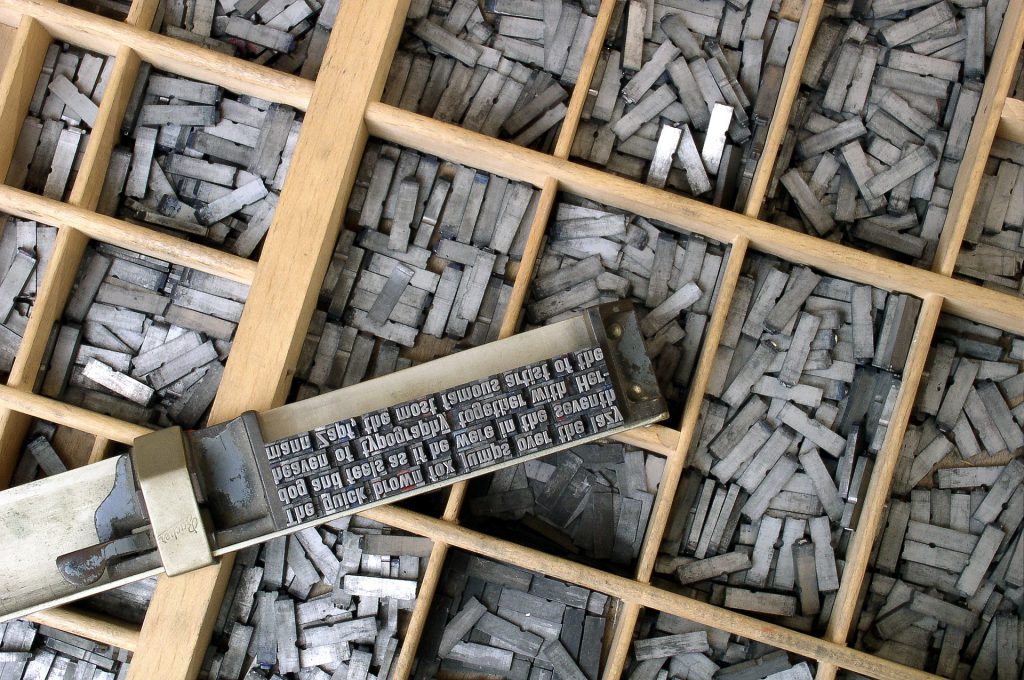
Typography is also a very important element of print marketing, Brittany Leaning, HubSpot Strategist explains: It plays a critical role in strengthening your brand, creating interest in your product, and highlighting your central message.
What s more, we re constantly digesting words throughout the day, whether it s in digital or print form. While we often discuss the meaning and message behind those words, it s easy to forget the importance of typography itself. In design, different typeface choices can express mood, tone, and atmosphere, as well as elicit feelings and impact the viewer.
We understand that it can seem daunting to find the correct type or font for your print project. That s why we ve put together a list of inspirational typography to spark creativity for your next design.
Heads up - Make sure to always pay attention to the licensing terms as not every font is free for commercial use. Luckily for you, we did find a list of 70+ fonts that are free for commercial use if you want to check those out.
Related article: 10 Different Font Types and How to Choose Yours
Make a Splash with High Contrast
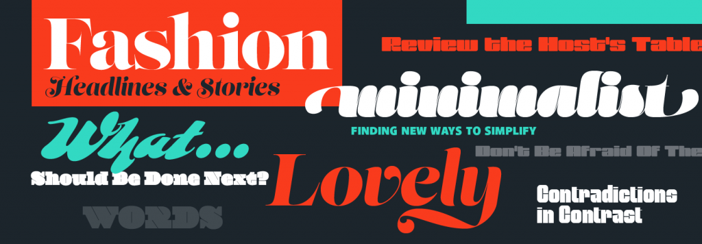
Combined with a dark or black background, large, bold, and brightly colored typography provides a striking dissimilarity that catches the eye of your viewer. In promoting their high contrast fonts, Adobe describes why such a juxtaposition leaves a lasting impression:
Don t be afraid of the dark! Grab the attention of everyone around with sophistication and style. High-contrast fonts hit all the right marks when you need to go big.
source: Adobe
This type of typography is perfect for events and holidays, when you want to do more than simply sell a product. You want to get viewers ready for the experience they ll have, and sometimes big and bold typography is the best way to do that.

This flyer for a DJ event promises with both its content and typography to provide an unforgettable, high energy experience. The beauty of using contrasting fonts and color schemes is that it gives the eye something intriguing to explore.
Use Hand Lettering That Compliments Your Brand

The hand-lettered trend is staying put for both print and digital design. This typography became popular (and is still widely used) because there are so many varieties of hand-lettering type. It can coordinate with any branding and can be used to give a rustic vibe or inspire a yoga audience.
Be careful when using hand lettering for headers. Because these letters can be wispy and light, it may not stand out as well as a bolder typeface. If you re not sure how to pair this with other fonts, check out CreativeBloq's guide to perfect font pairings to ensure you create a clean and stand-out typography design.
Leverage the Power of Nostalgia
Retro is such a beautifully evolving design trend because, as time rolls on, newer periods will experience a retro-resurgence with generations yearning for nostalgia. Just look at the Stranger Things phenomenon - the TV show experienced overwhelming success by tapping into the 80s-mindset and culture. What s more, the logo is a perfect example of retro typography. The font used, ITC Benguiat, is recognizable to fans of Stephen King, the Smiths, and Choose Your Own Adventure book lovers as a hallmark of life in the 80s.
A developer even created a logo generator where you can strangify your name, or any text:
When designing your next print project, think about your target demographic, and consider using a retro throwback font to create a stronger emotional connection. The key is not overusing this style in your designs. Unless it s key for your brand, use it sparingly, and only when absolutely relevant.
Keep it Classic with a Clean Sans Serif
source: PSPrint Blog
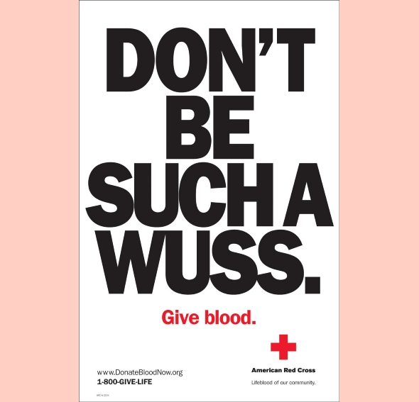
San serif is one of the four font families that allows for a clean typography experience. A famous example of a font in this subsection is Akzidenz-Grotesk. This typeface became popular in the 1950s and 60s, with many brands using it in their marketing, according to Mental Floss. In fact, one of the most popular and recognizable examples of brands using this font is the American Red Cross.
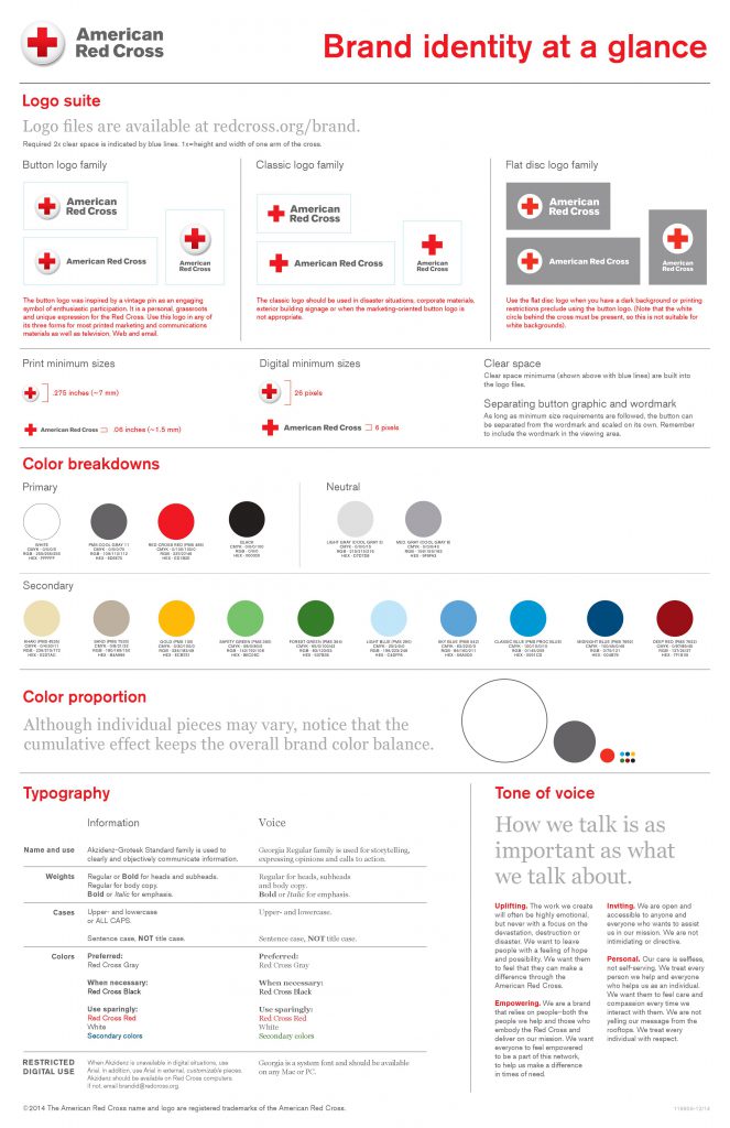
This type of font can work well in your print advertising to provide a clean, readable, yet still strong typeface. Not to mention, fonts like Akzidenz-Grotesk, Arial, and others in the family are very versatile and can work with most brands.
Related Article: 10 Design Lessons From Starbucks New Brand Guidelines
Typography Inspiration for Your Next Design
Typography is an art form, but you don t have to be an expert designer to use the right typeface. Use this typography inspiration to make a lasting impression with your print design and bring your messaging to life.
************************************************************************
Intrigued by all that fonts and typography can do? Check out these other awesome resources: