5 Design Ideas for Your Real Estate Marketing Flyers
Learn essential tips for designing effective real estate marketing flyers.

Dustin Hodgson
Published Mar 20, 2019
 It s easy to forget that print materials, like real estate flyers, are just as important as what you share about your brand and business online. They re not only an extension of you, as a real estate agent, but they also help you sell homes and attract new clients. Without an eye-catching, informative design, great images, and the right words, however, this business tool won t be of much help to you. Before you design any more real estate marketing flyers, keep these simple tips and ideas in mind. You ll find that when you keep it simple and stick to your brand, you can have the most impact.
 #1: Choose Your Words Wisely
The wording and language used in your marketing materials can influence your sales, according to Zillow, who analyzed 24,000 home sales. They found that certain words caused homes to sell well above their listing price. The word luxurious, for example, exceeded the expected sale price by 8.2 percent. [caption id="attachment_3993" align="alignnone" width="700"] englishlikeanative / Pixabay[/caption] If you want your flyers to help you find clients and sell homes for higher than their listing price, work these 15 words into your flyer:
 - Luxurious
- Captivating
- Impeccable
- Stainless
- Basketball
- Landscaped
- Granite
- Pergola
- Remodel
- Beautiful
- Gentle
- Spotless
- Tile
- Upgraded
- Updated
#2: Find a Professional Photographer
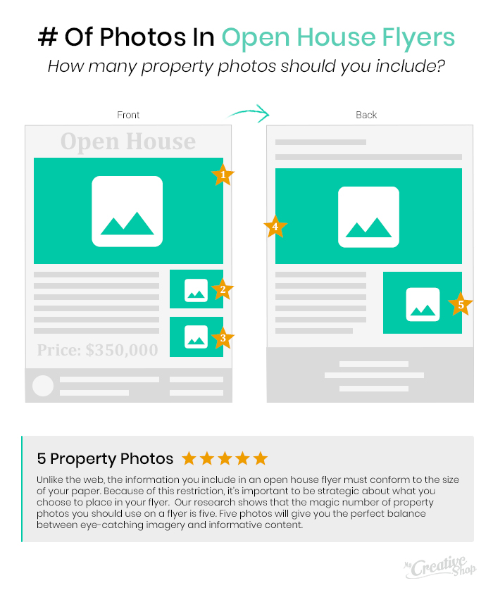
In the 21st century, it s a no-brainer that your real estate marketing brochures need good images. While words can create a powerful mental picture, images show potential buyers the property, along with other important features like the floorplan, landscape, and amenities. In this digital age, low-quality photos are no longer acceptable, so choose high-resolution, high-quality photos that show the house in its best light. [caption id="attachment_3988" align="alignnone" width="700"] JESHOOTS-com / Pixabay[/caption] The first step in doing this is hiring a professional photographer. Peter Lorimer, real estate mogul agrees that photography is no longer a nice-to-have. Not only will these photos go on your flyers, but they ll likely go on your website as well. If you want to get the attention of potential buyers, you need a professional to be taking photos for you, plain and simple. Once you get your photos, don't clutter your flyer. According to MyCreativeShop, the average real estate marketing flyer advertising a home has five images use this as your benchmark to avoid using too many photos.
#3: Create Different Flyer Versions for New Audiences
While it s easy to get a few dozen copies of the same design, consider who you want to target with your flyers. This is a critical factor in ensuring that your print marketing is effective, because when tracking the performance of your flyers, you ll come back to the goals you set, which reflect your target audience. Different designs, language, and listings will appeal to different groups of people, depending on income, age and lifestyle. Before finalizing a single design, consider where you want to post or distribute your flyers, and the person you re targeting, so you can customize the design to appeal to your target demographic.#4: Keep Your Flyers Simple
You may be attracted to eye-catching colors for your marketing flyers, but make sure the font and background colors aren t jarring. Not only is this off-putting, but wild design elements can make it hard to find the must-have information like listing price, square footage, and your phone number. Not to mention, according to WebFX, colors actually influence buyers psychologically. While red evokes a sense of urgency, blue creates a sense of security and trust in a brand. Luckily, there are two simple ways to avoid using design elements that might turn buyers off:
 - Stick to your branding, which likely doesn t include bright colors and fonts that are hard to read. If you don t have one already, create a brand guide, which makes it easier to maintain consistency, maintaining the same look and feel of all your marketing materials.
- Use templates like those offered from MyCreativeShop, which provide you with a base to start from. You can then customize and add text, but don t have to come up with every element on your own.
#5: Test Different Designs and Styles
Instead of using just one flyer style for all your marketing, consider different designs that allow you to highlight different features of the home and your brand. If you re not a creative person, check out some of the templates below that allow you to step outside the box and develop unique flyers that will stand out from your competition.Design Your Next Marketing Flyer
If you re ready to design your flyer, check out our helpful flyer-building tutorial to make sure you check all the appropriate boxes before you hit print. Track the success of each flyer by setting goals, using custom offers, and including QR codes and tracked links so you know what s working and what s not.