How to Make a Yard Sign [6 Steps + Helpful Tips]

Wondering how to make an effective and eye-catching yard sign? We ve got you covered! After exploring countless tips and tricks employed by MyCreativeShop customers, we re sharing the most practical yard sign ideas below plus some common mistakes you can easily avoid.
Start with these six steps, and you ll know exactly what to do. You can even start designing your yard sign immediately, if you re ready!

1. Plan First
The most important tip with any print marketing piece is to take the time to plan the content upfront.
Spending just 15 minutes on planning can save you a lot of time when it comes to actually creating, and it can prevent expensive print mistakes like realizing you forgot to include your email address or the date of the event!
We recommend sitting down at a computer or piece of paper and creating a list of the most important items:
- What is the goal of your yard sign? Is it to attract customers, get people to message you, share an important event, or simply raise brand awareness? Knowing why you are making the yard sign and what you want to get out of it will make sure that your final design achieves your goal.
- What contact information do you need to provide? Some yard signs may only need a phone number or email address, while others (like real estate open houses) may require a full physical address or a website URL.
- What images or brand assets do you have to include? List out any specific colors, fonts, logos, or photos that you must incorporate.
- What else? Write down all the nice to have items that you'll only include if you have extra space, such as a tagline, additional photos, more words, etc.

2. Be Choosy About the Headline
Based on the list you ve just created, go ahead and write the main headline for your yard sign. Remember that the headline will be the largest piece of text and in fact, it may be the only thing that fast-driving viewers will be able to spot.
So think carefully: What is the single most important piece of information you want to share? By the way, single is important! We recommend keeping your yard sign to just one clear headline so that viewers don t get confused or overwhelmed.
Your headline could be worded as a command (like SHOP NOW!) or as a simple phrase (like JUST SOLD!). Some examples of effective yard sign headlines include:
- VOTE TODAY
- PARKING HERE
- [EVENT] + [DATE]
- VISIT OUR YARD SALE
- YES, WE RE OPEN
- OPEN NOW!
- OPEN 10AM - 6 PM
- PLEASE COME IN!
- TEXT US AT [###-###-####]
- CALL NOW
- FOR SALE
- POLLING LOCATION
- ELECTION CENTER
- MAJOR SALE
- 50% DISCOUNT!
- SELL YOUR HOUSE
3. Sketch Out the Rest of the Design
After you ve chosen the headline, it s time to get sketching! It can be helpful to do this on a piece of paper. (Or if you re designing with MyCreativeShop, you can do all your sketching in our online yard sign maker.)
Start by writing your headline in very large text. Then fill in the rest of the yard sign using the list you brainstormed in step 1. For instance, maybe you'll add a short sub-headline, some key contact information, and your logo.
The biggest tip here is to keep it simple! Remember that your yard sign will likely be read by people who are distracted by walking, driving, or bicycling. The simpler and easier to scan, the better.
4. Consider Both Sides of the Yard Sign
As you re sketching out your yard sign, don t forget to think about the front and the back as two different designs.
One common mistake that we see is using the same exact design on both sides. While this can sometimes work, it often doesn t. For example, remember that:
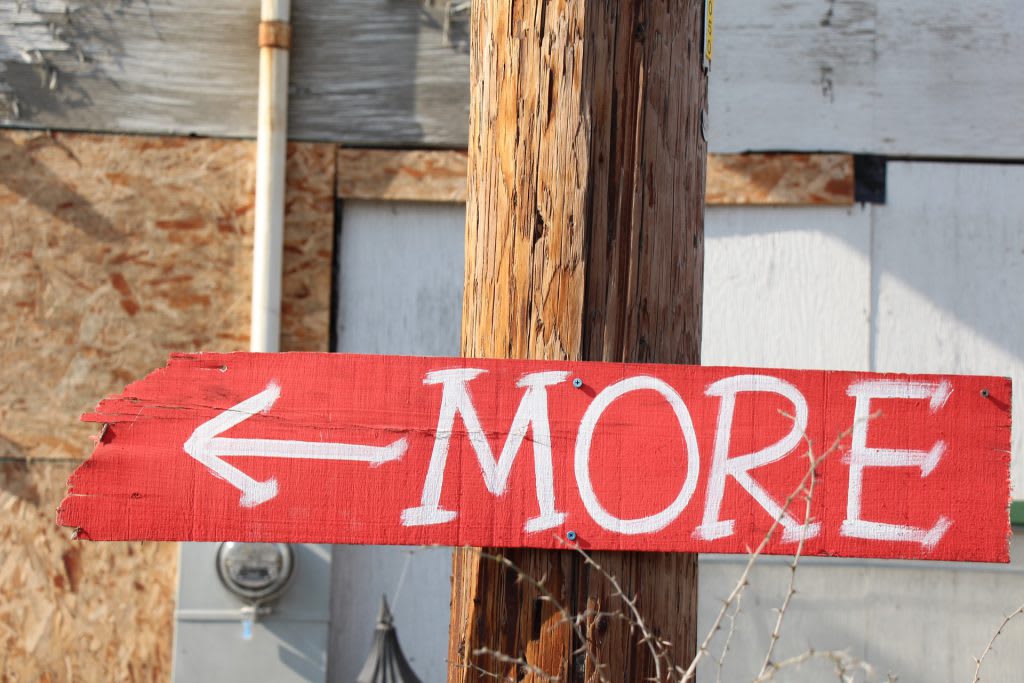
- Directional arrows need to point in opposite directions on the front and back.
- Any directional words (like right, left, forward, or back) will also need to be opposite for each side.
You may even consider whether you need a second side at all. If your yard sign will only face one direction, you could probably save time, energy, and money by not printing it two-sided.
5. Decide DIY vs. Professional
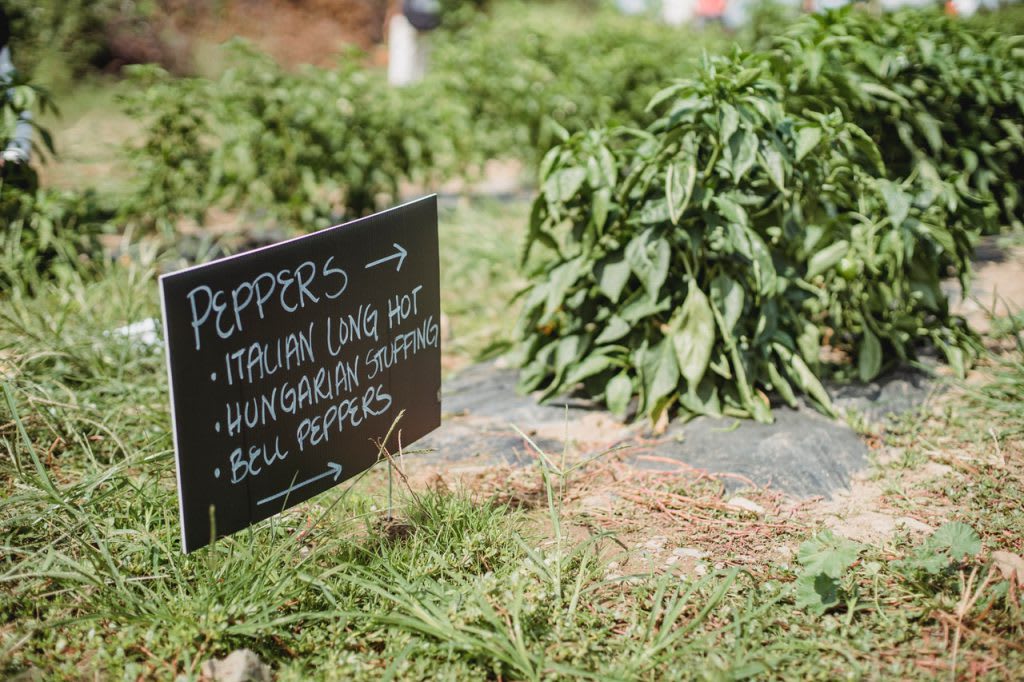
Depending on the purpose of your yard sign, you might be best served by just buying some signs from the local supermarket and writing on them with a marker. This is perfectly okay for things like garage sales or personal projects!
For any kind of business communication, however, it s probably better to create something professional that matches your brand. Yard signs are very affordable as far as marketing goes, and it's worth the effort to make a positive impression.
So where can you get professional yard signs?
Well, we might be biased, but we're a great choice! You can use MyCreativeShop s online yard sign maker to design your sign right from your browser and then order prints delivered to your door.
Of course, we aren't the only option. You could also go to a nearby print shop to see whether or not they offer design services in addition to printing. Or you could hire an independent graphic designer online or in your local area.
If you are planning to use MyCreativeShop, then check out our quick guide to using our editor to communicate your brand effectively.
6. Final Check: Is It Readable? Really?
Okay, so your yard sign design is all sketched out and you re ready to commit, either by writing it out by hand or by creating a professional design. But before you do that...
Make sure to double and triple-check the readability! Look at your sign with a critical and objective eye, asking yourself:
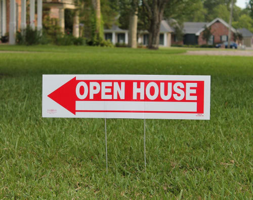
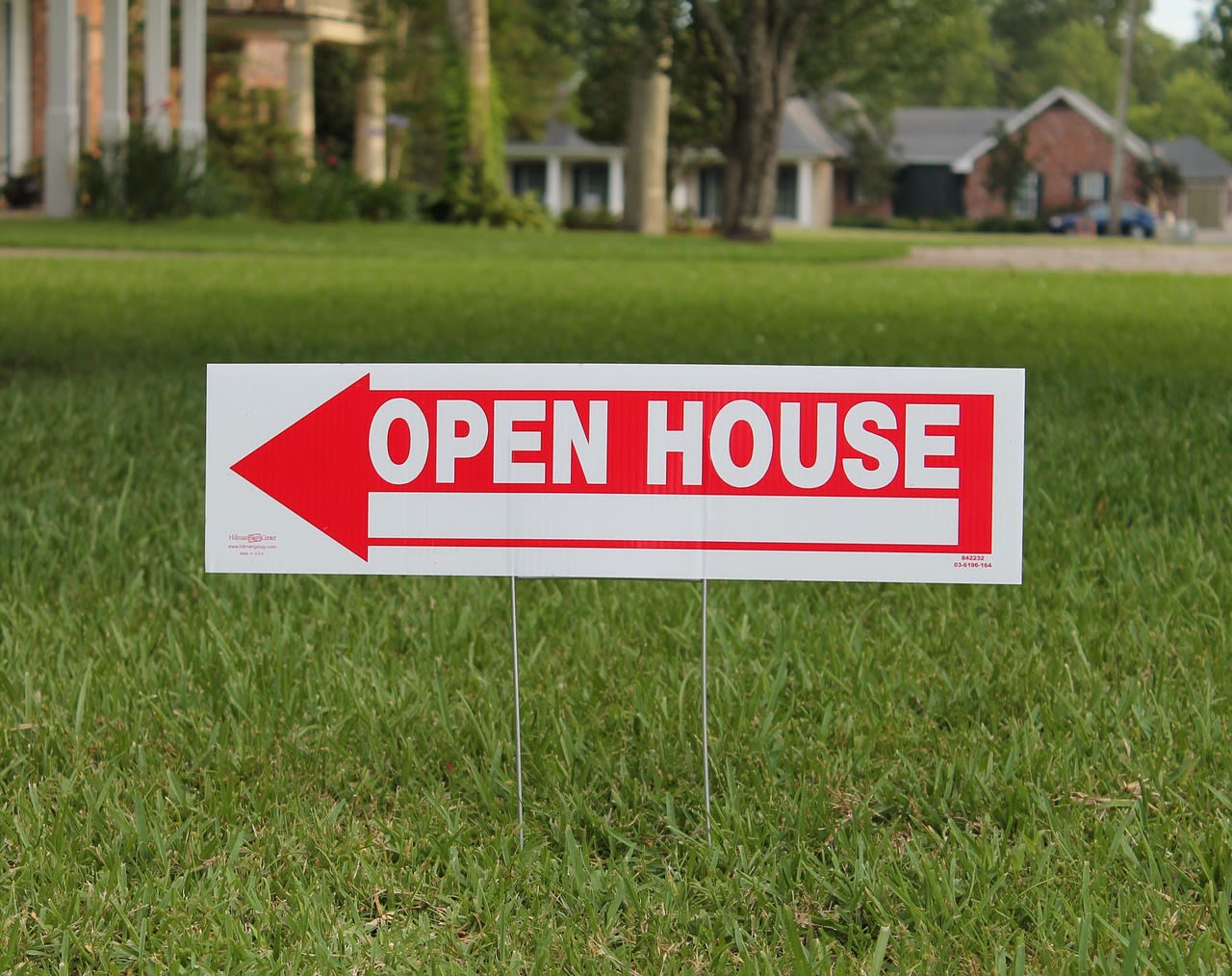
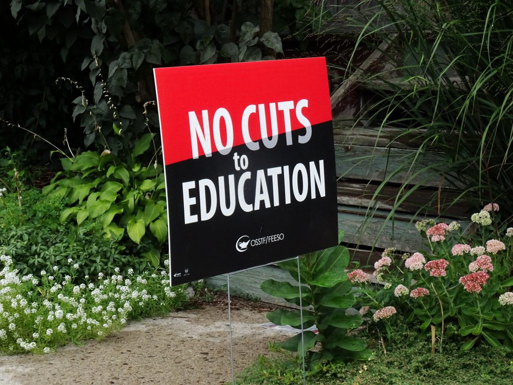
- Can I make the text shorter? It s always better to cut words where possible. (Just look at the yard sign example above to see how few words can get the point across!)
- Is the font clear enough and large enough? In most cases, it s best to choose a very readable font over something too ornamental. (Think something like Cera or Mont from this list of awesome modern fonts.) And a good rule of thumb is to make the text at least one size bigger than you think it needs to be.
- Is the color contrast strong enough? It s a good idea to stick with very contrasting colors, such as bright white text on a dark background. (Again, check out the image above.) Remember that people of all ages and eyesight should be able to read your yard sign.
- Can I use something visual to replace words? A high-quality photo might say the same thing as a headline like Gorgeous homes. Or for a pedestrian-focused yard sign, a QR code linking to a website landing page might be able to replace an entire block of text.
***********************************************************************
Check Out Our Yard Sign Templates and Get Started!
That's it! We hope you'll learn from our customers' experience and put these helpful yard sign tips to work for you.
Yard signs may not be the most groundbreaking tool in your marketing arsenal, but there s a reason why they re such an old standby and that s because they work! Even during the confusion of a global pandemic, they work.
So if you re ready to start creating your own marketing workhorse, head over to our yard sign templates. You can experiment with our online editor totally for free, so it s a pressure-free way to get started brainstorming your design. We can t wait to see what you create.
