How to Drive More Conference Leads with Brochures

Conference leads can be some of the most powerful for your business. In fact, 41 percent of marketers believe that events like these are the single-most effective marketing channel, more so than digital advertising, email marketing and content marketing, according to Bizzabo s 2019 Event Marketing Report.
Tradeshows and conferences provide you with a platform to bring services to the market, drive sales, and network with other professionals in your industry. However, simply attending an event won t lead to sales. One of the tools you can leverage to drive conference leads is a brochure.
Brochures are a great way to leave booth visitors with something tangible, while making it easy to explain how you and your products can make their lives easier. They re also cost-effective to design and print. For example, when designing brochures with MyCreativeShop, you can create your own design for less than $10.
While paper materials may seem like ancient history, tangible take-aways can work to your benefit. Rather than getting lost in a sea of contacts on LinkedIn, the people you meet will have a physical memory of your interaction. FedEx also found that 85 percent of consumers are more likely to work with a small business if it has professionally, custom printed materials.
If you want to drive more tradeshow and conference leads with brochures, make them stand out, while representing your brand and driving customers to act.
Jump right in and learn how to make your brochure design stand out!
Update Outdated Brochure Design
If your brochures were designed more than two years ago, it s time to update them. Not only has your business likely changed, but a sleek, modern look will help your brochure stand out in a stack of conference papers. The same FedEx data also reveals that consumers believe the quality of printed materials reflects the quality of the service provided by the business, making design critical to their perception of your brand.
When updating the look and feel of your print materials, keep these simple but important tips in mind:
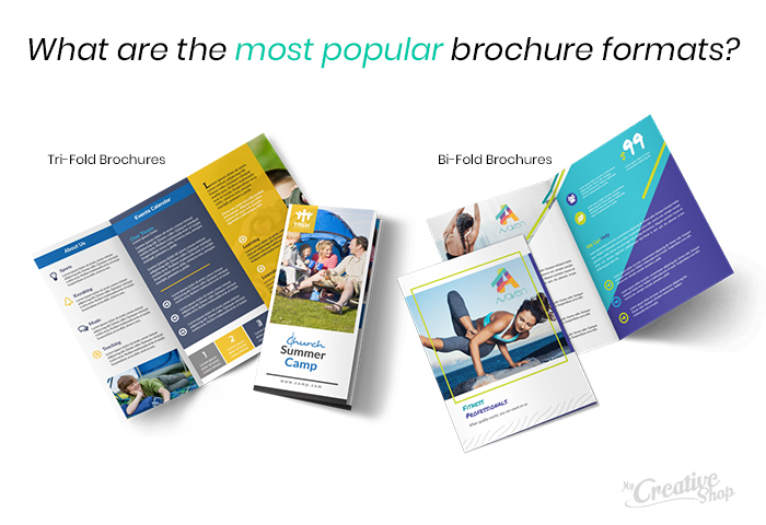
Choose the right format: Brochures are most commonly made as bi-fold or tri-fold. Choosing the right format will determine both how your content flows and how much information you can include. Test the same design and messaging with both to see which best fits your needs.
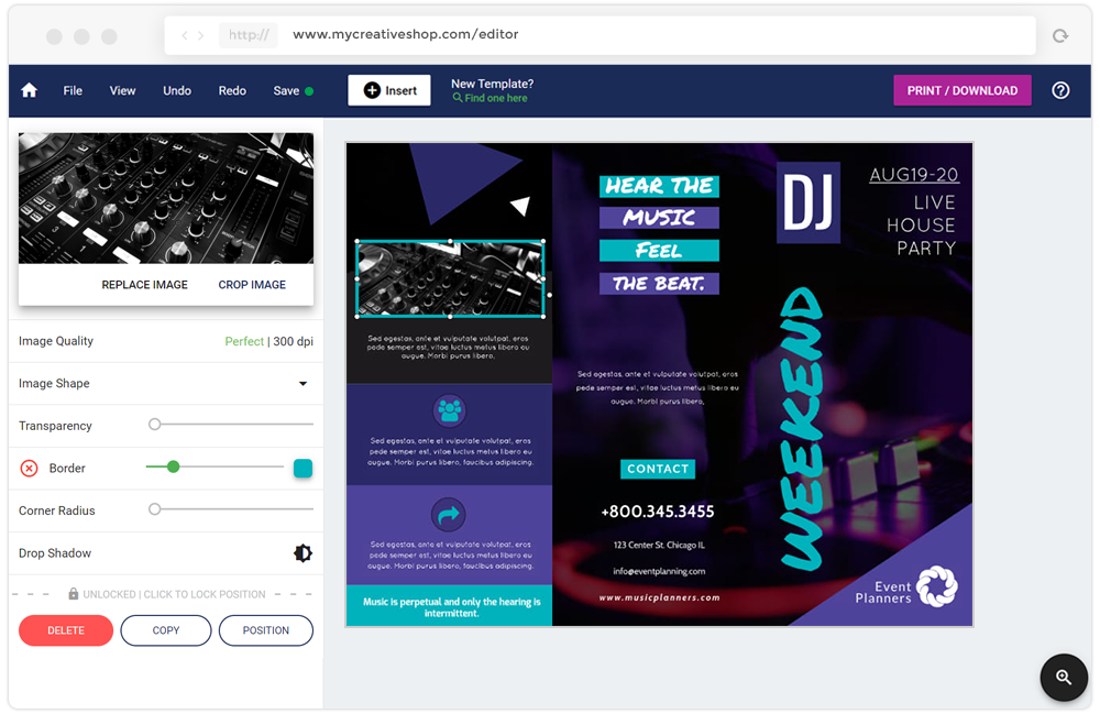
Fun fact: It's not always easy for first-time designers to organize their thoughts on the canvas, but a tri-fold brochure offers a natural layout for organizing that information for you. Give it a try!
Use a minimalist design: A modern, minimalist design will ensure your reader sees the most important information, without the clutter of too many images or too much text. Use white space to your advantage to make sure your copy is as effective as possible.
Make your CTA clear: Your final ask or call to action (CTA) can easily get lost in a brochure. Make it clear by using text that s easy to read and stands out on the page.
Tip: Your CTA doesn't need to be the biggest and brightest thing on the page, it just has to be the single most important action you'd want your audience to take.
Stay true to your brand: The most important aspect of your brochure is that it s branded. Future customers should be able to look at it and immediately recognize that it s yours. Some of the most well-known companies across the globe can be recognized just by their logo or brand elements, like the Nike Swoosh or the Amazon smile. Use this brand power to your benefit by sticking to your brand colors, imagery and font.
Get ready to redesign your brochures with our recent blog post: Design to Print Process: A Guide for Small Business Owners
Tailor Your Messaging
Think of your brochure as a high-level introduction to your brand, covering the who, what, where and why. However, don t use generic messaging that might be found on your website. Instead, tailor the messaging to the event you re attending.
For example, a yoga retailer attending a wellness conference, will use different messaging than if they were attending a retailer conference. In this case, your messaging might vary as such:
- Wellness event (B2C): Our eco-friendly yoga pants allow your body to breathe better during hot yoga classes and can be worn from class to dinner, without needing to change a single thing!
- Retailer event (B2B): Our eco-friendly yoga pants are affordable for your customers, while allowing for a strong profit margin for sellers.
The goal is to tailor your message to the interests of your target audience so the value of your service or product has a greater impact.
Encourage Engagement With Your Entire Brand
Don t let the relationship stop when you hand over a brochure. Encourage customers to engage with your brand on every level, from social media to your blog, to drive leads and sales well after the event has ended.
To do so, you need to build engaging elements into your brochure, allowing customers to easily move between online and offline. This multi-channel approach is critical to developing a recognizable brand while also reaching customers everywhere they are.
Here are a few ideas to consider as you prepare your conference brochures:
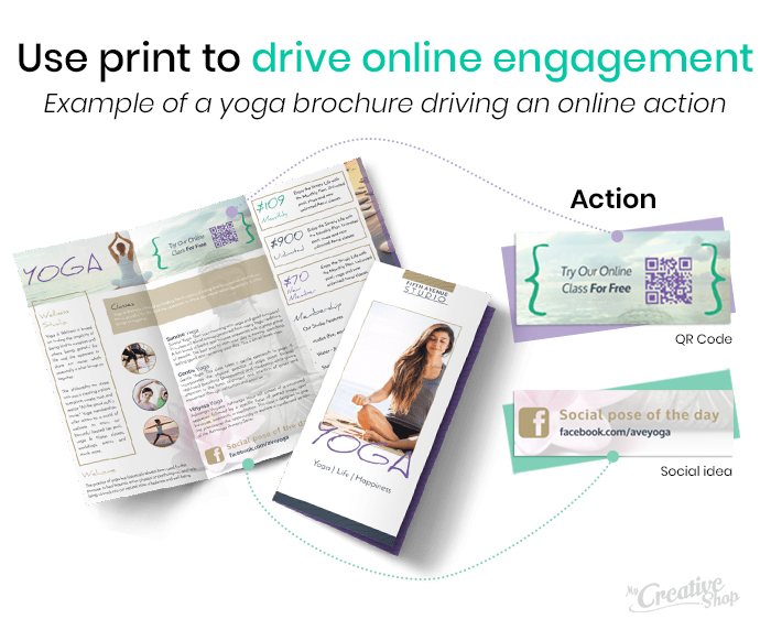
Embed a QR code or URL: Get customers online by putting a QR code or shortened link on your brochure. The key is ensuring that the page they reach is branded, even better if it s created specifically for this event. Get creative by directing customers to a video, email sign up, or related blog post.
Highlight social media: Encourage customers to follow you on social media by highlighting the icons for each platform. Dn t let them blend into the footer of your brochure. Use text like Follow us! with an arrow icon to drive action.
Encourage social engagement: Create a branded or event hashtag and encourage brochure readers to use it. In the yoga example above, this could be as simple as, Use #HotYogatoHappyHour to share the love!
Drive Conference Leads With Powerful Brochures
Conference brochures can be a valuable tool at events when leveraged effectively. To get the most from this marketing material, your design needs to be sleek and up-to-date. Your messaging also needs to speak to a specific audience and the experience needs to seamlessly flow from offline to online. Use these tips to get creative, driving more leads from your next conference and every one after that.
