From Blank Canvas to Masterpiece: Designing Music Lesson Posters


When it comes to capturing the essence of your music lesson and attracting students, few marketing tools are as powerful as a well-designed poster. A carefully crafted music lesson poster has the ability to turn a blank canvas into a masterpiece that sings to your audience and leaves a lasting impression.
In this article, we will explore the art and science behind designing music lesson posters that demand attention and inspire action.
The Importance of a Visually Appealing Introduction
Just as a captivating melody grabs our attention from the first note, your poster's introduction must do the same. It should boldly announce the purpose of the poster and engage the viewer instantaneously. A visually stunning opening can be the difference between catching the eye of a potential student and being lost in a sea of noise.
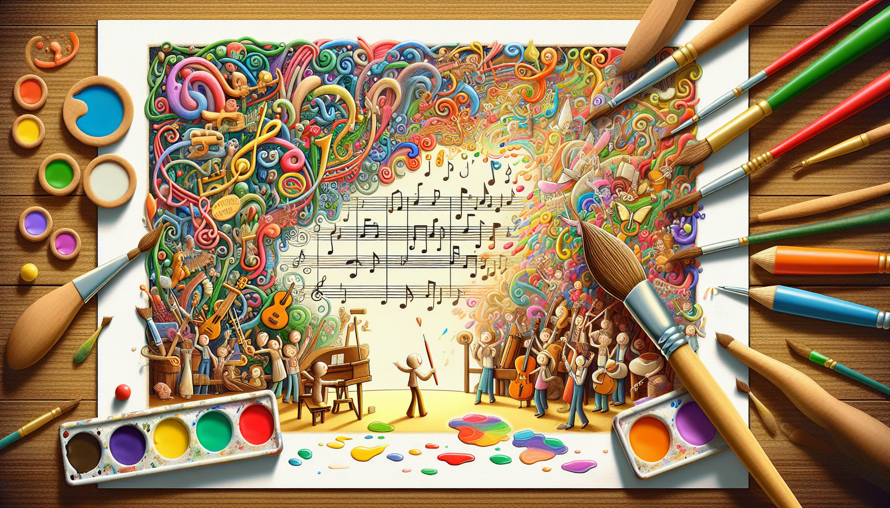
Imagine a poster with an unconventional twist. Instead of the usual musical notes floating across the page, a vibrant, abstract design emanates a sense of creativity and innovation. This unexpected approach immediately piques curiosity, compelling passersby to take a closer look. By breaking away from the norm, your poster will stand out in the crowd and make a lasting impression.
Formatting for Scannability and Readability
A well-designed poster is not only visually appealing but also easily digestible. As much as we may love the intricacy of a symphony, the average passerby has limited time and attention. To effectively communicate your message, break down information into scannable sections. Use captivating subheadings that guide the reader through the content.
Consider organizing your poster into logical sections such as "About Us," "Group and Private Lessons," "Now Enrolling," and "Special Offers." Each section should be concise and provide enough information to entice potential students. Utilize bullet points, bold fonts, and color accents to make key details stand out. By presenting your information in a clear and organized format, you enable viewers to quickly grasp what your music lesson has to offer.


A Symphony of Visual Elements
Just as a musician carefully selects each note to create a symphony, a designer must choose visual elements that harmonize to create a captivating poster. The color palette sets the tone and mood, evoking emotions that align with your music lesson's atmosphere. Vibrant colors can convey energy and excitement, while soft pastels can evoke a sense of calm and serenity.
Typography also plays a vital role in poster design. Use bold and legible fonts that are both aesthetically pleasing and easy to read from a distance. Remember, your poster may catch the eye of a passerby who is a few feet away, so make sure your typography is clear and attention-grabbing.
Strategic Breaks for Maximum Impact
Just as a well-placed pause in a musical composition can create anticipation, strategic breaks in your poster's design can guide the viewer's eye and enhance the overall impact. Break up paragraphs and sections with visually appealing white space, allowing the content to breathe and preventing overwhelm.
Additionally, consider incorporating eye-catching visual elements such as illustrations, photographs, or musical symbols that enhance the message you want to convey. These breaks in the design not only capture attention but also create a sense of balance and rhythm.
Final Thoughts
Designing music lesson posters is both an art and a science. By infusing creativity, strategic formatting, and attention to detail, you can transform a blank canvas into a masterpiece that resonates with your audience.
So whether you're a music academy, studio, or private tutor, use these design principles to craft music lesson posters that tell your unique story and attract the students who will appreciate your musical expertise!

