Design Thanksgiving Posters Like a Pro: 10 Tips and Tricks


Welcome to the ultimate guide to designing Thanksgiving posters like a pro! Thanksgiving is a time of gratitude, feasting, and community, and what better way to capture the spirit of this holiday than through eye-catching posters?
Whether you're organizing a community event, hosting a Thanksgiving dinner, or running a sales promotion, a well-designed poster can grab attention and convey your message effectively. In this blog post, we'll share 10 tips and tricks to help you create Thanksgiving posters that will impress and inspire!
1. Define Your Goal
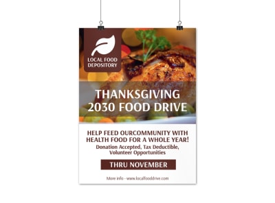
Before you dive into the design process, it's essential to clearly define your goal. Are you promoting a community event, showcasing a special thanksgiving sale, or advertising a food drive? Understanding the purpose of your poster will guide the design elements you choose, such as colors, imagery, and typography.
2. Capture the Thanksgiving Spirit
Thanksgiving is all about warmth, gratitude, and gathering. Use colors like warm oranges, earthy browns, and rich yellows to evoke the cozy ambience of the season. Incorporate images of families, delicious food, or fall foliage to capture the Thanksgiving spirit and create an emotional connection with your audience.
3. Keep It Simple
When it comes to poster design, simplicity is key. Avoid cluttering your poster with excessive text or too many images. Instead, stick with a central message and design around it. Use clean and easy-to-read fonts, and make sure your text is concise and to the point.


4. Utilize Contrast
Contrast helps your poster stand out and grabs attention. Experiment with contrasting colors, such as pairing a dark background with vibrant text or vice versa. This will create visual interest and ensure your message is easily readable from a distance.
5. Play with Typography
Typography plays a crucial role in poster design. Choose fonts that reflect the tone and style of your event or message. For a traditional Thanksgiving dinner, consider classic and elegant fonts. If you're hosting a fun and casual community event, opt for playful and whimsical fonts. Just remember to keep your text legible and avoid using too many different fonts in one design.
6. Create a Focal Point
Having a focal point in your poster helps direct the viewer's attention and communicates the main message. Use design elements such as bold typography, larger images, or vibrant colors to create a visual anchor that draws the eye.
7. Balance Composition
Balance is key to a visually appealing poster. Aim for a harmonious arrangement of elements by utilizing the rule of thirds or the golden ratio. Place your text, images, and other design elements strategically to achieve a sense of balance and visual flow.


8. Use High-Quality Images
Images can make or break a poster's impact. Use high-quality, professional images that enhance your message and evoke emotions. If you're unable to source images from a stock photo website, consider hiring a photographer or using creative commons-licensed images with proper attribution.
9. Add a Call to Action
Don't forget to include a compelling call to action in your poster. Whether it's directing people to RSVP for an event, visit your restaurant, or donate to a food drive, make it clear and easily accessible. Use contrasting colors or eye-catching arrows to draw attention to your call to action.
10. Get Feedback and Adapt
Lastly, don't be afraid to seek feedback from others and make changes to your design, if warranted. Show your poster to friends, colleagues, or even on relevant online design communities for constructive criticism. Incorporate feedback to improve your design and ensure it aligns with your goal and resonates with your target audience.
Putting It All Together
With these 10 tips and tricks, you're well on your way to designing Thanksgiving posters like a pro! Remember to define your goal, capture the spirit of Thanksgiving, keep it simple, utilize contrast and typography, create a focal point, balance your composition, use high-quality images, add a call to action, and seek feedback.
Now, go out there and create stunning Thanksgiving posters that will make a lasting impression on your audience!