Dance Posters: 7 Tips to Give Your Marketing Strategy a Boost

Promoting your dance school effectively requires a compelling poster that captures the essence of what you offer. A well-designed poster serves as both an invitation and a teaser, enticing potential students with vibrant visuals and clear messaging. By incorporating the right elements, you can communicate your class style, schedule, and benefits in an engaging way. This not only helps attract new dancers but also establishes the identity of your dance program.
In this post, we will share 7 tips to help you create eye-catching dance posters that resonate with your target audience!
1. Understand Your Audience
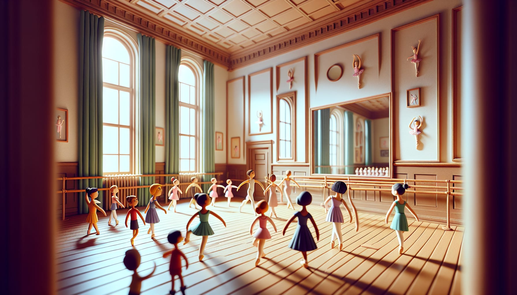
The cornerstone of effective marketing is a deep understanding of your target audience. Are you promoting a camp for young dancers or a tryout for a competitive dance team? Each audience comes with unique preferences and needs, which will dictate your design choices. Tailor your messaging, imagery, and tone to resonate with the specific group you're trying to reach. Use language that connects — for example, inspire kids with playful imagery or encourage parents by highlighting safety and skill development.
2. Choose Bold Graphics
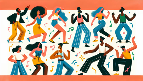
Dance is all about movement and energy, and your poster should reflect that. Utilize bold, vibrant graphics and high-quality images that evoke the dynamism of dance. Whether it’s a photo of dancers in mid-leap or abstract shapes symbolizing motion, your graphics should draw viewers in. Make sure to select visuals that match the theme of your event—whether that’s contemporary ballet, hip-hop, or traditional folk dance. This visual coherence will strengthen your overall branding.


3. Create a Compelling Headline
Your poster's headline serves as the bait to draw in potential attendees. Make it punchy, provocative, and enticing. Instead of generic phrases like "Dance Classes Available," consider something more exciting such as "Unleash Your Inner Dancer!" The goal is to capture the reader's attention within a split second— your headline should compel them to read more.
4. Utilize Color Psychology
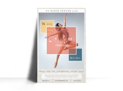
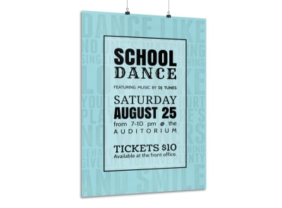
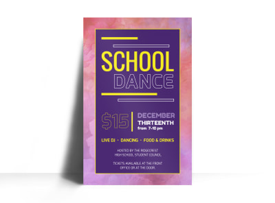
Colors convey emotions and can significantly influence perception. When designing your dance poster, utilize color psychology to align your color choices with the feelings you wish to elicit. Bright colors like red and orange can evoke excitement and energy, while blues and greens promote calmness and serenity. Choose your palette wisely to reflect the mood of your dance event and attract the right audience.
5. Include Essential Details
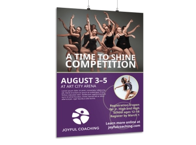
While artistic elements are crucial, they should not overshadow essential information. Be sure to include all relevant details, such as location, date, time, and how to register. Opt for a clean, legible font that stands out against the background. Organize the information hierarchically, allowing the most vital points to catch the eye first and providing clearer details as the viewer continues to read.



6. Incorporate Your Brand Identity
Your dance studio or school has a unique identity that should be reflected in your posters. Consistency in branding, including logos, fonts, and colors, fosters recognition and builds trust with your audience. Authentic branding ensures that your posters feel cohesive with your overall marketing materials, reinforcing your identity and mission with every viewer.
7. Call to Action
A compelling call to action (CTA) is a vital component of any marketing material, including dance posters. Encourage your audience to take action by adding phrases like "Register Now" or "Join Us on the Dance Floor!" Make your CTA bold and prominent so that it motivates viewers to engage with your event. A well-placed CTA can lead to increased registrations and greater community involvement.


Final Thoughts
In the competitive world of dance marketing, your posters must stand out and serve as dynamic tools for expression and communication. By understanding your audience, utilizing bold graphics, crafting compelling headlines, applying color psychology, including essential details, incorporating your brand identity, and delivering a clear call to action, you can significantly enhance your dance marketing strategy.
Embrace these tips, design with passion, and watch as your dance posters captivate and inspire!

