9 Fresh Ideas for Real Estate Postcard Marketing


Real estate postcard marketing is not a thing of the past. In this increasingly competitive industry, companies and agents must use a multichannel marketing approach to reach their target audience in different locations.
A recent report found that 26 percent of agents said direct mail was an effective way to communicate with clients, and nearly 60 percent said that direct mail was important for lead generation. However, only 10 percent reported using direct mail as a marketing tactic.
Take advantage of this opportunity to reach your potential clients where your competitors are not. Use these ideas to make postcard marketing a key part of your winning strategy.
How to Make a Postcard: A Simple Guide for Business Owners
1. Include a Customer Review
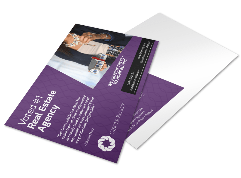
Consumers love reviews; 86 percent read them when researching local businesses, according to a Bright Local survey. What s more, your potential clients are reading an average of 10 reviews before they feel they can trust your business. Make it easy for prospective clients to get to know you and your business by incorporating a positive customer review on your postcard. You can easily add a review to this design in the bottom section of this MyCreativeShop template.
2. Embrace the Minimalist Trend
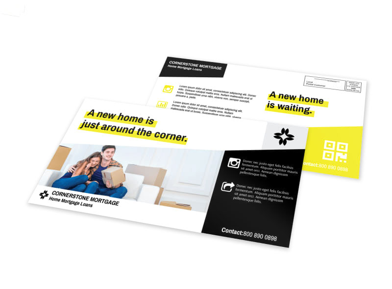
Quickly hooking your audience with captivating text in a small space requires you to use the less is more mindset when designing. To make your message pop, use a simple yet sleek postcard, like this template. Create strong calls-to-action and relevant information to make sure your reader understands what you want them to do.
5 Design Ideas for Your Real Estate Marketing Flyers
3. Go Ultra Modern
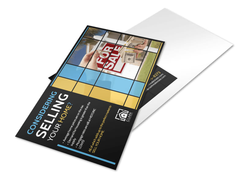
We love this design because it takes an image of your choice and splits it into an abstract artistic frame, (use this famous modernist painting as inspiration). Customize with your branded colors and an appropriate image for a contemporary and refined postcard.
4. Entice with Interactive Details

Add a feeling of weight to your real estate marketing postcards by using heavy cardstock or adding an interactive element, to ensure your marketing materials entice, rather than bore. These embossed business can be used to inspiration for your next campaign they have a textural element but also a weighty appearance with rounded edges, making them unique.
5. Increase Your Branding
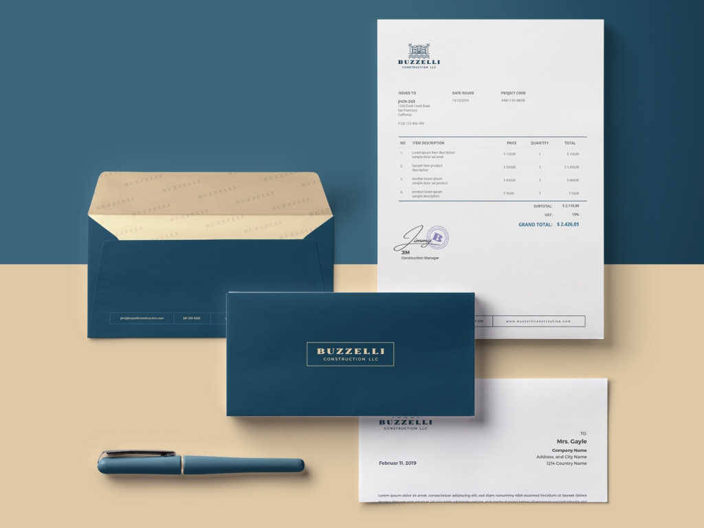
Use this letterhead package as inspiration for well-branded postcards. Note how the interior of the envelope includes a watermark with the company s logo, a subtle but sleek touch. Consider how you can use branded envelopes for your postcards to personalize the message further and make them stand out.
6. Promote Your Tech
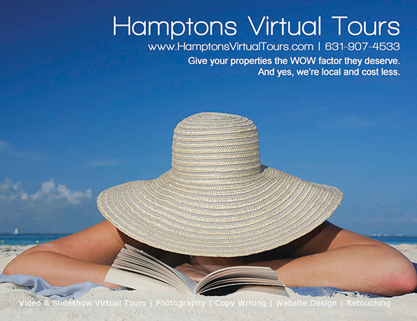
Instead of trying to break through the noise in a crowded market, highlight the tech you use. Modern clients may be intrigued by virtual tours or the ability to facetime for property viewings. If your brand is different than other agents around you, make sure potential clients know.
7. Highlight Powerhouse Statistics
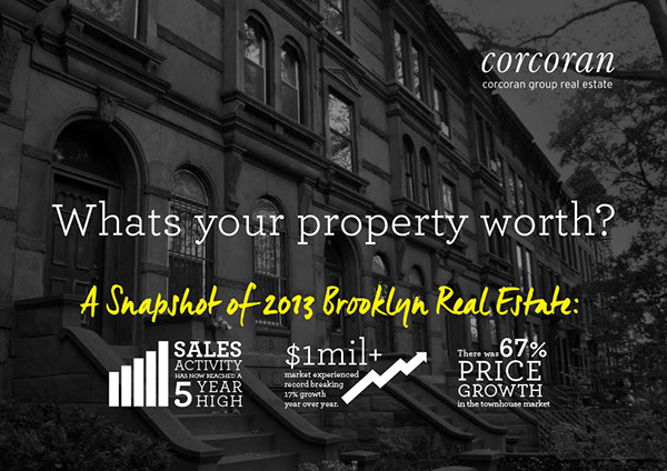
This real estate company wanted to educate the market on the benefits of selling their home now by designing a postcard with strong stats and figures to grab the viewer's attention. Remind homeowners of the value of their home and growing market, using strong graphics and data, to pique their interest.
8. Inject Some Humor
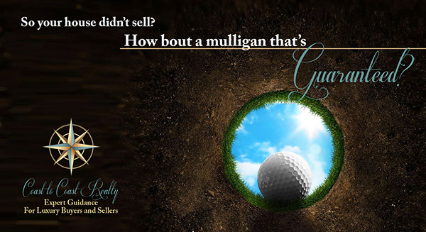
When appropriate, use humor to get your message across. In this case, an audience of golfers will not only get the joke, but appreciate the fun messaging. What s more, the design is simple and easy to replicate for your own audience.
9. Use Stylized Elements
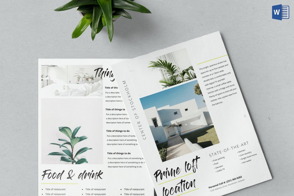
Hand Lettering or handwritten script is a popular font style in both social media and web design. Incorporate stylized elements into your real estate postcard marketing campaign, using a script font that looks more like an Instagram post than a real estate marketing postcard. Find inspiration in different elements of this template to make your marketing stand out.
Create Dynamic Postcards for Your Real Estate Company
Your turn! Time to develop a new, fresh real estate postcard marketing campaign. Use these designs as inspiration to give your brand the modern feel is needs to win the clients your competition is missing.