7 Tips for Successful Banner Design


Sharing your business or organization s message with your stakeholders or community really can be as simple as creating and displaying a custom banner that hits all the right notes. Whether you re looking to communicate your COVID-related updates to customers and clients in a socially-distant way or just getting the word out about an upcoming event or sale, a banner is truly the perfect fit.
While banners are a relatively uncomplicated marketing medium, there are still some pitfalls to avoid along with a few design tips that can really amplify your message. Knock one out of the park by creating a custom banner that follows these 7 tips for success!
1. Give a Call to Action

Image via Firespring
The whole point of creating a banner is to motivate the reader to do something. You may be encouraging loyal customers to join you for an appreciation event, letting students and parents know the details of your next college prep workshop, or simply advertising your current specials. In order for your banner to be successful, you must include a very clear and unmistakable call to action (CTA). Additionally, the reader should be told how to act on that CTA. This may mean that you include an easy-to-read web address or phone number, event/sale dates, or a variety of other things. However you decide to approach your CTA, it s absolutely essential that it stands out, and that all other design elements complement it without being distracting.
2. Stick with Vectors

Image via Cline Company
If you ve ever had that sinking feeling after discovering that the image you included in your print project became fuzzy and pixelated when scaled-up instead of the crisp, clean photo or graphic you started with, then you ll appreciate what vector images can do for your finished vinyl banner. Unlike bitmap images, which have a set number of pixels (bits) and can only be blown-up to a certain point before they reach a DPI that s not fit to print, vector images use mathematical equations to determine their lines, shape, color, and location and can be scaled-up and down while still remaining clear and consistent.
Keep reading: A Complete Guide to Understanding DPI
3. Choose Your Typeface Wisely
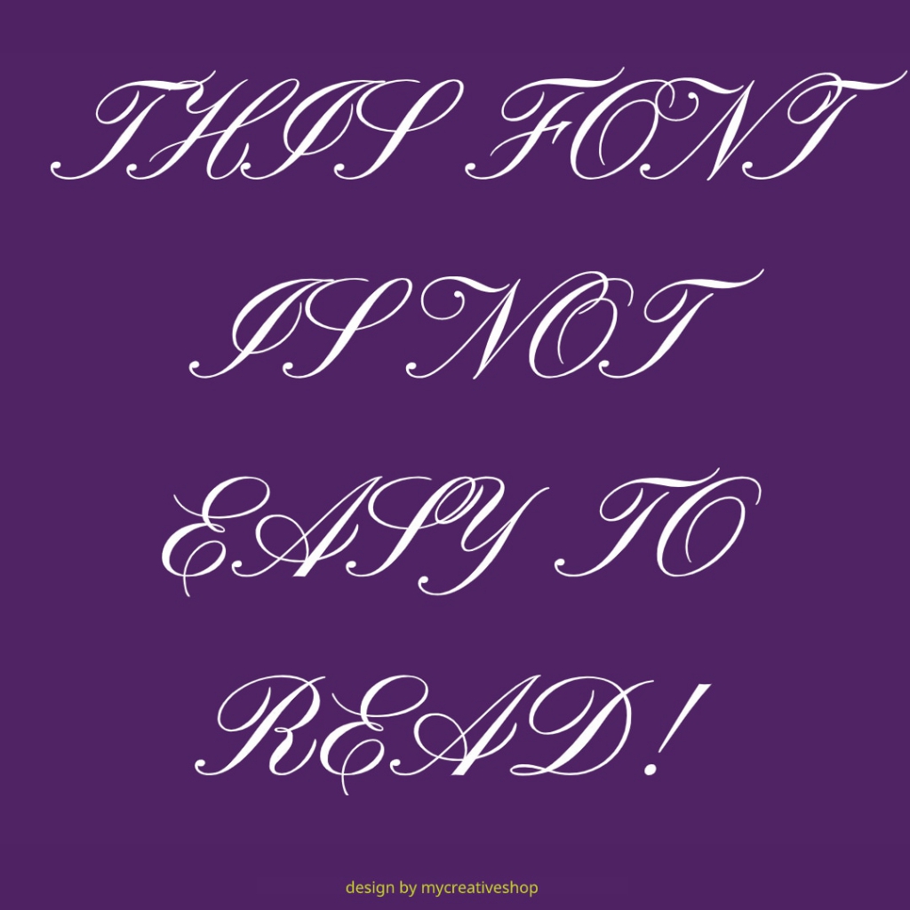
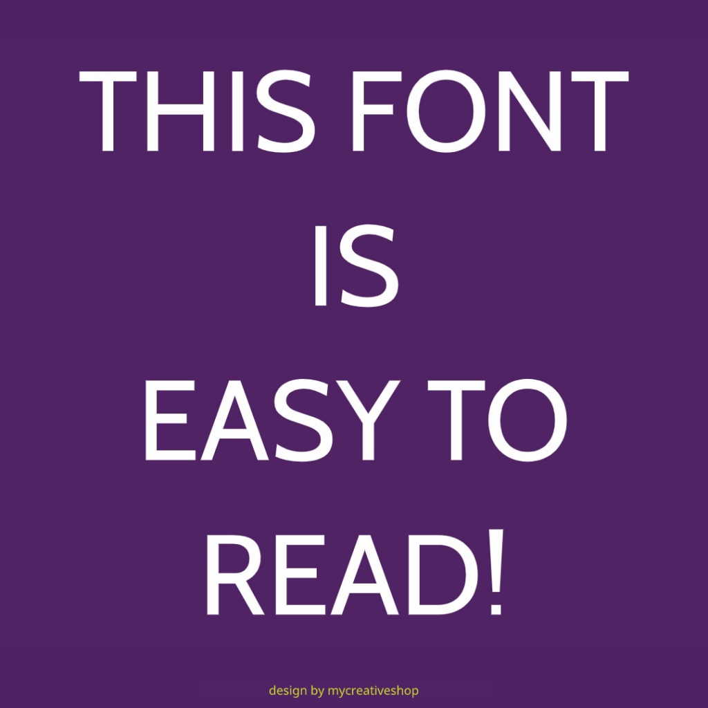
Images via MyCreativeShop Blog Images Templates
During the banner design process, you may be tempted to incorporate that trendy script font that you stumbled across. Before you do, take the time to consider whether it will be easy to read at a distance (as banners tend to be viewed) or whether the loops and whirls will over-complicate your message. The font you choose should not only be visually clean, but it should align with the tone of your message and with your own branding strategy. The right typeface for your banner will likely be a sans serif font with just-right character spacing and weight (the Goldilocks of font selection, if you will). Find a winner for your banner design by checking out our post: 10 Fonts for Fantastic Signs.
Keep reading: 10 Different Font Types and How to Choose Yours
4. Create Contrast and Consistency with Color
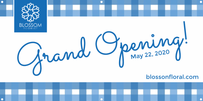
Design via MyCreativeShop Grand Opening Banner Design
When viewing a message from a distance, color - both of the text and the background - can make all the difference in the world. A thoughtful, profound message can get completely lost in a sign that lacks contrast or goes overboard with color to the point of distraction. At the same time, a simple color scheme that aligns with your branding strategy and provides just enough contrast can drive the point home effectively. To achieve this outcome, keep your color scheme simple; two or three colors should do the trick. The reader shouldn t have to work hard to understand what you want them to do, so don t overthink it
5. Balance, Balance, Balance

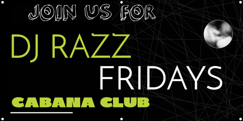
Designs via MyCreativeShop Balanced DJ Banner Design and Imbalanced DJ Banner Template
With any design project, creating balance between the different design elements is essential to achieving an effective finished product. What does balance look like? The placement, color, and weight of the different elements (text, images, etc.) should appear natural, with no one item distracting from another. Each aspect of the design should fit and not distract from the overall message of the banner. The old adage of less is more should be followed, and most impulses to add just one more thing should be ignored. Keep your design simple and balance will be easy to find!
6. Stay on Message

Image by Rudy and Peter Skitterians from Pixabay
Every piece of your banner design should support the message you re trying to convey. If it doesn t connect, don t include it. Take every opportunity to be consistent with your branding strategy, as this creates continuity across all your marketing mediums.
7a. It s All in the Timing...
Image via Dreamstime
7b...And the Location!
Timing really is everything. If your banner is promoting a time-sensitive event or sale, make sure you get it up early enough to make a difference, but not so early that no one cares yet (i.e. don t hang Christmas sale banners in June!). It s also incredibly important that you take your banner down as soon as the event is over to avoid appearing unprofessional.
Image via Creative7Designs
Location, location, location! The tried-and-true real estate mantra is just as relevant to banner placement as it is to finding your dream home. For maximum impact, hang your banner where your target audience will see it - over and over again, if possible! Ideal outdoor locations include exterior walls along heavily-traveled roads and any surface visible near stop-and-go traffic areas. Catching drivers on their morning and evening commutes provides repetition and gives your message the best chance to be retained.
Bonus - Make it Memorable!
Image via Screenrant - Monty Python and the Holy Grail
One of the most important, yet intangible aspects of any design is that little something that makes it memorable. It may be a catchy slogan, jaw-dropping image, or a fantastic design - whatever grabs the attention of the reader and KEEPS it is the "Holy Grail" of banner creation. Seek after it, but stay true to the design tips we shared above!
************************************************************************
Explore Fantastic Banner Design with MyCreativeShop
When you re ready to get started, MyCreativeShop has all the banner templates and tools you ll need to create a successful design that works for you. Check them out today!