10 Tutoring Postcard Design Tips: Stand Out from the Crowd


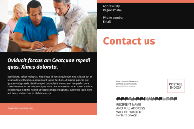
As a tutor, you understand the importance of standing out in a crowded market. With so many tutoring options available, it can be difficult to attract new clients and make a lasting impression. That's where postcard marketing comes in. Postcards offer a cost-effective and targeted way to promote your tutoring services.
In this article, we'll explore 10 tutoring postcard design tips that will help you stand out from the crowd and capture the attention of potential students.
1. Start with a Strong Headline
Your postcard headline is the first thing potential students will see, so it needs to be impactful. Use a bold font and a compelling message that highlights the benefits of your tutoring services. For example, "Unlock Your Full Potential with Expert Math Tutoring." This headline immediately grabs attention and communicates the value you offer.
2. Use Eye-Catching Images
A picture is worth a thousand words, and the right image can convey the essence of your tutoring services. Choose images that are relevant to your tutoring niche, such as books, math symbols, or a student studying. Ensure the image is high-quality and visually appealing to make a lasting impression.
3. Keep the Design Clean and Simple
A cluttered design can be overwhelming and may distract from your message. Opt for a clean and simple design that focuses on the key information. Use white space to create balance and make important elements, such as your contact information, stand out.
4. Use Bold Colors
Colors evoke emotions and can help your postcard stand out in a mailbox full of white envelopes. Choose bold and vibrant colors that reflect your tutoring brand and appeal to your target audience. For example, use bright colors like yellow or orange to convey energy and enthusiasm.
5. Include Testimonials
Testimonials from satisfied students and parents can build trust and credibility. Include short, impactful testimonials on your postcard to showcase the positive experiences others have had with your tutoring services. Use quotes and attributions to show authenticity.
6. Highlight Your Unique Selling Proposition
What sets you apart from other tutors? Identify your unique selling proposition (USP) and prominently showcase it on your postcard. Whether it's your years of experience, personalized approach, or academic achievements, make sure potential students know why they should choose you.
7. Use Clear Call-to-Actions
Don't leave potential students guessing about the next step. Include clear and concise call-to-actions on your postcard. Whether it's to call, email, or visit your website, make it easy for interested individuals to take the next step and contact you.
8. Offer a Limited-Time Promotion
Create a sense of urgency by offering a limited-time promotion on your tutoring services. For example, "Enroll in Summer Tutoring and Get 10% Off." This motivates potential students to take action and not miss out on a great deal.
9. Personalize Your Postcards
Personalization can make your postcards feel more tailored to the recipient. Use variable data printing to include the recipient's name and address, and consider adding a handwritten note or signature for a personal touch.
10. Print and Post with a Professional Service
To ensure the highest quality and professionalism, partner with a reputable printing and mailing service like SnailBlast by MyCreativeShop. They offer USPS-approved mailing guides and can handle everything from printing to postage and mailing services, making your postcard campaign seamless and hassle-free.


Conclusion
With these 10 tutoring postcard design tips, you can create eye-catching and effective marketing materials that will help you stand out from the crowd. Remember to start with a strong headline, use eye-catching images, keep the design clean and simple, and highlight your unique selling proposition. Don't forget to include clear call-to-actions and personalize your postcards. Finally, print and post with a professional service like SnailBlast to ensure the highest quality.
By implementing these tips, you'll attract more students and grow your tutoring business!

