10 Quick Tips for Creating Impactful Nutrition Brochures

Are your nutrition brochures lacking the impact you desire? Do they blend in with the sea of generic flyers out there? Well, fear not, because we have the inside scoop on creating nutrition brochures that will captivate and educate.
In this article, we will share 10 quick tips that will take your nutrition brochures from ordinary to extraordinary. So grab your pen, unleash your creativity, and get ready to make your brochure stand out from the crowd!
1. Define your target audience
Before diving into the design process, it's crucial to identify your target audience. Are you targeting fitness enthusiasts, individuals with specific dietary requirements, or busy professionals looking for quick and healthy meal options? Understanding your audience will help you tailor your messaging and design to meet their needs and preferences.
2. Craft a compelling headline
Your brochure's headline is the first impression you make, so make it count. Grab attention with a catchy headline that sparks curiosity and highlights the benefits of your nutrition offerings. Remember, a well-crafted headline can entice readers to delve deeper into your brochure.
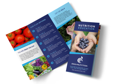
3. Use captivating imagery
Images can speak louder than words. Include vibrant, high-quality images that showcase delicious and nutritious foods. Whether it's a mouthwatering salad, a colorful smoothie, or a plate of lean protein and vegetables, visually appealing imagery will immediately grab attention and make your brochure more engaging.


4. Keep it simple and concise
In a world filled with information overload, simplicity is key. Keep your content concise and to the point. Use bullet points, short paragraphs, and clear headings to make it easy for readers to navigate and digest the information. Avoid overwhelming them with excessive text or technical jargon.
5. Incorporate compelling testimonials
Nothing builds trust and credibility like real-life success stories. Include testimonials from happy clients who have achieved their health and wellness goals with your guidance. These testimonials can provide social proof and persuade potential clients to choose your services.
6. Make it interactive
An interactive brochure can leave a lasting impression on your audience. Consider incorporating QR codes that lead to recipe videos or additional resources. Interactive elements like quizzes or challenges can also encourage engagement and keep readers invested in your brochure.
7. Use colors strategically
Colors evoke emotions and can influence how people perceive your brand. Choose colors that align with your nutrition message and the emotions you want to convey. Green, for example, can evoke feelings of health and freshness, while blue can promote a sense of calm and trust.


8. Focus on benefits, not just features
When describing your nutrition offerings, emphasize the benefits they provide. Instead of simply listing the features, explain how your services can improve energy levels, support weight management, or enhance overall well-being. Paint a picture of the positive impact your nutrition solutions can have on your audience's lives.
9. Provide clear call-to-action
What do you want your readers to do after reading your brochure? Whether it's scheduling a consultation, signing up for a newsletter, or visiting your website, include a clear call-to-action that guides your audience towards taking the next step. Make sure the call-to-action stands out and is easy to follow.
10. Proofread and print with care
Before finalizing your nutrition brochure, proofread it thoroughly to ensure there are no spelling or grammatical errors. Additionally, pay attention to the printing quality to maintain the visual impact of your design. Choose a high-quality paper that highlights your brochure's colors and images.


Final Thoughts
By following these 10 quick tips, you can create nutrition brochures that leave a lasting impact on your target audience. Remember to define your audience, craft a compelling headline, use captivating imagery, keep it simple and concise, incorporate testimonials, make it interactive, use colors strategically, focus on benefits, provide a clear call-to-action, and proofread and print with care.
Now go ahead and design brochures that inspire, educate, and motivate individuals to make healthier choices for their well-being!


