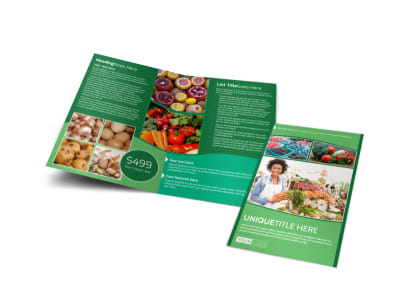
10 Fresh Design Tips for Eye-Catching Farmers Market Brochures


Imagine walking through a vibrant farmers market: the scent of fresh produce wafting through the air, the vibrant colors of countless fruits and vegetables enticing you from every stall. Now picture a brochure that captures this same energy—a brochure that not only informs but draws people in, making them crave the wholesome goodness local farmers offer.
If you want to create a farmers market brochure that stands out amidst the bustle and captures the hearts (and wallets) of potential customers, you’ve come to the right place. Here are ten fresh design tips to help you craft brochures that are not just eye-catching, but also deeply engaging!
1. Embrace Bold Colors
The world of farmers markets is bursting with color. Your brochure should reflect this vibrancy. Use bright and bold colors that mirror the produce you’re promoting. Think deep greens, sunny yellows, and luscious reds. A strong color palette will not only draw the eye but also evoke feelings of freshness and vitality, enticing potential customers to come and explore.
2. Use High-Quality Imagery
Nothing makes a brochure pop quite like stunning visuals. Invest in high-quality photographs that showcase the fruits, vegetables, and activities at your market. Consider photos that capture the essence of community and freshness—smiling farmers, bustling stalls, and crispy produce. Good imagery not only makes your brochure attractive but also helps convey the quality of the products being sold.
3. Keep It Simple
While it may be tempting to fill every inch of your brochure with information, simplicity often works best. Stick to a clean layout that showcases key information effectively. Use whitespace strategically to prevent overwhelming your readers and to guide their eyes through the most important details. Remember, less is often more.
4. Craft Compelling Headlines
Your headlines should spark curiosity and invite action. Use compelling, benefit-driven headlines like “Fresh from Our Farms, Straight to Your Table” or “Discover Local Delights This Weekend!” Great headlines draw readers in and encourage them to keep reading, increasing the odds of them visiting your market.
5. Incorporate Clear and Engaging Copy
Once you have drawn readers in with visuals and headlines, keep them engaged with concise and persuasive copy. Use conversational language that reflects the values of the farmers market. Highlight special features, such as local vendors, organic produce, or family-friendly activities. Aim for a tone that resonates with your target audience, whether they are health-conscious individuals, families, or food lovers.
6. Provide Essential Information
Don’t forget to include crucial information such as the market's location, hours of operation, and any special events or promotions. Make it easy for customers to find you and feel the urgency to visit. This information should be clearly delineated, possibly in a designated section or in bold text, ensuring it stands out for anyone quickly scanning through your brochure.
7. Feature Testimonials
Nothing speaks louder than the experiences of satisfied customers. Consider including a short customer testimonial or two within your brochure. This social proof builds trust and can encourage potential visitors to check out your market, as it shows that others have had positive experiences.
8. Offer Incentives
Drive traffic to your market by including special offers or discounts in your brochure. A “visit us this weekend for a free tote bag!” can be a powerful motivator. Clearly state any promotions right on the front or in a highlight section inside your brochure to ensure visibility.
9. Showcase Local Vendors
Highlighting your local vendors not only adds personality to your brochure but also fosters a sense of community. Include a brief section that introduces a few vendors or unique products available. For instance, “Meet John, our local honey farmer—get a taste of his golden honey at booth #5!” This personal touch can set your market apart and make it more inviting.
10. End with a Clear Call to Action
Finally, every effective brochure should end with a compelling call to action. Encourage readers to visit, share, or follow your farmers market on social media. Use phrases like “See you at the market!” or “Join our community of local food lovers!” This not only prompts an action but also creates a sense of urgency and excitement.


Final Thoughts
Creating an eye-catching farmers market brochure doesn’t have to be daunting. By embracing bold colors, high-quality imagery, and engaging copy, you can transform a simple pamphlet into a powerful tool for attraction. Remember to keep the layout simple, include essential information, and feature testimonials. As you design, let the vibrancy of your market guide every decision you make on paper.
With these ten fresh design tips in mind, your brochure will not only entice visitors but also reflect the soul and community spirit of your farmers market!