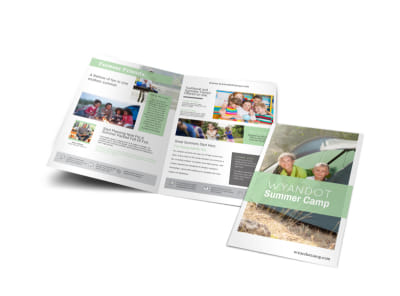
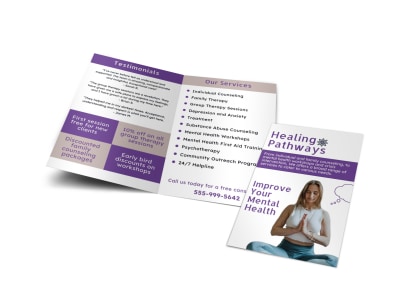
Non Profit Brochure Templates


Tips to get you started on designing, printing & promoting your Non Profit Brochures
-
What you should include in your nonprofit brochure depends on which audience the brochure is designed for. If your brochure is targeting your organization’s donors and stakeholders, you may want to include brief program descriptions, outcomes/results, financial accountability details, and information on your current fundraising campaign(s). Brochures aimed at program participants should highlight the benefits of participation, along with any costs fees required. If your audience is your volunteer base, focus on program successes and opportunities to get involved.
Any nonprofit brochure you create should be written for a specific audience (stakeholders/donors, participants, volunteers, etc.) and should include a clear call to action (CTA). Your organization’s name, logo, and contact information (including email, web, and social media) should be easy to find and photos of your non profit at work should be scattered throughout. Work in a notice that past-year Form 990s, audited financial statements, and annual reports are available upon request (or on your website). Note the tax-deductibility of financial donations for those interested and share a brief history of your organization. In the end, all elements of your design should support the overall goal of your brochure.
-
Before you embark on the nonprofit brochure design journey, you’ll want to gather together all the elements that will make your brochure a success. These include, but are not limited to, your logo, high-quality images, and original content. You'll also need a well thought-out branding strategy (yes, nonprofits have a brand, too!). If you need help with yours, check out these articles: How to Create Your Visual Branding Strategy with MyCreativeShop and 10 Design Lessons from Starbucks’ New Brand Guidelines. Once you have everything in hand, take a look at the nonprofit brochure templates we have to offer and choose the one that suits your organization best. Begin by customizing the color scheme to match your branding strategy, swapping in your logo, and replacing sample images with those from your own library. Update all placeholder text with your own original content, using headings and subheadings to make important details stand out while not crowding the panels of your brochure with too much text. Stick with the fonts in the template or change it up to fit your brand. Add in shapes, arrows, icons, and more to get your message across. After you’ve finished your customizations, proofread your brochure for any typos or mistakes. You can also enlist the help of a friend or colleague to review your project for readability. Once you’re happy with the finished product, send it our way for high-quality prints!


